How to use colour psychology in UX design to achieve our goals in marketing and branding
Colours play a key role in our everyday lives and how we perceive the world. We can use this to our advantage when establishing a brand identity, marketing a product, or creating a service. But to effectively do so, we must first understand how it all works.
What is colour psychology?
Imagine a parrot in the wild, using its colourful feathers to attract a mate or warn off potential predators. The parrot's bright, vivid colours convey complex messages and play a crucial role in its survival. Similarly, in human psychology, colours can evoke emotions, shape perceptions, and influence behaviour. By using strategic colours in design and marketing, we can create a powerful brand identity, convey messages, and enhance the overall user experience. The use of colour psychology is an important element in creating effective designs that resonate with our intended audience. While colour psychology and colour theory go hand in hand, they are two different concepts. The former focuses on emotional and behavioural effects on individuals or groups, while the latter is about the principles and concepts behind the use of colour.
General meaning of common colours
Colours - given context - can have multiple meanings. Let’s go over the meanings of the most common colours:
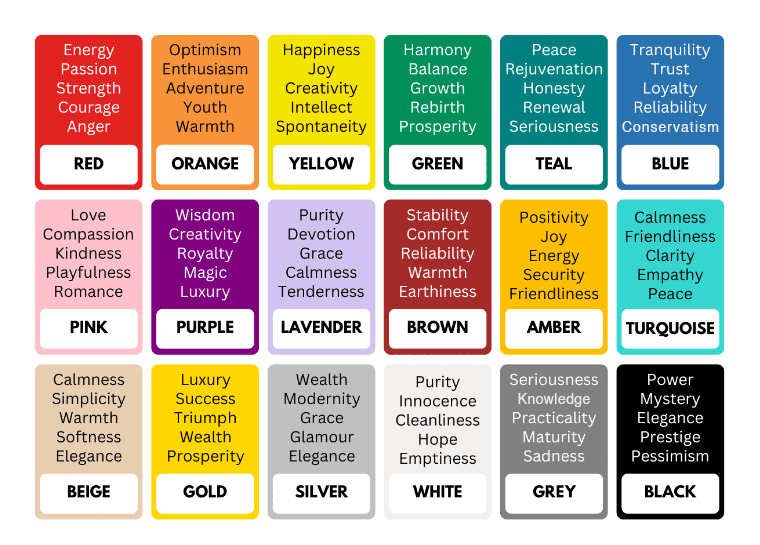 The meaning of common colours. Source: The Colors’ Meaning
Conscious decisions
Just as colour evokes emotions in you or me, it does in our audience as well. But to be able to implement colours well, we first have to know their intricacies. In all of marketing, knowing our target audience is the first step. Just as we would refrain from using subject-specific jargon when talking to a general audience, we should tailor our colour palette based on context as well. By understanding the intricacies of colour psychology and taking into account the preferences and cultural differences of our target audience, we can create a brand identity that resonates with them and sets us apart from the competition.
Saturation and brightness
But unlike our audience understanding the lingo, we can’t really get a binary answer as to whether a person likes a colour in advance. Fortunately, experts have done in-depth studies to narrow down the possibilities. Hue is far from the only thing affecting us when it comes to a colour palette. Young audiences tend to prefer brighter, more saturated colours. As we get older, we tend to gravitate towards muted colours. A common reasoning for why children prefer brighter colours is that their developing brains may be more attracted to high-contrast and visually stimulating environments. They may also be more drawn to colours that are associated with their favourite toys, games, or cartoon characters. In this sense, toys being colourful to appeal to children, and children preferring saturated colours is a two-way street.
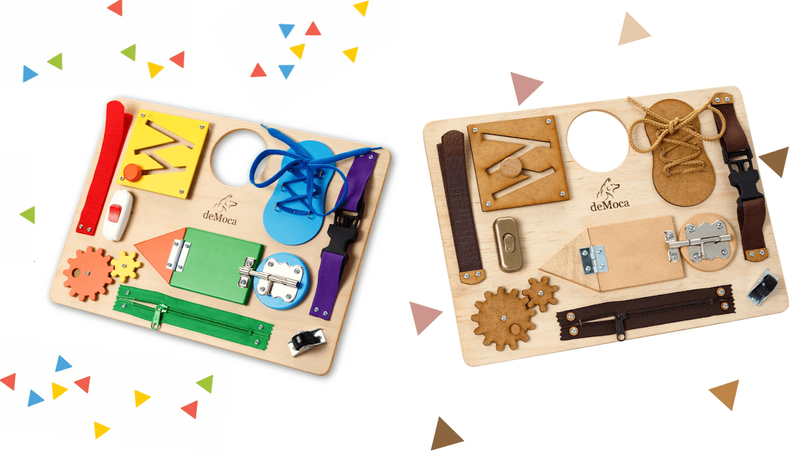 Hues, brightness, and saturation affect colour perception from an early age.
Source:
deMoca
Hues, brightness, and saturation affect colour perception from an early age.
Source:
deMocaResearch on colour preference has also shown that while both genders tend to prefer blue, there are differences in the intensity and range of colours preferred. Men generally prefer brighter and more intense shades of blue, while women tend to prefer the softer and more muted end of the spectrum. Additionally, while blue is the primary colour preference for both men and women, women's colour preferences are more evenly divided. These gender differences in colour preference may be influenced by a variety of factors, including biology, culture, and personal experiences. For example, some researchers suggest that differences in colour preference may be related to differences in the ways that men and women perceive the world and process information.
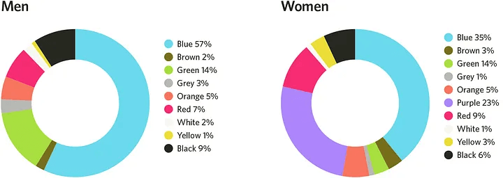 Differences between color preferences based on gender. Source:
Medium
Differences between color preferences based on gender. Source:
MediumCultural and religious differences
It is good practice to not only think of gender and age but to also account for differences in cultures or religious backgrounds. In the West, one might associate the colour green with greed, while someone from the Middle East is more likely to think of strength or hope. An American might feel joy and happiness when seeing yellow and someone from Japan may think of masculinity. Depending on where we are trying to market our product or brand, these are also important things that we should not forget about. It is crucial to do thorough research and take into account the cultural and religious backgrounds of our target audience when choosing a colour palette for our brand or product. By understanding how various cultures interpret the same colours differently, we can ensure that your branding and marketing efforts resonate with our audience and avoid any unintended negative outcome.
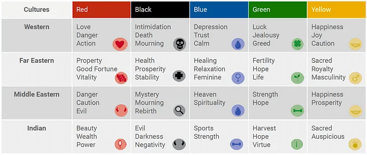 Differences between color perception based on cultural background. Source: Medium
Colour harmonies
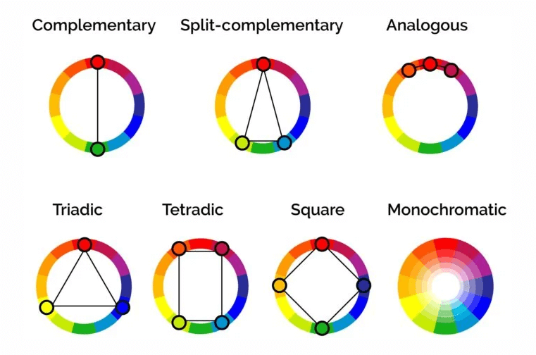
Colour harmonies refer to the way colours are used together and in combination with each other. There are several types of colour harmonies, including:
- Analogous: Colours that are next to each other on the colour wheel, such as red, orange, and yellow. Analogous colours create a sense of harmony. They can be used to create a cohesive and balanced design.
- Complementary: Colours that are opposite each other on the colour wheel, such as red and green or blue and orange. Complementary colours create a sense of contrast and can be used to create a dynamic, eye-catching design.
- Triadic: Three colours that are equally spaced apart on the colour wheel, such as red, yellow, and blue. Triadic colours create a sense of balance and can be used to create a bold and vibrant design.
There are also other types of colour harmonies, such as split-complementary, tetradic, square, and monochromatic. Similarly, these use different combinations of colours to create different effects. Overall, colour harmonies provide a useful framework for creating effective designs and can be used to create a sense of balance, contrast, or vibrancy, depending on the desired effect.
 Color harmonies. Source:
Colors Explained
Color harmonies. Source:
Colors Explained60-30-10 rule
The 60-30-10 rule in colour theory is a guideline to creating a balanced and visually appealing colour scheme. The rule states that a colour scheme should consist of 60% primary colour, 30% secondary colour, and 10% accent colour. The primary colour is the main colour used in the design; the secondary colour is used to complement and balance the primary. The accent colour is used to create contrast and draw attention to specific elements in the design. By following this rule, you can create a cohesive and balanced colour scheme that is visually appealing and easy to navigate for the viewer.
Going unconventional
While understanding colour theory and the meanings behind different colours can be helpful in creating effective branding and marketing, there are also times when it can be beneficial to go against convention and break the rules. For example, using unexpected or unconventional colours can help a brand or product stand out in a crowded market and create a memorable impression. This can be particularly effective when targeting a younger audience that may be more receptive to non-traditional branding. It’s important to note, however, that breaking the rules can also be risky and may not always be successful. Before steering away from conventional colour palettes, we need to carefully consider our audience and the message we want to convey, as well as the potential risks and benefits of using unconventional colours.
The right colours for your brand
All successful brands use colours consciously in marketing. They understand the power of colour in creating a lasting impression and shaping consumer perception. Whether it's the iconic red and white of Coca-Cola or the bold yellow of McDonald's, colours play a key role in creating a memorable and recognisable brand identity. By using colour deliberately, brands can evoke emotions, convey messages, and create a sense of consistency across their products, be they physical or digital. For example, a luxury brand may use a muted and sophisticated colour palette to convey elegance and exclusivity, while a youth-oriented brand may use bright and bold colours to convey energy and excitement.
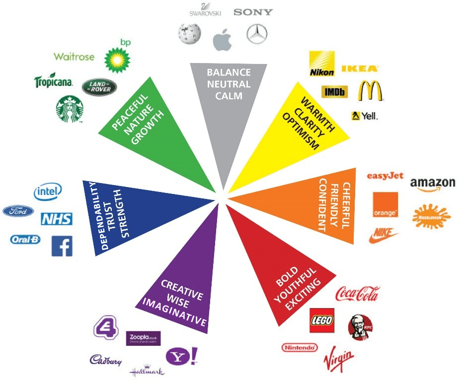 Large brands use color consciously for effective marketing. Source: Medium
Colour psychology in UX design
Everything discussed so far is crucial to consider when it comes to UX design to ensure we achieve our desired outcome. But there are also some additional aspects where colours can be an important tool. In UX design, colour psychology helps us inform usability and navigation cues. For example, colour can be used to guide users towards specific actions, like making a purchase or filling out a form. Consider the use of contrast for making primary call-to-action (CTA) buttons stand out, ensuring they attract user attention and promote desired actions.
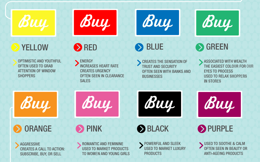 Color meanings when it comes to Call to Action buttons. Source: ConvertKit
Colour is also a powerful tool for defining an information hierarchy. By assigning specific colours to specific types of information, we can guide users through the information flow more seamlessly. This concept is particularly useful in complex interfaces where information needs to be sorted and categorised in an intuitive way. Colour psychology also helps create more inclusive designs. The use of certain colour combinations, respecting contrast ratios, greatly improves readability for visually impaired users, thereby making the design more accessible. We should ensure that the chosen colour palette is legible and aesthetically pleasing to all users,regardless of their visual ability.
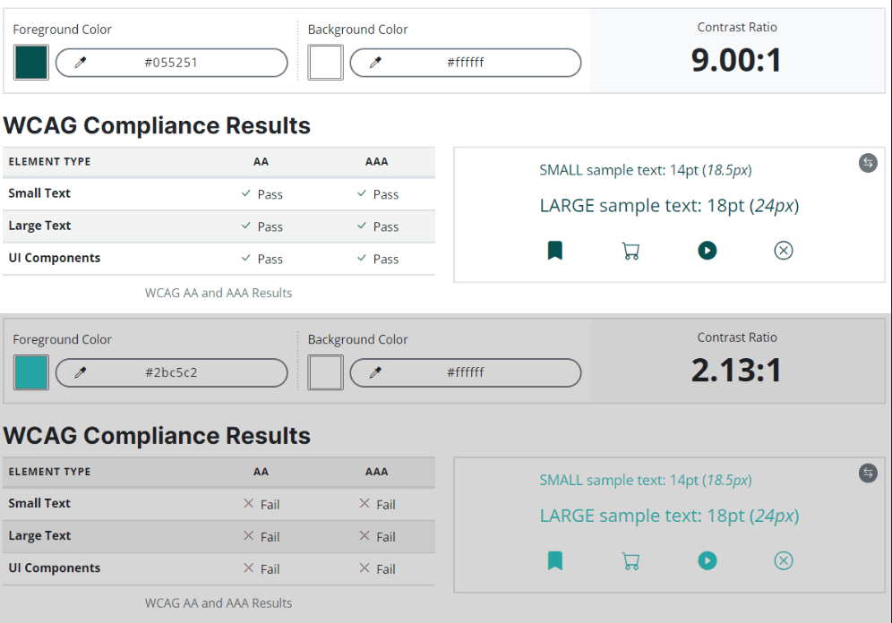 Checking contrast ratio to match the Web Content Accessibility Guidelines.
Source: Accessible Web
Checking contrast ratio to match the Web Content Accessibility Guidelines.
Source: Accessible WebColour psychology in UI design
Colour psychology plays a significant role in visual consistency and branding in UI design. Ensuring a consistent colour scheme across various screens contributes to a coherent look and feel that can improve user recognition and engagement. A consistent colour scheme that aligns with the brand's identityhelps familiarity and reinforces brand recall.
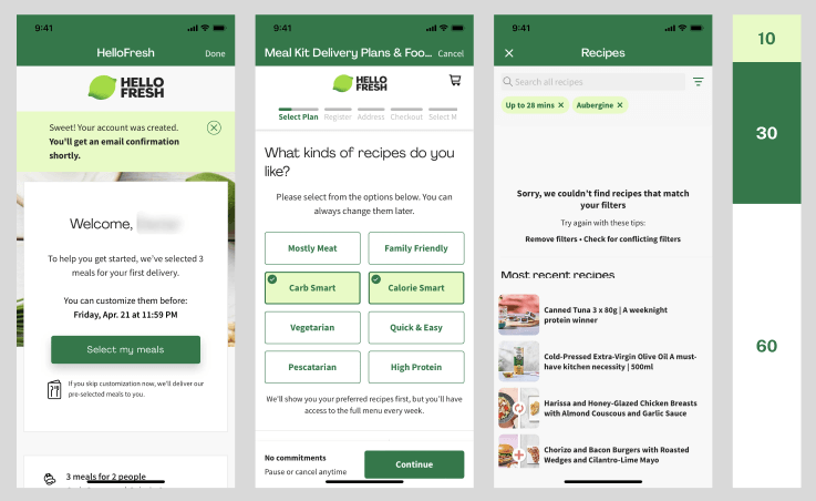 The 60-30-10 rule is present in the Hello Fresh iOS UI. Source: Mobbin (Hello Fresh)
Moreover, we can utilize colour to indicate the functionality of UI elements. For instance, certain colour codes are universally recognised, such as green for success messages and red for error alerts, and can improve the immediate understandability of the interface.
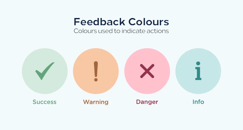 Feedback colours and their meanings. Source: Digital Synopsis
Additionally, colour psychology aids in crafting the aesthetics of micro-interactions. These small functional movements, such as a button changing colour when clicked, can provide valuable feedback to users. The proper use of colour in these instances not only makes the interface more dynamic and engaging, but also assists users in understanding their interactions with the UI.
Conclusion
This might sound like a lot to take into consideration and make trying to implement colours consciously seem like a feeble endeavour. But while it may seem complex at first, it is much simpler when put into practice. If we flip the script, every little nuance is another thing we can use to our advantage and another push in the right direction towards successful marketing. From the colour of a logo to the design of a website or the colours in the user interface of a mobile app, every aspect of a brand's visual identity should be carefully considered and refined to create a cohesive and compelling message. In short, if we want to achieve success in branding and marketing, it's crucial touse colour consciously and strategically.
By taking the time to understand the power of colour and its impact on consumer perception, we can create designs that stand the test of time and resonate with our target audience.
About the authors
David has a diverse background in numerous creative fields and development, bringing a unique perspective to UX design. Committed to keeping up with the latest trends and with the aim of always learning something new, he is continuously broadening his vision to new ideas.
Related posts
The Austrian Fintech scene - Greener grass?
From my earliest days of living in Hungary I was conscious that Austria played a big part in the history of my adoptive homeland. Austria was partner in a once-great empire, and a byword for high cult...
The Romanian Fintech scene - Trusting your feet
What is a bank for? Why are there bankers? Where is this coming from?I am plunged straight into philosophy by the Co-Founder and CEO of Finqware, one of Romanian Fintech’s brightest offerings. Perhaps...
Europe’s most popular digital banks - what should we know about them?
Online banking services are satisfying more and more needs and are becoming more and more widespread; many are choosing the comfortable solution of using their smartphone as a bank, among others.Many ...
Related case studies
Percapita
We designed a full-fledged application for simplifying everyday finances.
K&H Bank's Corporate Netbank
The K&H Electra Netbank App consolidates all financial needs into a single, user-friendly application. With its intuitive design, businesses can effortlessly manage their company's cash flow, transactions, and investments from one centralized hub.
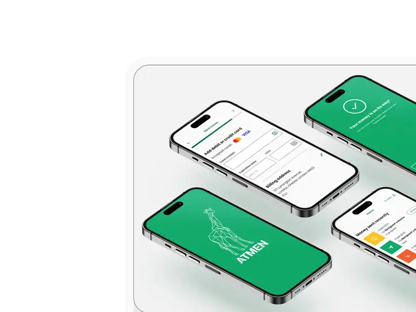
Atmen Fintech
Mobile App
Designing a Minimum Viable Product for a Diaspora Neobank Startup
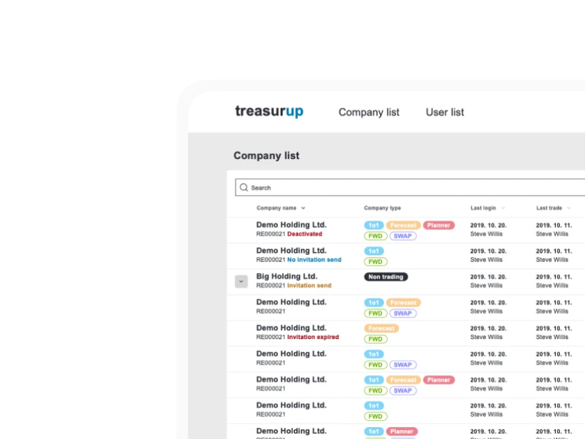
Treasureup
We established written and visual consistencies and guidelines for TreasurUp’s financial platform.
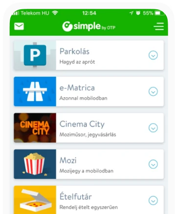
Simple by OTP
Simple by OTP Bank is Hungary's No.1 mobile payment app for cashless payments with 1M+ downloads, and 1 million+ transactions.
White Label Banking App
We provide full-blown next-generation mobile banking solutions for sales-oriented banks.
Want to read more
about UX, fintech and banking?
Subscribe to our biweekly newsletter and get the latest of our news and thoughts!