The best examples how to use microinteractions to enhance your ux design
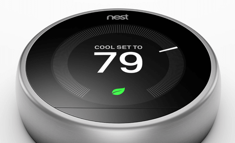 Nest thermostat
https://youtu.be/SNW9OIM05QMMedium - Expanding and collapsing imagesA much appreciated feature of the Apple Watch is the Find My iPhone feature.If your phone is nearby, you can make it ping. The sound your Apple Watch inducing your phone to produce is quite loud, so you’ll definitely hear it.
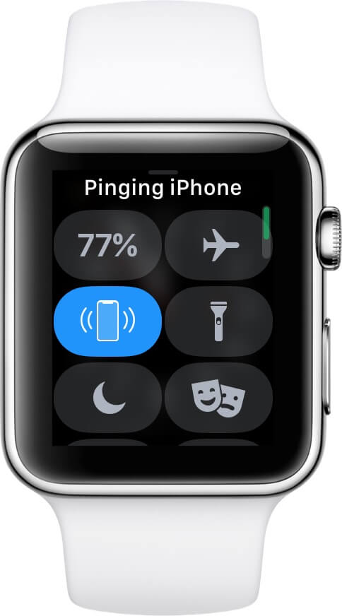 You can find your iPhone by playing a sound on it with your Apple Watch
https://youtu.be/r7XROr8M7ykDouban App - loading animationIn the process of password creation there is acontradiction between security and user experience interest.From a UX perspective, the main goal is tomake the process as straightforward as possiblebut from asecurity aspectthestrength of the actual passwordis the most important thing.If we take a closer look, these two are not really against one another, you just have to find a way to align the two. In the the picture below we see such a solution.As you’re typingin your new passwordyou’ll get instant feedback about the strength of your passwordand what kind of character still needs to be added. This instant feedback, saves you from experiencing rage when even after the third time you’re typing a new extra-difficult password, it’s still insufficient for the site’s requirements.
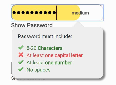 Instant feedback on password strength.
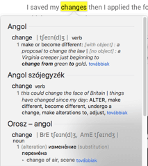 Macintosh built-in dictionary triggered by highlighting and right-clicking on a word.
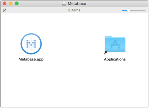 Mac’s application installation made easy.
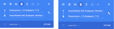 Google Maps - changing directions made easy
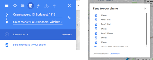 Sending directions to your phone quickly without re-typing the addresses all over again
https://youtu.be/DYqI0nJ39EwiPhone - cursor relocationOnDribbble, in the default mode, you’ll be presented with the visual design and by hovering over the picture, you’ll see the short description of that particular design. This makes easier for us to have an overview quickly, even without clicking on anything.Main aspects of a good microinteraction
- Single task completion -It focuses on a single task and designed to complete only that
- Make it functional -Microinteractions should be invisible which means they must not be kitschy but purely functional. Not more and not less that is necessary
- Think ahead- They should expect the mistakes people may make and act to either prevent them or make them reversible. Make your design forgiving
- Use it wisely -Don’t overpopulate your product with microinteractions, only use them if they can really make a difference
About the authors
undefined
Related posts
Spanish Fintech - A bridge to bigger goals
Look, I know it’s not a good thing to resort to easy stereotypes when speaking of different nationalities. Generally I would steer very well clear of, ‘All Swedes are…’ or, ‘Greeks are usually disting...
Searching for Austrian financial UX agencies - Mission implausible?
‘Your mission, should you choose to accept it’ was the challenge given to operatives in the original TV series of Mission Impossible. Now, in the Tom Cruise role (I wish!) I'm being asked to fulfil th...
Atomic design methodology in UX - 7 things you need to know
UX and UI designers apply the atomic design methodology to make consistent design changes faster and easier. But sometimes we tend to use things because of their popularity and not b...
Related case studies
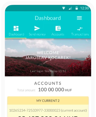
K&H Bank's Corporate Netbank
The K&H Electra Netbank App consolidates all financial needs into a single, user-friendly application. With its intuitive design, businesses can effortlessly manage their company's cash flow, transactions, and investments from one centralized hub.
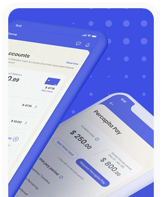
Percapita
We designed a full-fledged application for simplifying everyday finances.
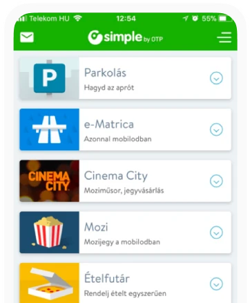
Simple by OTP
Simple by OTP Bank is Hungary's No.1 mobile payment app for cashless payments with 1M+ downloads, and 1 million+ transactions.
White Label Banking App
We provide full-blown next-generation mobile banking solutions for sales-oriented banks.
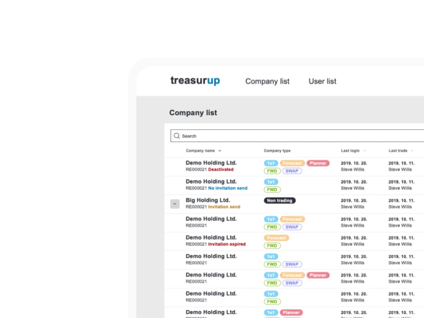
Treasureup
We established written and visual consistencies and guidelines for TreasurUp’s financial platform.
Want to read more
about UX, fintech and banking?
Subscribe to our biweekly newsletter and get the latest of our news and thoughts!