
MEMOQ Website Setup
Bullet proof navigation with modern and easy to use design.
The Case
We designed the information architecture and the visuals for the second most popular translation software to engage successfully four fundamentally different customer segments. We shaped the information architecture with four round of cards sorting excersises and we created the fresh and appealing design based on careful wireframing exercise.
MemoQ is Kilgray Ltd’s translation support software, which is the second market leading software of its kind on the global market. It is a multi-faceted product. It serves well the needs of individual translators as well as those of large companies. Different types of clients are interested in different functions though. For this reason it was challenging to structure the content of the memoq.com website in a way that everyone can find with ease the information that is relevant for them.
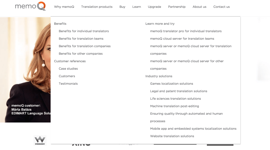
 Opening page targeting four segments
To organize content in a user-centered way we used the card sorting application on optimalworkshop.com, which enables users to group and name content of the site online. Based on more than 100 users’ feedback we reorganised content significantly so that information can be found quickly. We created a much more clear-cut new system, which better reflected the users’ concepts. We discussed the result with a focus group of 15 people, which helped us further clarify labels and relocate some content to a more appropriate place on the site.
Once our standpoint about the reorganised content had solidified, we contacted again the 100 participants from the earlier phase and we asked them to name the new content groups again. This showed us how precise our concept was. After the third round of research there was enough feedback for us to distill the ideal grouping and labeling of content for the four most important user segments (individual translators, groups of translators, translator agencies and translation departments of corporations).
 Redesigned structure to serve all of the segments
The final version was tested again with the treejack tool of optimalworkshop.com. We asked 50 users to find content according to our instructions in the soon-to-be-renewed website. For example, the instruction was: “You are an individual translator and you want to figure out what kind of advantages memoQ provides.” and the user was supposed to find the page presenting the advantages of the product for an individual translator. The test results pointed out the labels that were not understandable enough for users(due to the well-planned and thorough iterations there were not that many) and we improved them with the close cooperation of the memoQ staff.
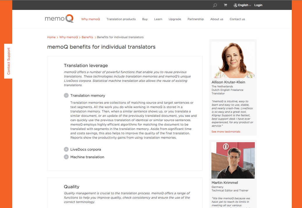 Benefits for individual translators
The question may arise: why were 4 phases needed to create the navigation structure. Wasn’t it a waste of time? Looking at memoq.com’s structure the answer is “no”. Even though our first approaches were already much better than the original structure, it was necessary to have four iterations to create such a structure from often highly variable grouping options and labels that is easily navigable for people with different ways of thinking.
Once the navigation was tailored to the needs of the most important user groups, we set off drawing the wireframes of the most important pages. While the pages of key importance were designed by Ergomania, the ones that are less prominent were designed by the members of the developer team with our continuous support.
Comapring memoq to other productsAfter the wireframes, Ergománia’s designer made the design for all the individual pages. Even though memoQ had already had visual guidelines, we renewed it significantly, so that the up-to-date design would meet the highest expectations. In this phase we encountered several exciting design challenges. One of them was drawing the icons helping the orientation of the 4 different segments on the opening page, because only small details could reflect the different characteristics of the 4 different groups. Therefore we differentiated the translator companies from groups of translators with the tie sign, whereas companies using translations but not specialised on translation were distinguished with signs from other professions such as a hardhat, headset or medical cross.
Icons for different segmentsWant to read more
about UX, fintech and banking?
Subscribe to our biweekly newsletter and get the latest of our news and thoughts!