Simple by OTP
Step by step creation of the first Hungarian fintech UX prize winning application.
The Case
Jesus Christ, we won! :) We were requested to redesign the Simple application in spring of 2016 after having won a tender up against Hungary's two leading mobile UX agencies. Redesigning an application that already boasted an extensive user base for three platforms was a great challenge. Moreover, we were familiar with the application’s useful but heterogeneous content and functionalities, which essentially made it a digital marketplace.
Research Phase: Flexible Dashboard Display for Expandability
We first began with the mandatory critical steps. After researching best practices (we are thoroughly familiar with the available solutions thanks to our fintech specialization), we surveyed the new expectations and the ones which differed from current needs with a 12-person series of interviews. During the interviews, Simple staff members took part as observers to allow them to adopt and accept our approach and proposed solutions.
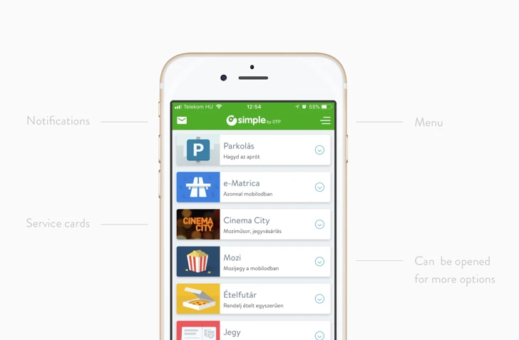
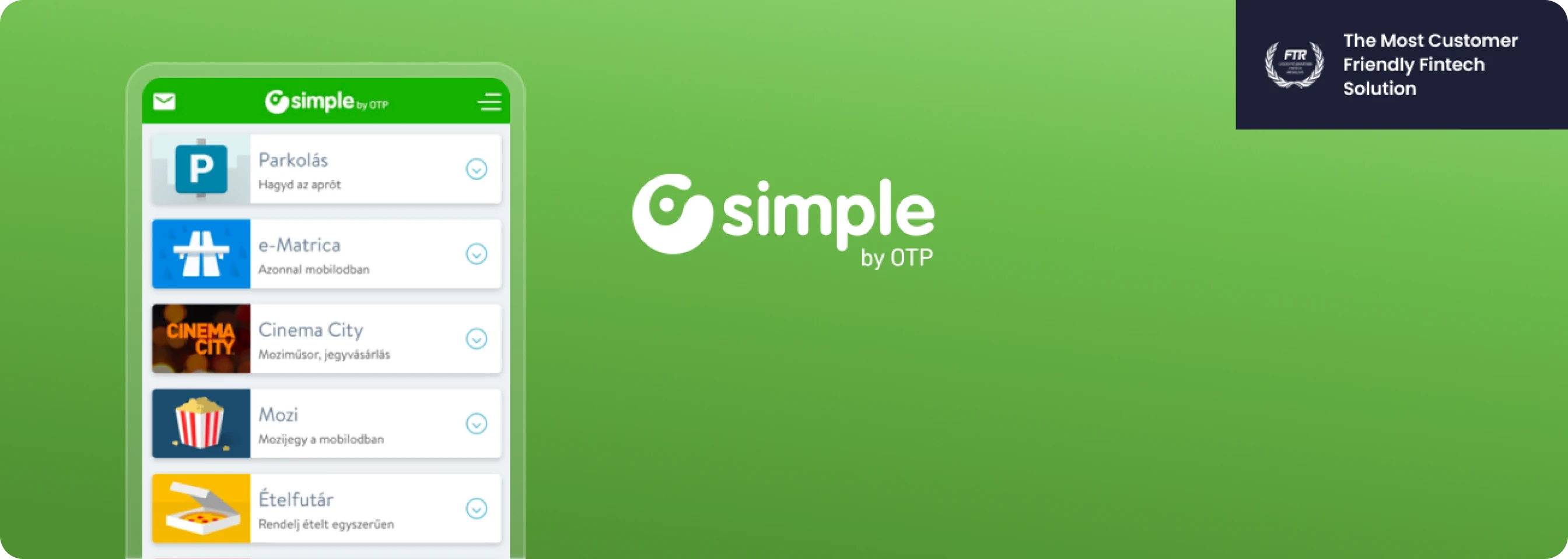
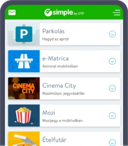
OTP Simple
After this research, we designed the dashboard screen providing the framework for the new application. We definitely saw that the earlier tile solutions reminiscent of Windows 8 are now fully obsolete and needed to be replaced, but the future trend was still unclear.
Contactless Payment
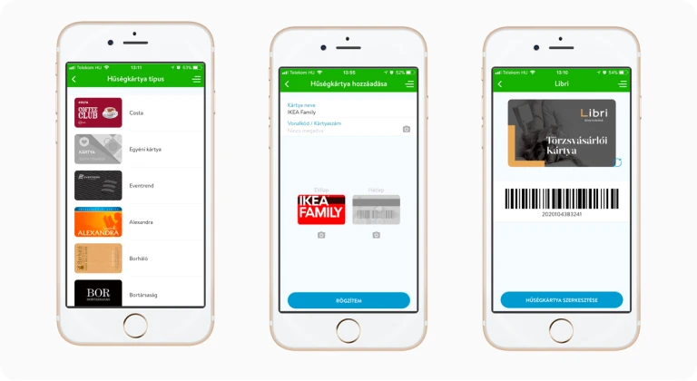
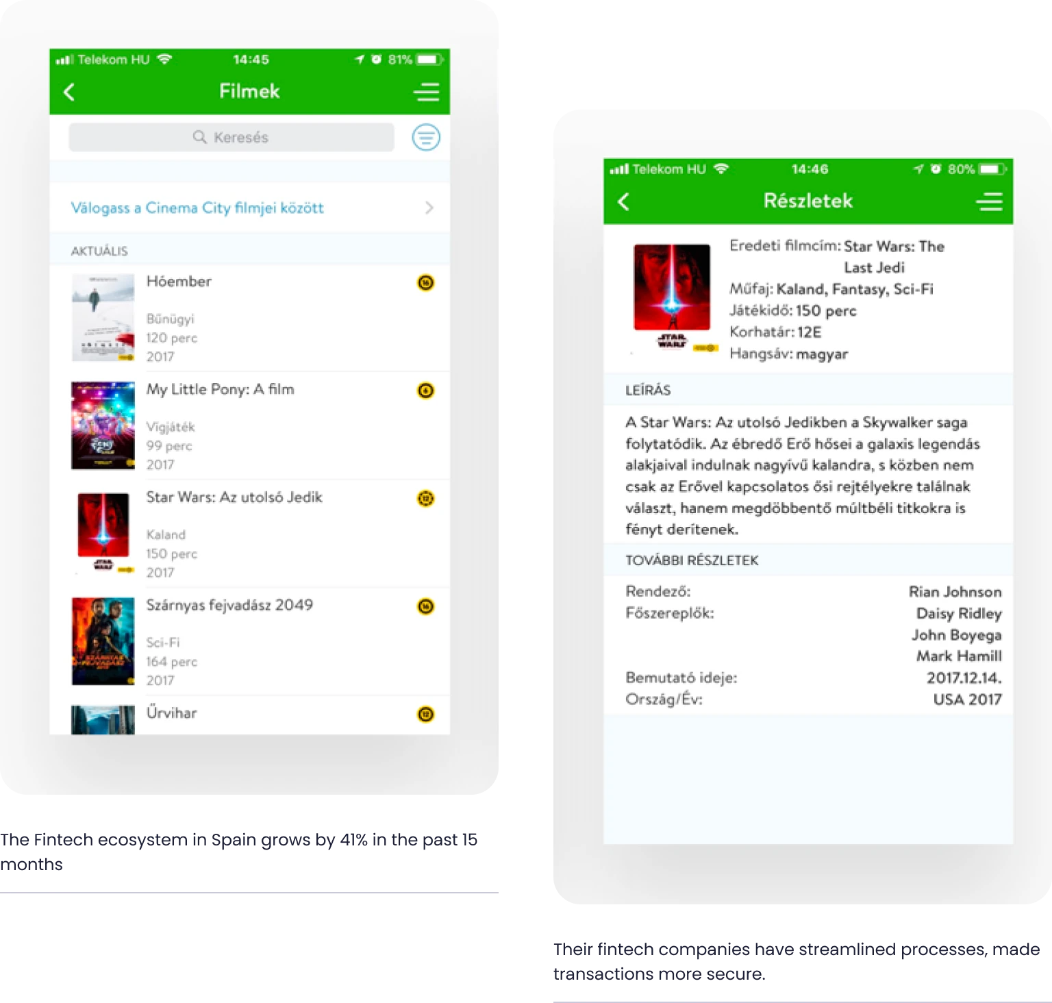
NFC capability, card digitalization: We also reformed the process of adding a bankcard alongside designing the dashboard. The greatest challenge here was card digitalization based on NFC capacity and getting the message out this feature was also available for non-OTP customers. During this stage, we created numerous in-depth flowcharts showing the different status.
The greatest challenge in designing the card registration process was not UX design, but to harmonize many different financial interests. Besides finding the common denominator, our aim was to design the processes to the last detail and to communicate in a sophisticated manner, as we had to communicate several things to our financial users that they had never heard of before.
The process
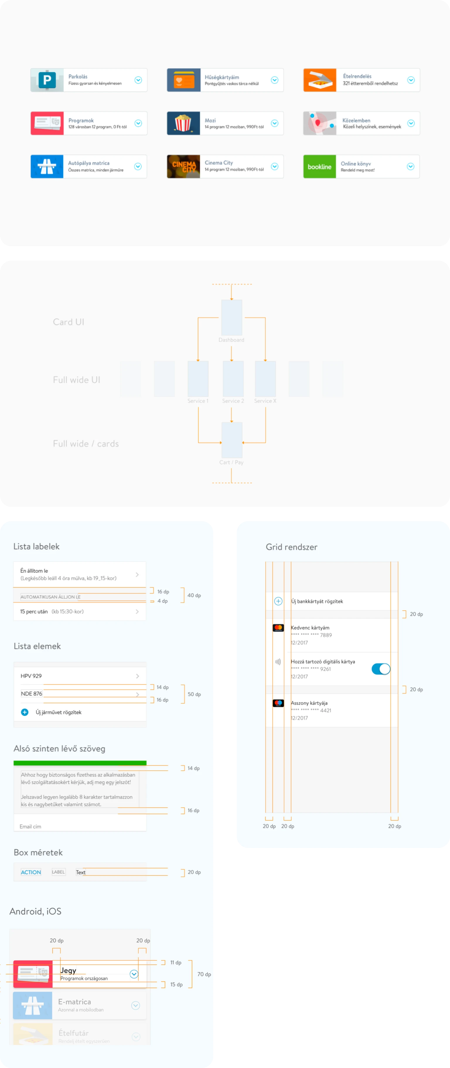
Creating a distinguishing but universally applicable brand identity design. Simultaneously with creating the framework, we started designing a new brand image and designing the various processes (parking, ordering food, etc.). Here, we had to make sure that our processes could be applied to services that were largely unfamiliar to us at the time (such as the Bookline integration).
Multiple rounds of iteration, testing, testing, testing. The wireframes, interaction elements and visual design and the different processes underwent numerous iterations (for instance seventen rounds for parking) until we reached the optimum within the triangle of technical possibilities, business needs and user expectations. We identified the most critical processes based on user statistics and spent months devising solutions for them.
Both developers and designers took part in fine-tuning the UX processes to ensure smooth subsequent implementation. Once our processes and visual concept were outlined, we tested the application once again with 12 users for Android and iOS platforms.
"Spanish fintech is not just disrupting the financial industry, it's reshaping it with passion, innovation and determination"
- Sándor Csányi, CEO of OTP Bank
UX-UI Quality Control During Development.
We updated our designs based on the tests, created the assets and delivered the final design created in Sketch to the developers by uploading it to Zeplin. We provided active support for implementation during development to make sure that the final product met user expectations. The application was completed just a few months after receiving the plans and was released to users in May 2017.
UI Design - A new look and feel
The final visual appearance emerged after much testing and numerous iterations. The new UI interface took over 150 hours to create. Myriad unique graphic solutions were also incorporated along with the system-specific solutions (iOS, Android). One is the dashboard screen that emerged after trying 30+ UI variations providing the right solution for both the business and the user side.
We also created an application styleguide that defines the UI foundations and its architectural structure; screen designs for new functions can be easily created based on the styleguide. The new Simple brand identity design features a new font and hundreds of unique illustrations and icons. During the project development phase, our graphic designers actively supported Simple’s in-house development team to create a live application aligned with the designs.
Key focus points for the UI Design
Usability & accessibility first
Use system specific solutions
Use animations as storytelling
Result: Hungary’s Leading Financial Application
After it was launched, the application further reinforced its position and has now become an integral part of day-to-day digital life in Hungary. It boasts over 370,000 users, has been used to complete over.
1 million transactions and has digitalized 35,000 cards. Our near-perfect user ratings are our greatest joy: our rating is 4.8 for iOS and 4.5 for Android.
Impact in numbers
1 million
Transactions
35,000
Cards have been digitalized
4.8
Rating on iOS
Want to read more
about UX, fintech and banking?
Subscribe to our biweekly newsletter and get the latest of our news and thoughts!