
OTP Styleguide
When creating the OTP UI style, our aim was to create a design that is fresh, yet does not slavishly follow the most recent trends, one that can be used for at least 5–6 years without becoming outdated.
The Case
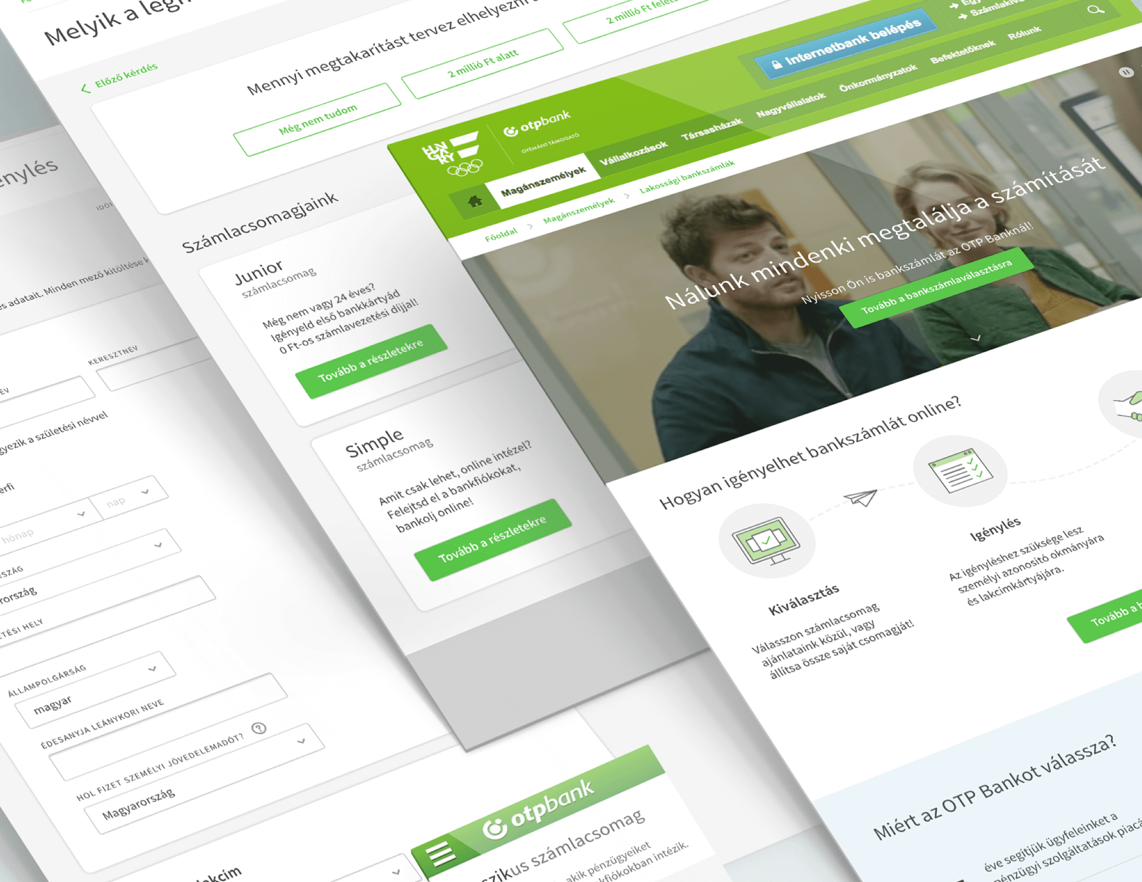
We’ve crafted the online style guide of the largest commercial bank in Hungary with, for products which are used by hundreds of thousands uses daily. Let us share this experience with you.
We were requested to work on the online visual identity of OTP Bank in mid-2015, our team was working with the product design team and development onsite in order to be aligned in every step. Our assignment consisted on on 3 main projects:
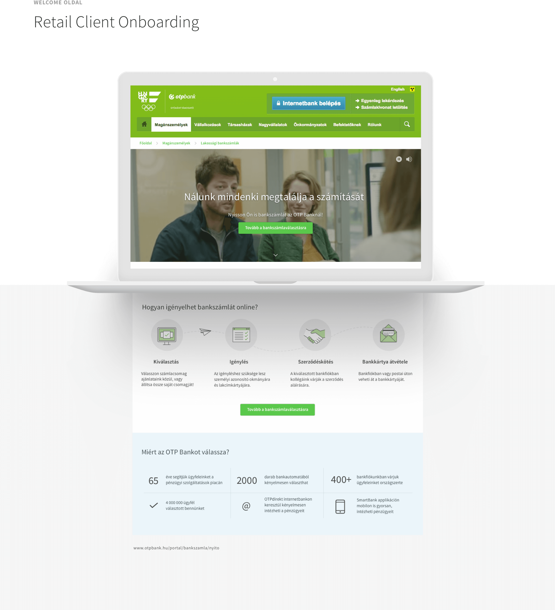
- Corporate account opening
- Personal loans for retail clients
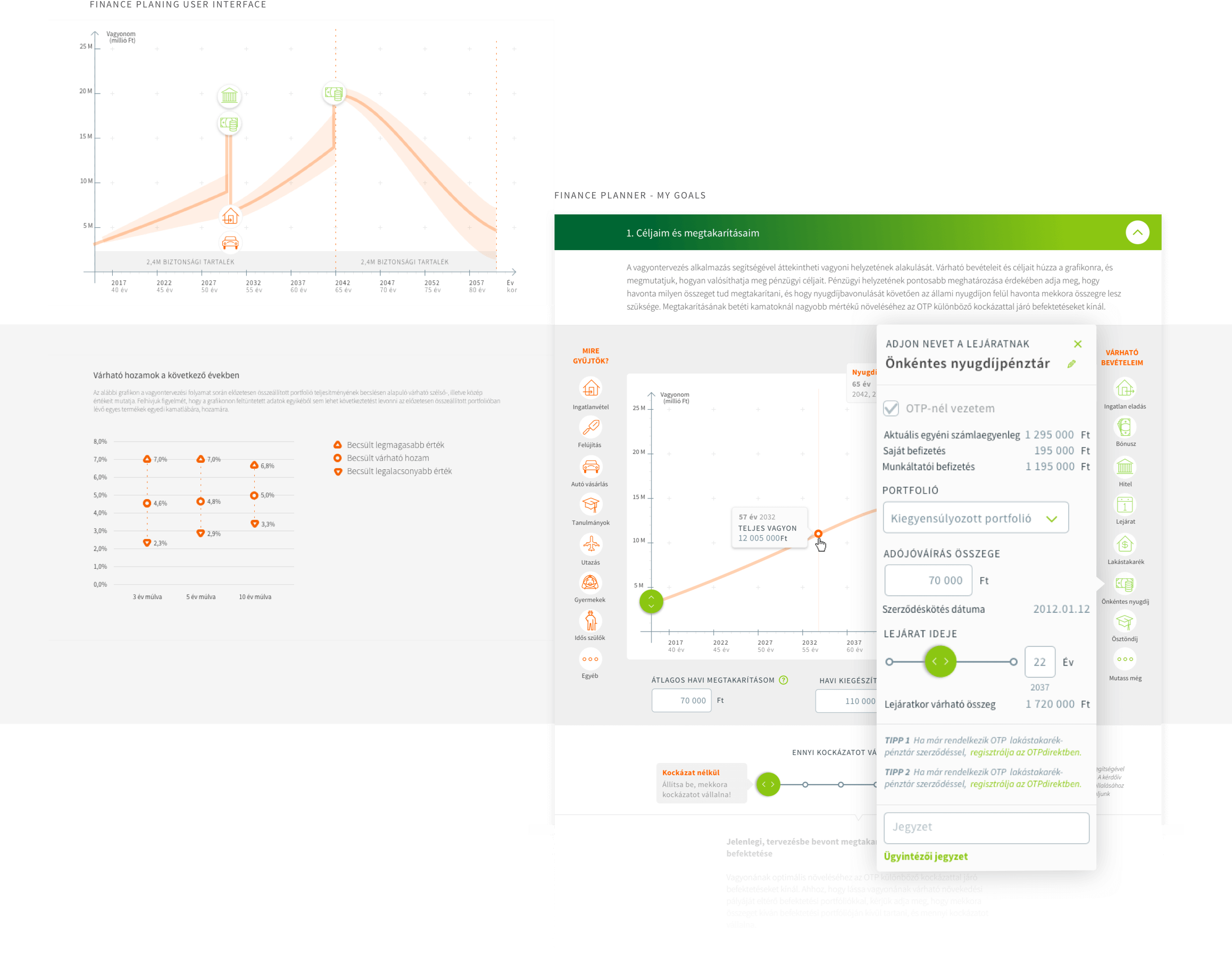
- Financial planner
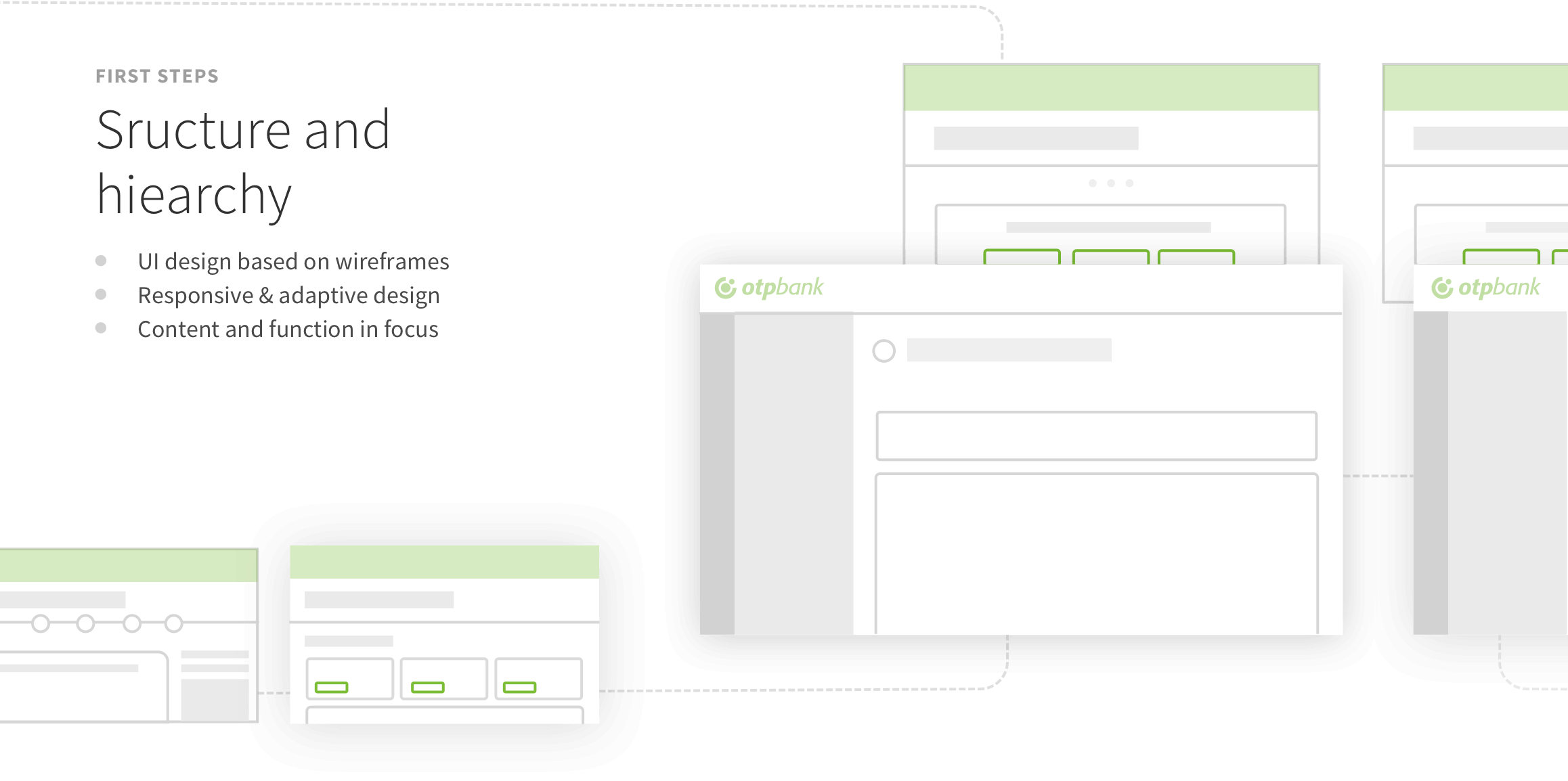
The challenge prompted the creation of a UI style guide. We sat down together and evaluated the existing UI interfaces, and based on that we defined the parameters of the direction to follow:
- 1 of the 3 completed UIs, it was Corporate account opening that was the farthest from the approved direction, and as a result, almost all of its elements were discarded.
- The final direction is a mixture of the wealth planner and the retail personal loan interfaces, where the elements of the wealth planning interface are dominant.
Besides discussions with the bank, we also worked together on several issues with Café Communications, the corporate identity design agency of OTP Bank while creating the guide. Typical areas of cooperation:
- Typography: standardizing offline and online interfaces,
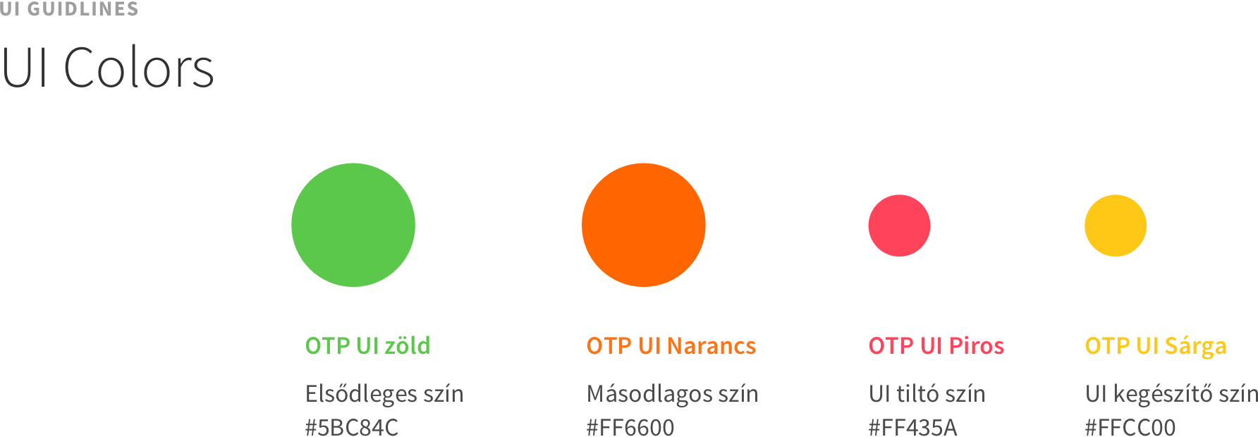
- Colours: defining the RGB code of the OTP UI green,
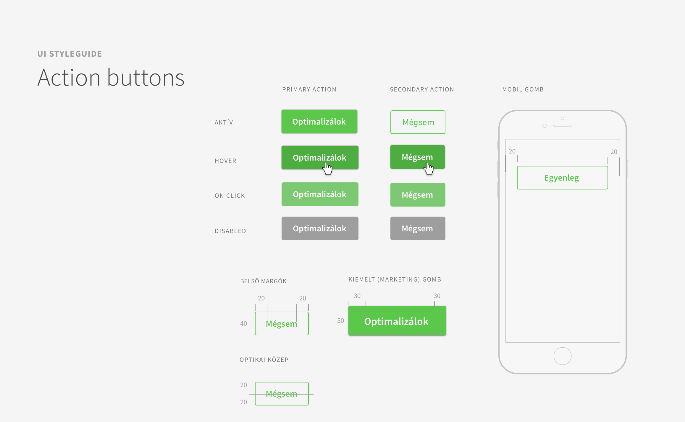
- CTA buttons: for a unified UI, the buttons on the banners need to match the look of the sites.
Want to read more
about UX, fintech and banking?
Subscribe to our biweekly newsletter and get the latest of our news and thoughts!