Big data visualisation
Rung András’s presentation at Data-driven Leadership Bootcamp.
Find below the excerpt of the presentation.
You can download the presentation here
DEFINE YOUR AUDIENCE
- What do colours mean?
- Which direction the reader used to reading?
- Which icons is the user familiar with?
- Readers are inside or outside industry?
CONTEXT OF USE
- What information do readers need in order to be successful?
- How much detail do they need?
- How long does she have to make it effective?
- Service design, holistic approach
UNDERSTANDING THE DATA STRUCTURE
- Is it a time-series? A hierarchy?
- How many dimensions does it have?
- Which are the most important ones?
- What sort of relationships do they have (e.g., one-to-one or many-to-many)?
- How variable are they?
- Are the values categorical? Discrete or continuous? Linear or non-linear? How are they bounded?
- How many categories are there?
DATA TYPES
- Nominal
- Categorial
- Ordinal
- Interval
- Temporal
- Geographical
- Relational
DEFINE BETTER GO ALS
- Show the sales figures / Show which product lines are performing the best and the worst in each region, for each of the last five quarters
- Compare the demographics of Twitter and Facebook users / Compare the ages, education, and income levels of Twitter and Facebook users
- Show a timeline of the performance of every NFL team for the 2011 season / Allow users to compare individual performance metrics for any pair of teams or for the entire league for the 2011 season
REPRESENATION AND REALITY
- Inherent properties
- Learned conventions
WHAT IS A DASHBOARD?
- Visual display of data
- Monitor conditions
- Facilitate understanding
PSYCHOLOGICAL MOTIVATION
- Desire to control
- Short term memory / single screen
- Option to drill down
- Splitting info between tabs
About the authors
A real veteran of UX by having 18 years of experience. Strong focus on business needs and innovation. András Rung has worked for various institutions and companies since 2002. He is the co-author of the first Hungarian usability book and author of the usability blog Ergomania.
Related case studies
Prefixbox
Prefixbox is a Hungarian e-commerce scaleup. We helped them design an AI agent that gives more accurate product recommendations to shoppers with generative AI.

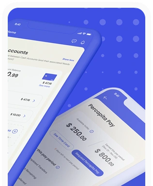
Percapita
We designed a full-fledged application for simplifying everyday finances.
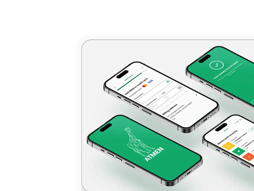
Atmen Fintech
Mobile App
Designing a Minimum Viable Product for a Diaspora Neobank Startup
Sterling Archer
By applying the DDD framework, we created multiple digital tools for a US based Data Company.

Ergomania and NGOs in the Netherlands
UX design for Fintechs, banks and financial startups is the everyday work of Digital Product Design company, Ergomania based out of Budapest, Hungary.

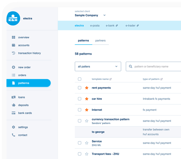
K&H Bank's Corporate Netbank
The K&H Electra Netbank App consolidates all financial needs into a single, user-friendly application. With its intuitive design, businesses can effortlessly manage their company's cash flow, transactions, and investments from one centralized hub.
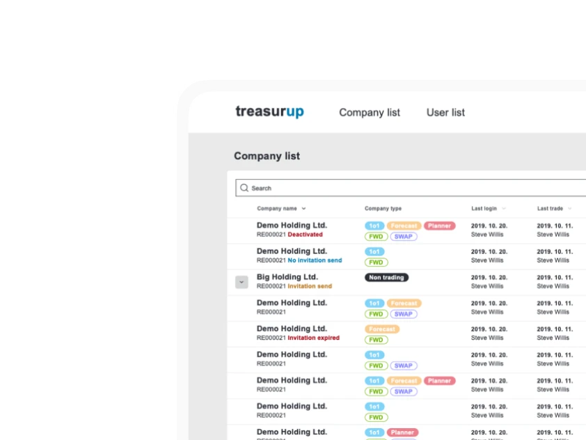
TreasurUp
We established written and visual consistencies and guidelines for TreasurUp’s financial platform.
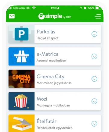
Simple by OTP
Simple by OTP Bank is Hungary's No.1 mobile payment app for cashless payments with 1M+ downloads, and 1 million+ transactions.
White Label Banking App
We provide full-blown next-generation mobile banking solutions for sales-oriented banks.
Want to read more
about UX, fintech and banking?
Subscribe to our biweekly newsletter and get the latest of our news and thoughts!