From Black Box to Glass Cockpit: How UX Can Make Financial AI Understandable
The integration of artificial intelligence (AI) into finance promises a new era of efficiency and accuracy. From algorithmic trading to fraud detection, complex models are now the driving forces behind financial decision-making. Yet, this progress has been haunted by the persistent black box problem. When an AI denies a loan or flags a transaction, how can we be sure the decision is fair and unbiased if even the experts can't fully trace its logic? This opacity represents a risk in an industry built on trust.
This challenge has given rise to explainable AI (XAI). XAI is less like a single technology and more like a design philosophy, aimed at making AI systems understandable to their users. This creates a core challenge for user experience (UX) designers and product strategists: how to design interfaces that move beyond data presentation to actually explain the reasoning behind a decision?
Why Clarity is No Longer Optional
For a long time, there was an accepted trade-off between an AI model's performance and its transparency. The most powerful black box models were often the most accurate. However, a confluence of regulatory pressure, internal risk mitigation, and growing market demand has made this trade-off obsolete. Explainability has become a strategic and legal necessity.
A primary driver is the evolving regulatory landscape. The European Union's landmark AI Act, for example, takes a risk-based approach, classifying many financial applications – such as credit scoring or insurance risk assessment – as high risk. This designation imposes a demanding set of obligations, including robust data governance, detailed technical documentation, mandatory human oversight, and a high level of transparency. The message from regulators is clear. If you can't explain your AI's decision, you can't defend it, and the penalties for non-compliance can be threatening.
 XAI serves as a bridge, demystifying the technology and creating a common language between highly technical data science teams and business stakeholders
Beyond the external pressure from regulators, there is also an internal business case for clarity. Opaque models introduce a potent new category of model risk. Without understanding a model's logic, it's impossible for internal audit teams to validate its reasoning or identify hidden biases. XAI serves as a bridge, demystifying the technology and creating a common language between highly technical data science teams and business stakeholders – risk managers, compliance officers, executives – who are ultimately accountable for the AI's outcomes. This shared understanding builds the institutional confidence required to move AI from the lab into the core of business operations.
Finally, in a crowded market, XAI emerges as a key competitive differentiator. Institutions that can provide clear reasons for their decisions build deeper trust with customers. An explanation for a rejected loan application that includes concrete steps for future success can foster loyalty in a way that a blunt, unexplained ‘no’ never could.
A Toolkit for Explanation
To open the black box, XAI offers a range of techniques, but for designers, it's most useful to think of them as tools for answering specific user questions. The two most fundamental levels of explanation are global (understanding the model's general logic) and local (understanding a single decision). Three key approaches have become industry standards for providing these explanations.
LIME and SHAP: Answering "Why This Decision?"
LIME (Local Interpretable Model-agnostic Explanations) is a fast, intuitive method for explaining a single prediction. It's like asking a doctor, "Given my symptoms today, what's the most likely reason for this specific headache?" It works by testing how small changes to the input affect the output, making it ideal for real-time operational dashboards where an analyst needs a quick, at-a-glance reason for an alert.
SHAP (SHapley Additive exPlanations) is a more robust, game-theory-based approach that is often considered the gold standard. To continue the analogy, SHAP is the full medical report. It not only explains today's headache (a local explanation) but also provides a complete breakdown of all the factors contributing to your overall health (a global explanation). Its greatest advantage is this versatility, making it perfect for performing a deep analysis, conducting fairness audits, and fulfilling regulatory reporting requirements where consistency and thoroughness are paramount.
Counterfactuals: Answering "What Would Need to Change?"
Perhaps the most user-centric approach, a counterfactual explanation shifts the focus from diagnosis to prescription by answering what would need to change for the decision to be different. For a customer, this is incredibly powerful. It changes the dynamic from a passive rejection to an empowered plan of action: "Your loan application would have been approved if your annual income had been $5,000 higher." This provides a sense of agency and fosters fairness, directly addressing the "right to explanation" required by many regulations.
Designing for Understanding
Knowing the techniques is one thing; presenting them effectively is another. Simply plastering a SHAP chart onto a dashboard will likely confuse users. The real task is designing the explainable user interface (XUI) – the layer that translates complex math into human insight.
 Interactive elements like sliders or what-if modules that allow a user to tweak inputs
- Principle 1: Treat the explanation as a dialogue. A good explanation should function less like a one-way data dump and more like an interactive conversation. The best XUIs allow users to probe the model, ask follow-up questions, or otherwise explore its reasoning. This can be achieved through interactive elements like sliders or what-if modules that allow a user to tweak inputs and see how the AI's recommendation changes in real time, giving a much deeper understanding than a static report ever could.
- Principle 2: Tailor explanations to personas. An explanation is only useful if it's meaningful to its audience. A one-size-fits-all approach will almost certainly fail. For example, a fraud analyst needs speed and efficiency to sift through hundreds of daily alerts where false positives are costly. Their dashboard should feature concise explanations ("Flagged due to high amount, new location"). A compliance officer needs auditability and a global view, so their dashboard must provide a summary to assess the model's overall fairness. A key feature here would be a powerful search function to retrieve any past decision and its complete explanation, providing a robust audit trail.
A portfolio manager needs to understand the drivers of portfolio risk and the rationale behind AI-generated recommendations. Their dashboard would benefit from an interactive counterfactual module, allowing them to ask, "Show me the minimal allocation change required to reduce my portfolio's risk by 5%," and receive an actionable explanation/recommendation. Finally, the customer needs simplicity and actionability. Their dashboard shouldn't show a chart at all. It should use counterfactual explanations presented in plain, empathetic language to explain a decision and provide a clear, constructive path. - Principle 3: Visualize with care. How an explanation is visualized directly impacts trust. A cluttered, confusing chart can make a user distrust a perfectly correct AI recommendation. The goal must be to provide insight that transcends the raw data. For an executive persona, for instance, presenting a dense SHAP summary plot is a design failure; it's information overload. The better XUI choice is to use AI to translate that same data into a natural language summary: "Net profit margin decreased by 2%, primarily driven by a 15% increase in customer acquisition cost in the APAC region." Always match the visualization’s complexity to the user’s expertise.
From Clicks to Conversation
The future of XUI design may not be purely visual. The most exciting innovation on the horizon is the rise of conversational AI. Imagine, instead of trying to decipher complex charts, we could simply ask a question. "Why did our projected revenue for Q3 drop by 5%?" AI Agent: "The forecast was revised down due to a projected sales decrease in the European market. Our model attributes 75% of this to recent negative macroeconomic indicators in that region."
 Instead of trying to decipher complex charts, we could simply ask a question from AI
This conversational shift is not a distant hypothetical; industry leaders are already building the prototypes of this future. Morgan Stanley, for instance, has equipped its 16,000 financial advisors with an AI assistant powered by OpenAI, designed to navigate the firm's immense library of market research and investment intelligence. Similarly, JPMorganChase is developing proprietary models to analyze financial documents and assist with investment selection, while Bloomberg has launched BloombergGPT, a large language model specifically trained on decades of financial data. These are not simple customer service bots; they are powerful analytical systems designed to provide complex answers to expert users.
While challenges like ensuring the factual accuracy and reliability of these AI agents remain, the potential is immense. This points to a hybrid future where dashboards provide at-a-glance monitoring, but the deep, explanatory questions are answered through natural language dialogue.
Building the transparent AI cockpit of the future is an interdisciplinary challenge. It requires uniting data science with human-centered UX, ensuring that as AIs become more powerful, they also become more understandable. Unlocking the full potential of AI in finance depends on the ability to build the trust and accountability that only true transparency can provide, perhaps even more than on the cleverness of our algorithms.
Learn Company Credit Risk management in simple terms, from Company Credit Report basics to Credit control, monitoring, ratings, and safer B2B customer decisions.
About the authors
Balázs has been working in content for more than 20 years, having the role as an editor at one of the first and largest news sites, later helping to establish the content marketing business for media publishers and agencies. Today, Balázs serves as content producer at Ergomania Ltd.
Related case studies
Prefixbox
Prefixbox is a Hungarian e-commerce scaleup. We helped them design an AI agent that gives more accurate product recommendations to shoppers with generative AI.

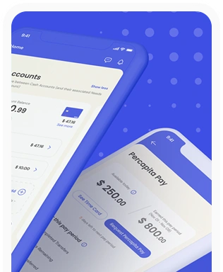
Percapita
We designed a full-fledged application for simplifying everyday finances.
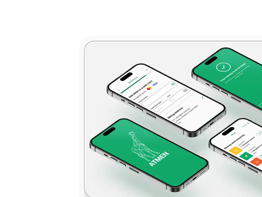
Atmen Fintech
Mobile App
Designing a Minimum Viable Product for a Diaspora Neobank Startup
Sterling Archer
By applying the DDD framework, we created multiple digital tools for a US based Data Company.

Ergomania and NGOs in the Netherlands
UX design for Fintechs, banks and financial startups is the everyday work of Digital Product Design company, Ergomania based out of Budapest, Hungary.

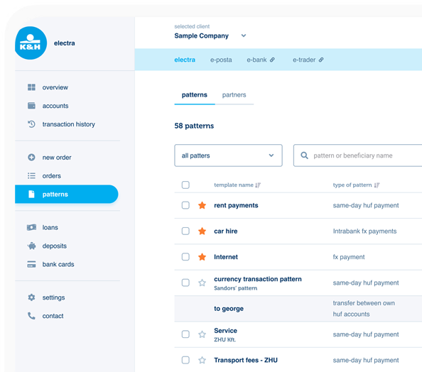
K&H Bank's Corporate Netbank
The K&H Electra Netbank App consolidates all financial needs into a single, user-friendly application. With its intuitive design, businesses can effortlessly manage their company's cash flow, transactions, and investments from one centralized hub.
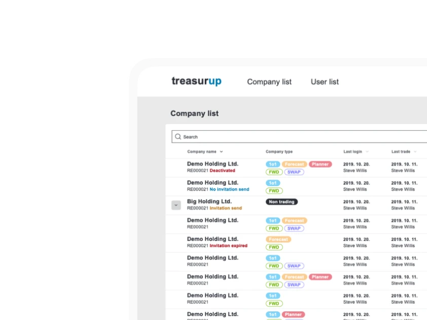
TreasurUp
We established written and visual consistencies and guidelines for TreasurUp’s financial platform.
Simple by OTP
Simple by OTP Bank is Hungary's No.1 mobile payment app for cashless payments with 1M+ downloads, and 1 million+ transactions.

White Label Banking App
We provide full-blown next-generation mobile banking solutions for sales-oriented banks.

Want to read more
about UX, fintech and banking?
Subscribe to our biweekly newsletter and get the latest of our news and thoughts!