How to Improve your UX Writing Skills?
5 tips for Designers
The importance of UX writing can be and has been expressed in many ways in the recent years. In this article, we claim that UX writing is important because it connects the visual elements of your design with the mindset and the vocabulary of the user. Also, words play a crucial role in the conversation with the user as they may express emotion and empathy, and may build trust in the user.
Writing is a skill. But if it’s a question of skill, then it also means that some people are good writers, others are not. Perhaps from some past failures, you may think you fall into the latter category. Don’t worry, we have good news for you: just like any skill, writing can be improved.
In general, if you want to be a good writer, you need a lot of practice, which basically means a lot of reading and writing. But if you want to write good interface copy as a designer, we have some special tips from our experience which you may find useful.
1. Use words as part of your UI
Words on a design are not something that can be “filled out” anytime later like an unknown variable in an equation. They are an integral part of your design, your product, your page, your application. Your design is organic; it can’t be split up to solely graphical and textual components.
In your design process, always pay attention how your work “talk” to the user. When you use words in a design, you are talking to someone, not just explaining your visuals.

2. Use realistic copy early in the design process
Be realistic. This rule applies to all types of content, including images as well as words. If you’re designing a pizza delivery webshop, and you are sending your ideas to your client, don’t use images of the Dead Star in your design, it doesn’t matter how much you like Star Wars. Similarly, it is unlikely that the customers of your webshop are called Hermione Granger or Neville Longbottom.
When you’re working on a real product, you should focus on realistic, appropriate content. Don’t use geek or funny text as in most cases they just distract your readers and cause confusion. Do not be afraid to be boring.
3. Avoid lorem ipsum
It is so tempting to ctrl-v something funny latin-like gibberish in your design instead of real copy. Sadly, it just goes to show that you are not familiar with an important part of your project, you didn’t do your homework or you are just lazy.
But most importantly, you shouldn’t use lorem ipsum because lorem ipsum confuses your audience. Users are often confused when they see lorem ipsum on a design – after all, how should they know what it means, why it is there?
Do your designer homework: replace lorem ipsum with appropriate content. In most cases, you can do this with very little effort.

4. Write like you were talking to someone
A good design is like a seamless conversation with your customer: it is easy to follow, and it answers the customer’s questions. You should guide your readers throughout their journey using a simple, plain language.
Don’t be exclusive; use words that everybody understands. Just like you would explain something to a family member or a friend.

5. You don’t always need words
Get rid of the words when you have to. Interface copy is neither a user manual nor a functional specification. It doesn’t have to be complete and comprehensive. It doesn’t have to cover and explain all the possible edge cases that the system otherwise handles. Good interface copy is never long.
Instead, think of interface copy as signposts that provide users with the least necessary information.
In some cases you don’t need words at all on your screens. For example, if users are required to submit their years of age, you don’t have to put there something like “It must be an integer between 1-99” as certainly 99,99% of your users would fall into that category. Let them write anything, and handle extreme cases with validation.
About the authors
Balázs has spent the past 15 years at various agencies and digital products as an Information Architect, UX Designer, researcher, consultant, and usability expert. He specializes in UX writing, data visualization, and hard SF. He still buys CDs and loves coloured pencils. Balázs received an MA in Sociology from ELTE and an MA in Modern History at CEU.
Related case studies
Prefixbox
Prefixbox is a Hungarian e-commerce scaleup. We helped them design an AI agent that gives more accurate product recommendations to shoppers with generative AI.

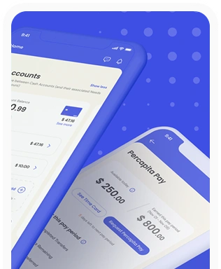
Percapita
We designed a full-fledged application for simplifying everyday finances.
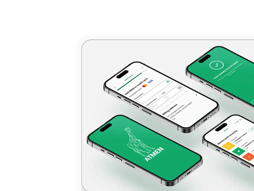
Atmen Fintech
Mobile App
Designing a Minimum Viable Product for a Diaspora Neobank Startup
Sterling Archer
By applying the DDD framework, we created multiple digital tools for a US based Data Company.

Ergomania and NGOs in the Netherlands
UX design for Fintechs, banks and financial startups is the everyday work of Digital Product Design company, Ergomania based out of Budapest, Hungary.

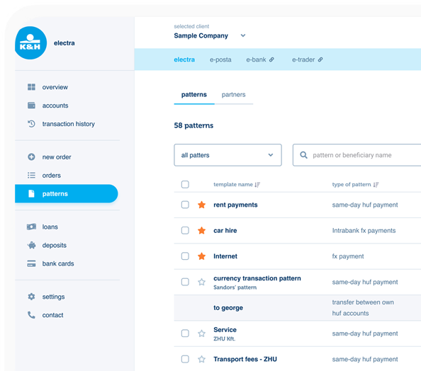
K&H Bank's Corporate Netbank
The K&H Electra Netbank App consolidates all financial needs into a single, user-friendly application. With its intuitive design, businesses can effortlessly manage their company's cash flow, transactions, and investments from one centralized hub.
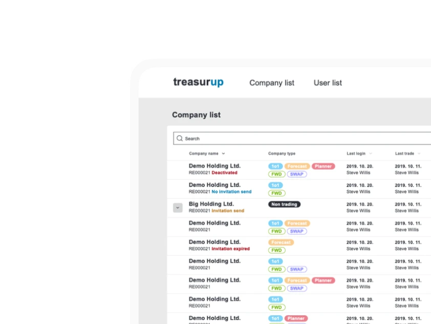
TreasurUp
We established written and visual consistencies and guidelines for TreasurUp’s financial platform.
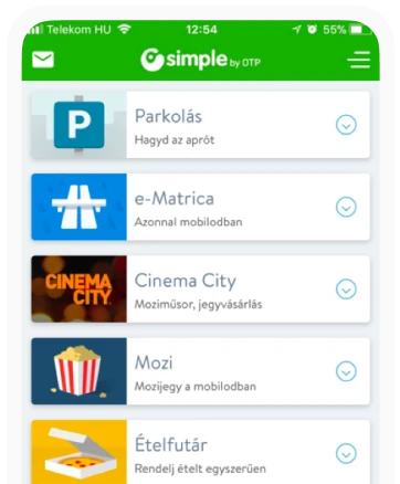
Simple by OTP
Simple by OTP Bank is Hungary's No.1 mobile payment app for cashless payments with 1M+ downloads, and 1 million+ transactions.
White Label Banking App
We provide full-blown next-generation mobile banking solutions for sales-oriented banks.
Want to read more
about UX, fintech and banking?
Subscribe to our biweekly newsletter and get the latest of our news and thoughts!