Minimalist UX Design in Fintech: The Key to Customer Satisfaction
One of the main causes of user churn is when a product requires too much effort to use – a problem that is exponentially true in the world of financial applications. In this high-stakes environment, the most effective strategy is not feature-hoarding, but the conscious application of radical simplification and minimalist design. But how does this approach become the foundation of trust and a measurable business advantage, and how will artificial intelligence (AI) reshape the future experience of finance?
We previously dealt with various factors that can lead to user churn. One we identified was when understanding and using a product requires too much effort. A poor first impression from inadequate onboarding makes the situation worse, as do small but constantly recurring frustrations. These eventually add up and lead to churn, as users look for simpler, more intuitive solutions.
Now, we’ll examine a strategy that can offer a solution to these very problems: minimalist design. Financial applications are particularly characterized by the need to convey complex information on one hand, and the potential for high user anxiety during use (if we make a mistake, the consequences are more serious than in Candy Crush) on the other. In this environment, minimalist design is not just an aesthetic issue.
 The primary goal is the reduction of cognitive load
Minimalist UX in Finance
When we talk about minimalism in the context of banking apps and fintech, it's more than the often-cited "less is more" principle. It's much more about the art of functional decluttering – the conscious (and data-backed) removal of any element that does not serve a critical user purpose at that specific moment. While in other areas minimalism might focus on visual space or aesthetics in the classic sense, here the primary goal is rather the reduction of cognitive load. A minimalist user experience (UX) breaks down complex financial processes into digestible, simple steps, preventing user overload, which can be a direct path to task abandonment and serious errors.
We can also see minimalist UX as a risk management strategy from two perspectives. At the functional level, the risk is user error. Simplified workflows reduce the probability of costly mistakes, thereby protecting both the customer and the company. At the psychological level, the risk is the loss of trust. A clean, intuitive interface can also demonstrate the company's competence, while a cluttered or confusing application subconsciously suggests a disorganized, unreliable company. The latter is not very fortunate when users are entrusting their money to a platform.
The Psychology of Trust and Simplicity
An average user experiences anxiety while using a financial application (if anxiety is too strong a word, let’s say their emotional state is one of heightened caution). They worry about the security of their data. They’re afraid of making mistakes. They can be confused by financial jargon. Minimalist UX offers a solution to this psychological barrier; simplicity here is the direct antidote to anxiety.
This can be achieved, among other things, through the use of straightforward, jargon-free language, where technical terms are replaced by simple explanations and helpful tips. Navigation must be predictable and consistent. Fee structures, transaction times, and security policies must be transparent and understandable. All of this can even transform the user's relationship with their finances: what was once a chore can become an easily accessible and even attractive activity.
Digital finance has brought many new opportunities, but too many options can easily lead to decision paralysis and digital fatigue. Minimalist UX provides an answer to this very problem. It doesn't overwhelm the user with a mass of features, but carefully selects and organizes the most important ones. Clean processes, clear calls to action (CTAs), and one-tap operations reduce unnecessary burdens and help the user make confident decisions. That's why the most successful apps are not those that can do the most, but those that most effectively simplify the financial decision itself.
The Measurable ROI of Minimalist UX
The benefits of minimalist UX are directly demonstrable in business results and return on investment (ROI). The data shows a clear cause-and-effect relationship between a simple, user-centered interface and the most important financial indicators.
- Higher conversion and adoption rates: A simple, clean user journey that makes steps like registration or the first transaction easy directly increases the rate of successful conversions. The tangible results of this are particularly demonstrable during onboarding. According to a Signicat survey of 7,600 European users, 68% of potential users abandon registration due to its complexity. Concrete examples also confirm this. After Revolut simplified one of its onboarding processes, the conversion rate increased from 15.6% to 25%. Similarly, the French company Shine, achieved an impressive 80% onboarding conversion rate with a streamlined process. And according to Forrester Research, a well-designed user journey can boost conversion by up to 200%.
- Increasing customer satisfaction and retention: A positive digital experience directly influences customer loyalty and satisfaction. According to Capgemini's 2024 World Retail Banking Report, a significant 22% segment of banking customers frequently switch providers specifically in the hope of better experiences. This is supported by an earlier analysis by McKinsey, which showed that a positive experience provided throughout the entire customer journey (not just in individual interactions) increases satisfaction the most, reducing churn by up to 20%.
The Pyramid of User Needs: Security First, Aesthetics Last
The UX of the most successful applications can be thought of as Maslow's pyramid of user needs. The three most important layers are the fundamentals, the information architecture, and the sensory layer.
At the base, we find security, clarity, and efficiency. The challenge of minimalist design is to make security measures both visible and reassuring, but without causing too much friction. The pinnacle is invisible security, where protection increases ease of use. Biometric identification (e.g., Face ID, fingerprint) is a good example of this.
 One-click transactions or sticky buttons ensure that users can achieve their goals with the fewest possible taps
Minimalist design breaks down daunting processes (e.g., applying for a loan) into logical, bite-sized steps. The use of progress bars is crucial for managing expectations and reducing uncertainty. Likewise, efficiency and speed are fundamental. Minimalist design ensures this through the easy accessibility of frequently used functions. One-click transactions or sticky buttons ensure that users can achieve their goals with the fewest possible taps.
This hierarchy fundamentally challenges the traditional design approach, which often prioritizes visual appeal. In financial services, beauty without security is worthless, and elegance without clarity is dangerous.
Information Architecture: High Density, Low Cognitive Load
The central problem in banking design lies in presenting comprehensive financial information without overwhelming the user. This requires an information architecture that ensures high information density without causing cognitive overload.
Here, the visual hierarchy primarily directs attention. Through the systematic application of size, color, contrast, and whitespace, it can be ensured that critical elements ‒ account balances, primary action buttons, urgent alerts ‒ are immediately noticeable, while secondary information remains accessible but not intrusive. This creates instantly scannable interfaces, allowing us to assess our financial situation at a glance.
Progressive disclosure is perhaps the most effective technique for managing complexity. Instead of overwhelming the user with every available feature and data point at once, the interface only reveals advanced options when they are specifically requested. This keeps the primary interface clean for novice users, while ensuring that more advanced users can also access the depth they need.
This technique is particularly valuable for managing regulatory requirements. KYC (Know Your Customer) and AML (Anti-Money Laundering) compliance requires extensive data collection, which traditionally results in intimidating forms, scaring users away. Progressive disclosure transforms this regulatory burden into a guided, step-by-step process.
The Sensory Layer: Typography and Color as Functional Elements
On minimalist interfaces, typography and color choice carry enormous weight, as these elements are both aesthetic and functional tools. Typography in fintech applications must prioritize clarity and accessibility over stylistic considerations. This means one or two clean, highly legible, typically sans-serif font families and consistent sizing standards. Designing for limited mobile space requires clear typography, including a legible font size, optimal line width, and generous spacing to improve readability.
Color psychology is a powerful tool for building trust and guiding the user. The most effective color palettes combine a dominant, trust-building base color (typically some shade of blue or green) with a single, high-contrast action color for important user interactions. This creates a clear visual language that helps the user, while also having to comply with the Web Content Accessibility Guidelines (WCAG), i.e., accessibility.
The Functionality Paradox: When Minimalism Meets the Needs of Experienced Users
The biggest challenge facing designers today is not technical, but philosophical: how to create an interface that seems simple to beginners, but also provides the tools that experienced users expect? An overly simplified interface can give the impression that serious capabilities are missing, but if advanced features are placed too prominently, it can overwhelm novice users, leading to churn and lower adoption.
Today's applications solve this paradox with three main strategies. The progressive disclosure already mentioned remains the basic approach, hiding advanced functions in clearly labeled secondary menus while keeping the central interfaces clean. Customizable dashboards allow users to personalize the experience and select which widgets and data they need. The most sophisticated solution is the context-aware user interface (UI), where the application intelligently offers relevant functions based on user behavior - for example, prioritizing budgeting tools after payday, or suggesting investment opportunities after a large deposit.
 The developed form of this trend is invisible UX and embedded finance
The Future: AI-Driven Adaptive Minimalism
The problem of finding the balance between novice and advanced is likely to be solved in one fell swoop by AI. With its help, hyper-personalized, adaptive interfaces can be created that automatically calibrate themselves based on the user's behavior and financial knowledge. A new user, for example, sees a simplified dashboard that focuses on basic functions like checking the balance and making payments. An experienced trader, on the other hand, can automatically find charts and complex data on their main screen in the same application.
This is a paradigm shift. Instead of designing interfaces, the focus is on designing intelligent systems that continuously optimize themselves for each individual user to minimize cognitive load. AI not only helps create minimalist products, but it also automates the process of minimalism itself, making personalization decisions that human designers would be unable to implement by hand.
This transformation can go beyond personalization and extend to proactive advice. Predictive analytics allows applications to anticipate user needs or potential problems before they arise. An app, for example, can detect an expected low balance and suggest budget adjustments, or recommend more optimal savings accounts by analyzing spending habits.
The developed form of this trend is invisible UX and embedded finance, where financial services are so seamlessly integrated into non-financial platforms that transactions become background processes. Users pay for a ride, buy something, or split a bill without ever opening a banking application. This evolution elevates UX design to a strategic function that directly balances user psychology, risk assessment, and business goals.
About the authors
Balázs has been working in content for more than 20 years, having the role as an editor at one of the first and largest news sites, later helping to establish the content marketing business for media publishers and agencies. Today, Balázs serves as content producer at Ergomania Ltd.
Related case studies
Prefixbox
Prefixbox is a Hungarian e-commerce scaleup. We helped them design an AI agent that gives more accurate product recommendations to shoppers with generative AI.

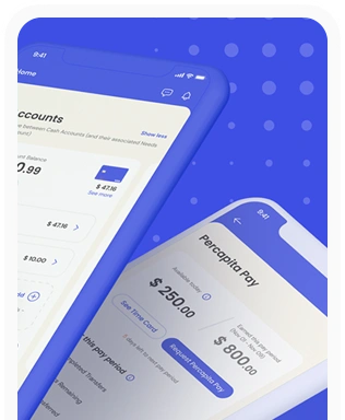
Percapita
We designed a full-fledged application for simplifying everyday finances.
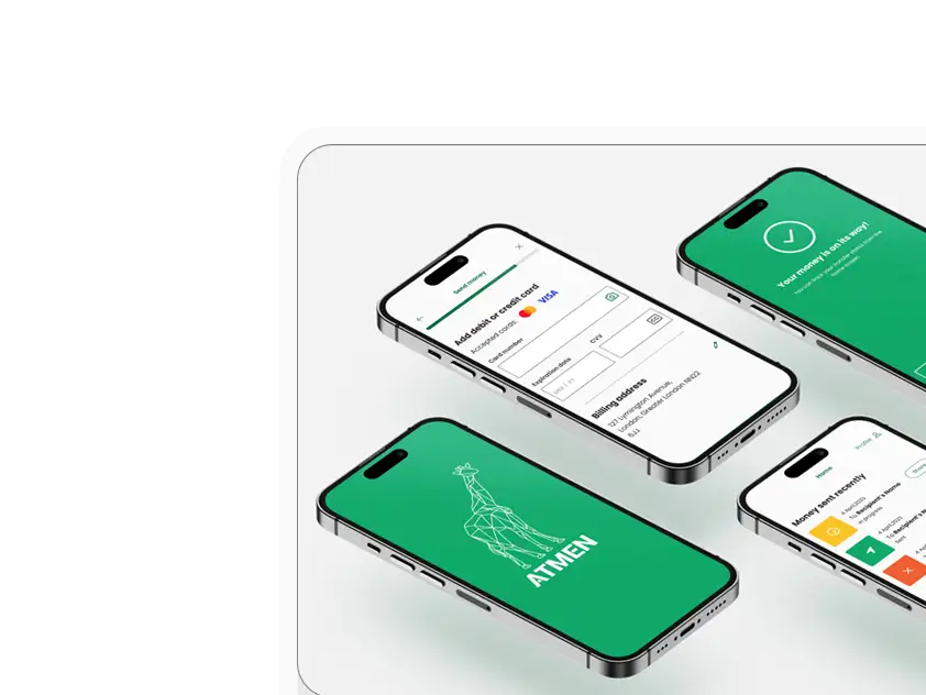
Atmen Fintech
Mobile App
Designing a Minimum Viable Product for a Diaspora Neobank Startup
Sterling Archer
By applying the DDD framework, we created multiple digital tools for a US based Data Company.

Ergomania and NGOs in the Netherlands
UX design for Fintechs, banks and financial startups is the everyday work of Digital Product Design company, Ergomania based out of Budapest, Hungary.

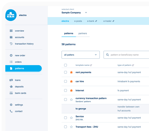
K&H Bank's Corporate Netbank
The K&H Electra Netbank App consolidates all financial needs into a single, user-friendly application. With its intuitive design, businesses can effortlessly manage their company's cash flow, transactions, and investments from one centralized hub.
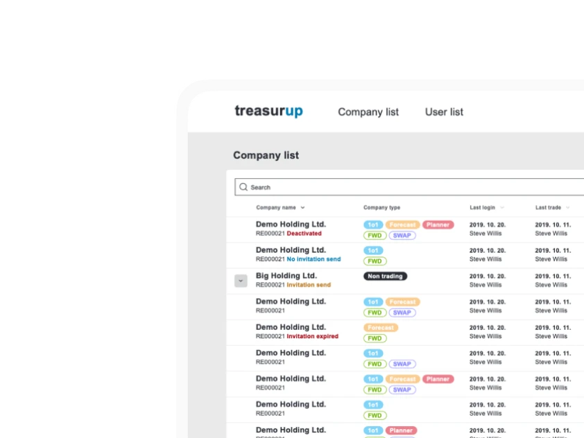
TreasurUp
We established written and visual consistencies and guidelines for TreasurUp’s financial platform.
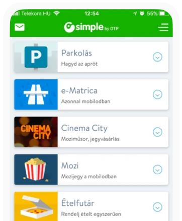
Simple by OTP
Simple by OTP Bank is Hungary's No.1 mobile payment app for cashless payments with 1M+ downloads, and 1 million+ transactions.
White Label Banking App
We provide full-blown next-generation mobile banking solutions for sales-oriented banks.
Want to read more
about UX, fintech and banking?
Subscribe to our biweekly newsletter and get the latest of our news and thoughts!