Mobile banking in Austria
In Austria, which considered to be a rather conservative country, it is perhaps not surprising that people still largely prefer cash and traditional banking services to digital solutions. Nevertheless, the digital sector is growing steadily with the emergence of mobile banking and apps. The digital payments currently make up around EUR 10,000 million per year and mobile payments are estimated at around EUR 2,192 million per year.
There are two main forms of mobile banking in Austria – stand-alone, independent mobile banks and mobile banking apps from traditional banks. Although in many cases they offer similar products or services, traditional banks and their apps can still offer their customers more services and different types of accounts, such as overdrafts, insurance and investments, which many mobile banks cannot.
Nonetheless, mobile banking with a digital-only interface still have many advantages. For example, they can save us the hassle and expense of opening a traditional bank account, such as account management fees, paper statement fees and in-person transaction fees – although many of these can be avoided by using a bank’s mobile app. Last but not least, mobile banks also have environmental benefits, as everything is done online, no physical paperwork is generated.
In general, most banking apps in Austria offer customers the following services:
- A complete overview of the account and money
- Simple transfers, including SEPA
- Smart contact lists
- IBAN and money transfer overview
- Secure, contactless payments with Apple Pay
- Management of all transfer and payment restrictions
- Booking an appointment for personalised administration
- Checking the investments or insurance linked to the account
- Stock exchange services
- Management of standing orders and automatic payments
Of course, every bank offers a slightly different ‘cocktail of services’. In our article, we focus on the UX solutions of Austrian to make the above services easy to use for their users.
Trendy interface: Erste George
One of the most striking changes in modern banking applications compared to the old financial management interfaces is the use of friendly, engaging user interfaces designed to promote transparency and reduce cognitive load.
The authoritative, sombre graphics of traditional banking applications have been replaced by minimalist and playful interfaces, often using an exciting colour palette that reflects the company’s image.
One of the best examples of the trendy user interface design and use of colour schemes is the new Erste George app, which is available in the Austrian market as well as in the Czech Republic, Slovakia, Romania, Croatia, Serbia and Hungary. In contrast to Erste’s blue and red colours, George uses youthful, vibrant purple, pink, orange and green colours to create contrasting and clean interfaces, promoting consistent usability across all pages. The app uses pale shades of colour to differentiate currencies, accounts and other options, while buttons and links that encourage action have been given brighter colours. And shades of grey help distinguish important text and explanatory paragraphs.

Online account storage: Bank Austria
Mobile scanning solutions are becoming increasingly common in business. The trend has been popularised by applications in the banking sector, where the OCR (Optical Character Recognition) technology for identification and IBAN scanning has greatly accelerated and simplified payment processes.
Since then, the use of OCR has become much more widespread: it is now used for self-check-in at hotels, tax-free shopping at duty-free shops, or even for scanning gas meter readings. But let’s just stick to the banking sector – how many times have you just wanted to keep a receipt at the end of a purchase ‘just in case’? Who knows, the product might need to be returned to the shop, it might come in handy for accounting, it might certify the purchase guarantee.
Although there are many separate apps for storing invoices and receipts online, Bank Austria has not left things to chance and in addition to the usual features in the app, the user can also use this service. The scanning process is preceded by a short onboarding session explaining the correct way to take a photo, and if successful, the digital invoice can be retrieved from the app at any time.

Statistics: BAWAG PSK klar
One of the most important updates to banking applications in recent years has been the statistical statement feature, which gives users the opportunity to see their finances, spending habits, debt settlements and savings in one place.
Almost without exception, challenger banks all offer this facility to users, and traditional banks have also started to adopt this useful feature in recent years. Statistical statements help users to better understand and interpret their own financial decisions, and this positive feeling can often create loyal customers.
That’s why it makes sense to display this complex financial information in simple patterns so that users who are not financial experts can quickly and clearly see their spending, debts and repayments.
The BAWAG PSK klar app is a good example of how personal finance statistics can be integrated into mobile banking systems. Klar automatically assigns a category to each transaction (home, food, etc…), which allows you to create different statements about their spending, and also set spending limits for the respective categories via the app, for example, if one intends to save money. It also allows the user to compare budgets from previous months, which can help in spotting any potential financial mistakes made, and can be useful for planning future investments.
Thanks to the simple, clean UI, the pages don’t feel cluttered and at first sight it is immediately clear what we see. The visual presentation of the data is also very classic and discreet, but the use of icons and the ability to display categories brings a friendly feel back to the pages.

Cards instead of lists: N26
The readability of mobile interfaces can be greatly improved by replacing the long list of different services/features/options with card elements. These cards can then be grouped in a number of ways, either as panels one below the other or broken down into several columns. This method makes many more options visible at first glance, helping the user to find the feature or service they are looking for more quickly. This saves valuable time and greatly improves the usability of the application.
A good example is the design of the N26 challenger bank interface. As shown on the insurance listing page, each product is displayed on a single card, and not as an item in a vertical list. And on the cards, a short description and a picture make the benefits of the product clear. The result is a simple, readable and friendly user interface.

Progressive display and scrollable accounts: Raiffeisen Mein Elba
Mobile banking interfaces are often full of data, with detailed information on users’ accounts, debts and the services offered to them. Even a simple login can give the user a headache caused by the flooding data – if the interface is not well designed.
Exposing information in small segments makes it easier for the brain to process a lot of information. This is one of the principles of form design, where grouping questions and presenting them in smaller chunks can help users complete them more quickly and accurately. This technique is known as progressive disclosure, which is crucial to ensure that users are not overwhelmed by a sudden flood of information.
The Raiffeisen Mein Elba app is a good example of how progressive disclosure can be incorporated into the design of a banking application. The home page of the app shows a list of cards with nothing more than the name of each account, the balance, the account number and a small icon indicating the type of account (e.g. a small piggy bank for a savings account). From here, the user can click on the card to display additional information about each account, e.g., transaction history.
The user can then easily view the other accounts by scrolling to the side, maximising the small screen space required by mobile interfaces without cluttering them with data.

Useful notifications: Easybank
In-app notifications are the shaky ground of UX design, as users can get frustrated when bombarded with messages from the app around the clock. This is especially true if these notifications don’t help them with their daily tasks, or are just ‘good to know’ information that comes too often, causing them inconvenience.
However, when used appropriately, banking app notifications can provide a personalised experience for users and help them in their daily lives. It is also a good way to build trust, as notifications give the confidence of being always informed and up to date with the information that is important to the user.
So let users choose themselves what they want to be notified about – whether it’s card or invoice payment notifications, credit application updates, if we let customers decide for themselves, we have a winning case.
Easybank has clearly listened to their users – in its notification management interface, it is easy to set up what and how many notifications to receive – or even specific keywords can be specified that will be displayed in the transaction and notified by the app.

eWallet heuristics: Bank Austria Mobile Geldböse
Digital wallets are the fastest growing payment method today. In Austria, Paypal is the most popular among users, but digital wallets developed by traditional banks (e.g. ELBA-pay app from Raiffeisen or Oberbank Wallet) are also gaining popularity.
Bank Austria’s digital wallet app, Bank Austria Mobile Geldböse, allows users to store their discount cards in the app in addition to the usual wallet features. In addition, when paying through the app to one of Bank Austria’s designated partners, some percentages of the money are transferred back to the account associated with that card.
The designers of the app kept in mind the principle of the Nielsen Norman Group usability heuristics that in order to create user-friendly interfaces, it is worth aligning the designed system with the real world to create a familiar world for users instead of an internal jargon or system. Accordingly, in the app, both debit and credit cards and discount cards appear as their real counterparts, making them easier to recognise and quickly find the data on them.

Conclusion
Overall, Austrian mobile banking solutions are following the European trend that traditional banks are trying to catch up with market-leading innovation of digital banks. While there have been some major developments recently (e.g. the Erste George app), many exciting features and UX solutions are still missing from the Austrian mobile banking scene:
- Virtual assistants (e.g. Bank of America, Kate)
- Gamification (e.g. Monese)
- Map-based transactions (e.g. Monzo)
- Built-in banking keyboard (e.g. Itaú Unibanco)
One of the biggest reasons for the success of the above examples is that the bank has partnered with certain Fintech companies. The integration of third-party solutions allows banks to improve the service packages they offer to their users at a large scale and at a fast pace.
And how will the Austrian mobile banking scene be able to keep up? That is the future, but much will depend on how far they can outperform the neo-banks in some places, as competition is getting tougher.
About the authors
UX designer, with a background in industrial design engineering and graphic design.
Related case studies
Prefixbox
Prefixbox is a Hungarian e-commerce scaleup. We helped them design an AI agent that gives more accurate product recommendations to shoppers with generative AI.

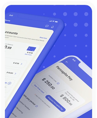
Percapita
We designed a full-fledged application for simplifying everyday finances.
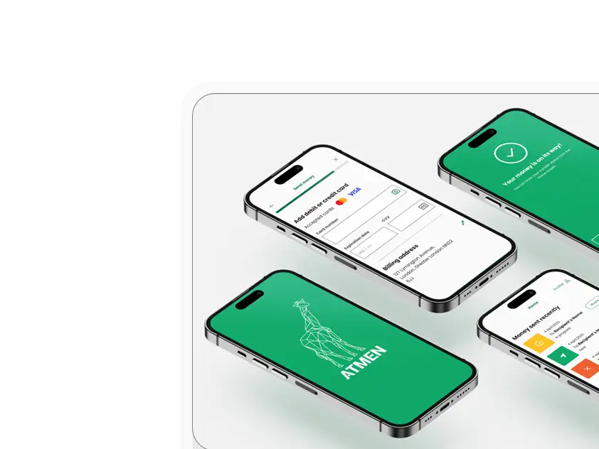
Atmen Fintech
Mobile App
Designing a Minimum Viable Product for a Diaspora Neobank Startup
Sterling Archer
By applying the DDD framework, we created multiple digital tools for a US based Data Company.

Ergomania and NGOs in the Netherlands
UX design for Fintechs, banks and financial startups is the everyday work of Digital Product Design company, Ergomania based out of Budapest, Hungary.

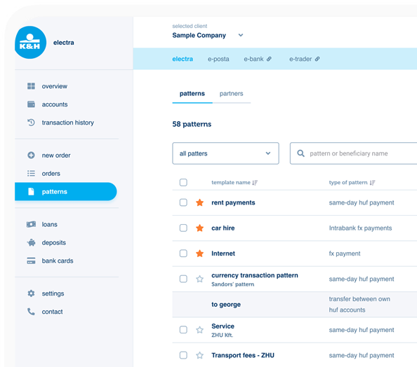
K&H Bank's Corporate Netbank
The K&H Electra Netbank App consolidates all financial needs into a single, user-friendly application. With its intuitive design, businesses can effortlessly manage their company's cash flow, transactions, and investments from one centralized hub.
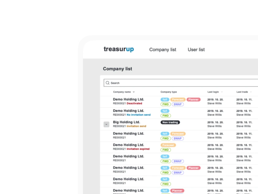
TreasurUp
We established written and visual consistencies and guidelines for TreasurUp’s financial platform.
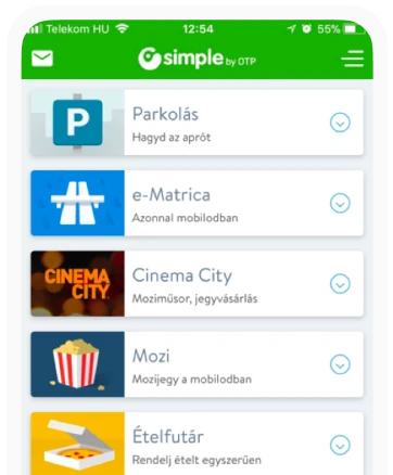
Simple by OTP
Simple by OTP Bank is Hungary's No.1 mobile payment app for cashless payments with 1M+ downloads, and 1 million+ transactions.
White Label Banking App
We provide full-blown next-generation mobile banking solutions for sales-oriented banks.
Want to read more
about UX, fintech and banking?
Subscribe to our biweekly newsletter and get the latest of our news and thoughts!