Tips and tricks to design better date pickers
The date picker can simplify the entry of dates in an input field. Indicating the date may seem like a small, negligible item in an application or a website. Everyone has already seen and used a date entry field…. But if we dig deeper, it turns out that the solution we use does matter. Indicating the date can easily determine the user experience, and most of the time, not in the positive sense. A poorly designed date entry field or date picker, thus cumbersome to use can immediately result in frustration, which may lead to abandoning the entire process. Another unlucky situation is when one mixes the day with the month due to a wrong date format when making an online reservation.
The basics
In simplified terms, a date can be entered:
- in text format
- by scrolling
- using a dropdown list
- using a date picker
- using a combination of the above
- using an unconventional design (significantly different from the usual solutions)
If using only text entry, we should (must) incorporate validation and error handling. However, there is one major issue with versions using only scrolling, a dropdown list or a date picker, especially in the case of longer forms: it may be uncomfortable to let go of the keyboard, while an unusual solution may not be right due to the time needed to understand it.
In general a date picker is the right choice if the date to be entered is relatively close to the current date. Using it is even faster and more optimal than using the keyboard or a transparent calendar-type representation of weekdays (e.g. in case of time intervals) may also be a possible solution.
In most cases it is better to opt for the text entry solution; this allows us to meet the needs of users with different preferences. But it is often worth limiting leeways for users to a healthy degree to reduce the number of potential errors. For example, Airbnb does not allow text entry for defining the time interval because the overall search solution is more consistent this way, as there is longer form when searching (map, filters, images) and the chosen date is usually in the near future.
Text entry – error handling – formats
Who is the target audience? When dealing with an international user base, we should take into account the different formats that exist, or at least define a truly functional sample. We should not ask users to use special characters, no matter which separator is concerned. Introducing separate fields may be a good alternative.


Date picker types
We will not analyse all of the solutions out there individually, but this topic requires special attention during the design stage since even a minor change in the date picker’s interface compared to the norm may create a lot of misunderstandings. Displaying the month in letters for instance reduces the possibility of error.
Also displaying the past few days in letters can also foster quicker perception as in this case, there is no need to check the exact date. It can be useful to hide or grey out non-selectable dates, such as holidays or non-bookable (already booked) dates or the days of the previous month. Let’s see a few basic types:


Birth dates, events long past or cases when the date picker should not be used
Entering a birth date may require too many interactions on a date picker and showing the days in a calendar format is not a relevant aspect either. In this case, a dropdown list is generally used to reduce the number of steps involved.

Although this prevents users from opting for the wrong format and software validation is not that relevant (31 February), scrolling multiple dropdown lists, then selecting the wrong date and restarting the whole process is not much better than clicking many times in the date picker…
An alternative solution could be to set the starting date 18 years earlier or starting with the year as the first step. Dispaying several years at the same time is recommended, but once again, the text format, i.e., using the keyboard, may be better. (While still watching out for the format.)


Mobile, alternative and combined versions… Which one should I prefer?
Now that we are warmed up, the question arises: do we need a date picker at all? Different solutions are better suited to different situations. Sometimes we design a native mobile application (specifically optimised and running on a specific device or platform) or we need to display the hour and minute. Sometimes a simple slider is enough. There is no perfect date picker perfectly tailored for every situation.


If we take the interval elapsed since the current date as the basis and show it in letters (last week, last month…), it can improve the user experience. In the two examples above, the individual setting option has also been retained.


If we need the hour and the minutes or even seconds, a combined date and time picker solution with switchable modes, may be warranted, but allowing this at another entry point usually works better.

A picker in a picker — instead of skipping ahead by year/month, we can also use another picker to display the month and the year simultaneously. But the question here is the same: to what extent does our interface remain intuitive, as it will not be clear to all users to click on the header and using it may become complicated on a mobile device.

Using only the numeric keyboard or separating stepping by year and month can work fine on a mobile device.

Conclusion
There are many good and just as many poor solutions in any given setting. We described solutions that work better on mobile devices or desktop computers and also some unique solutions. Don’t forget about your international users either. Using the keyboard is justified in most cases, but you can think about the next input on the form, or in case of an interval, apply automatic skipping to the end date if this helps the completion process. A reset button can often shorten the process.
In case of a broader user base, using screen readers may be important and must be handled separately in most cases. Implementing skip between dates (days) using buttons (+, -) may also work well if there are many non-selectable days or searching is restricted to a relatively small range for example.
We could go on discussing the various beliefs and challenge the usability of our current design patterns, but one should make the effort to consider the range in which our users will enter values and try to identify the situation (environment), type of information needs and the purpose for which users will use our application, to tailor date picking for these factors.
Whether you’re vetting a counterparty in Dubai, acquiring an oilfield in the North Sea, or onboarding a fintech client in London, due diligence is your first and best defense against surprises. This guide explains what due diligence means, how different types (financial, commercial, client/AML, vendor, ESG, sanctions, legal, operational) fit together, and when to use which check. It includes industry-specific playbooks for oil & gas/petroleum and financial services, practical checklists, and regulatory anchors for the UK, EU, and UAE so your teams can execute with confidence. The focus is on clear steps, decision-grade outputs, and proportionate, risk-based depth rather than theory.
Additional articles and examples on this topic:
https://www.smashingmagazine.com/2017/07/designing-perfect-date-time-picker/
https://uxdesign.cc/ui-mechanics-of-a-date-picker-792f2aceb8aa/
http://ui-patterns.com/patterns/CalendarPicker/
About the authors
Related case studies
Prefixbox
Prefixbox is a Hungarian e-commerce scaleup. We helped them design an AI agent that gives more accurate product recommendations to shoppers with generative AI.

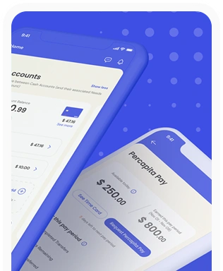
Percapita
We designed a full-fledged application for simplifying everyday finances.
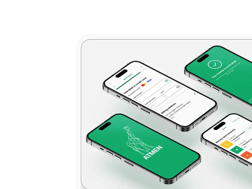
Atmen Fintech
Mobile App
Designing a Minimum Viable Product for a Diaspora Neobank Startup
Sterling Archer
By applying the DDD framework, we created multiple digital tools for a US based Data Company.

Ergomania and NGOs in the Netherlands
UX design for Fintechs, banks and financial startups is the everyday work of Digital Product Design company, Ergomania based out of Budapest, Hungary.

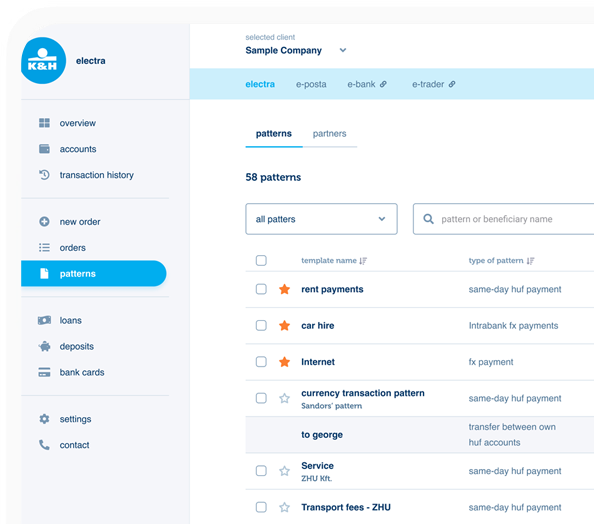
K&H Bank's Corporate Netbank
The K&H Electra Netbank App consolidates all financial needs into a single, user-friendly application. With its intuitive design, businesses can effortlessly manage their company's cash flow, transactions, and investments from one centralized hub.
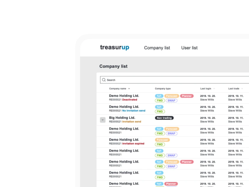
TreasurUp
We established written and visual consistencies and guidelines for TreasurUp’s financial platform.
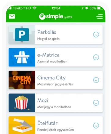
Simple by OTP
Simple by OTP Bank is Hungary's No.1 mobile payment app for cashless payments with 1M+ downloads, and 1 million+ transactions.
White Label Banking App
We provide full-blown next-generation mobile banking solutions for sales-oriented banks.
Want to read more
about UX, fintech and banking?
Subscribe to our biweekly newsletter and get the latest of our news and thoughts!