Top 3 UX-UI challenges in the process of buying a motorway vignette in a mobile banking application
Users are increasingly conducting their digital transactions via mobile applications. The number of users who also perform their financial or banking transactions on banks’ own mobile applications (mobile banking) is increasing day by day.
Buying a motorway vignette is a popular feature nowadays, used regularly by the majority of car users. It is no wonder that more and more banking operators wish to make this or similar features available in their own banking mobile application.
Financial operators and banks in Europe focus more and more on building convenience features into their own banking mobile applications. Such enhancements and features will greatly contribute to an even wider use of the applications and to building loyalty.
Convenience features can bring a number of benefits:
- Acquiring new customers
- Increasing the satisfaction of your old customers
- More frequent use of the application
- Increased loyalty to the bank
- Dissemination of digital banking
- No need to install and use a separate application
- Shopping in a familiar, convenient mobile banking environment
- New innovative solutions in banking mobile applications
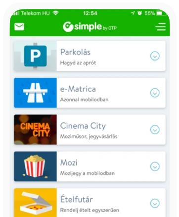
Perhaps one of the biggest Hungarian success stories was the OTP Simple application designed by us. To date, it is one of the most downloaded Hungarian applications in the Google Play Online store. As an experiment, OTP created a standalone application with interesting and useful convenience features for users. With this decision, OTP has separated banking mobile services from convenience functions. Users prefer to use applications where they can use several convenience functions, such as paying for parking, buying cinema tickets, etc. One such popular convenience feature among users is the purchase of a motorway vignette. In 2017, the Simple application was designed to include a motorway vignette purchase feature, in line with the UX trends of the time.

A new project gave us the opportunity to redesign such a feature. The aim of the development was to implement a motorway vignette sales service for all vehicle categories and the associated full vehicle management. The development of such a function raises a number of UX issues, to which we tried to propose possible solutions in the discovery, definition and design phases using the 3D model.
The designed application is able to handle multiple vehicles, and visually illustrating which vehicle (based on license plate number) has a valid vignette for which county. During the design process, great emphasis was placed on providing an outstanding customer experience for the users, and to this end the interfaces were designed to be customer and user friendly.
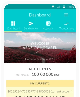
In this article, we would like to show how, in designing an application with the same functionality in a mobile banking environment, we rethought the process and screens for buying a motorway vignette. A UX/UI solution was developed that helps the application to promote a better user experience.
Motorway vignette purchase
From the concept to implementation
Like all UX/UI projects, this one was built on the 3D framework, which is an acronym for discover, define and design. In the discovery phase, we conducted research to assess the needs of business stakeholders, employees and users of the prospective application. In the define phase, a number of workshops were used to develop concepts for the design and process of the entire mobile application. From the concepts we created UX wireframes and UI screens, which we tested with users, iterating our designs based on user feedback.
Following best practice research and user interviews, it became clear that there are few good motorway vignette purchase applications on the market. As an example in Hungary, we analysed the sites e-autópályályamatrica.hu or autópályamatrica.hu based on UX/UI aspects. Both sites have a similar structure, there is hardly any difference between the structure and look of the two sites. Among the sites offering international motorway vignette purchase, we examined the Romanian site roviniete.ro and the Slovakian site eznamka.sk. Some of the available applications impose a high cognitive load on the user, so the design aimed to reduce this load for the users. We considered it necessary to create a clear, simple design for the new mobile application, free of visual noise. It was also valuable for the future application to have a sensible grouping of functions, so that logically related elements were grouped together. It was a very important element of the UX design that each function should be accessible to the user in a quick and unthinking way. In order to achieve this, it was necessary to use informative and understandable UX copy throughout the design.
It also became clear to us that the applications on the market do not use any visual representation of which county a user has a valid vignette for. This is mostly displayed in text or table format in current applications. In the design, we wished to put more emphasis on the visual representation of the territorial validity of the vignettes, in a way that is not interpreted by the user as visual noise. During the design process and based on user feedback, an innovative solution was found.
Another key area is to improve fast access to functions. In many cases, it is not displayed to the user which vehicle the information displayed applies to, and the quick switching between them has not been resolved in all mobile applications provided to the user.
In addition, the application should support the whole process of buying a motorway vignette and the complete vehicle management.
To enhance the user experience, an additional feature was also designed into the application. The person using the application can use a voice chatbot to complete the purchase process. This feature will facilitate the process of buying a motorway vignette while driving (safely). A conversation with the chatbot makes it easy and simple to purchase a vignette. This way, the purchase process does not distract the driver from driving while shopping.
UX-UI Design

On the first screen, the vehicle management was designed where users are required to enter basic vehicle data. From the list of vehicles displayed, you can quickly and easily select the one that suits you, or enter a new vehicle. When entering a new vehicle, the user only needs to provide the most basic information.
A visual display helps the user to choose between the vehicles in the list. The use of icons allows a more compact presentation and helps to better understand the site.
One of the most exciting challenges was how to visually display the valid motorway vignette for each county, the vehicle and the option to purchase on one screen. After several wireframe drawings, the following innovative screens were created.

Based on these designs, the valid vignettes were displayed on a blank map of Hungary’s counties, in green. The user can visually check for which county they have a valid motorway vignette. At the top of the screen, a quick and easy vehicle switching option appears. This allows the user to select another vehicle from a drop-down list, where the vignette details for that vehicle are displayed. On the screen, you can also purchase a new county or annual motorway vignette for the selected vehicle.
At the time the design was created, there were counties where it was not required to buy a motorway vignette to use the motorway. These counties were given a striped colouring in the application (screenshot 2).
The UX design resulted in a clean page that is visually understandable for users. At first glance, the user knows for which vehicle and for which county they have a valid vignette. They can easily switch between vehicles and quickly purchase a vignette.

The motorway vignette purchase screen also only requires the system to enter the most necessary information. A fundamental principle of UX design is to provide the user with the right information about the service. Therefore, an information block has been placed at the bottom of the screen to provide the user with precise information about the validity of the vignette.
Smart notifications
The application was designed to send a smart notification to the user when there is a change in the validity of the motorway vignette. The text of the smart notification is displayed on the locked mobile phone screen, reminding the user that the validity of the motorway vignette is about to expire or has already expired.

During the design we also took into account the case where the user forgot to buy the motorway vignette earlier, in which case the application will also send a notification. The notification will give the user the option to purchase a new motorway vignette. The user also has the option to purchase the vignette securely, quickly and easily with Voice instructions.
Voice purchase
During the design process, we wished to give the users a new and innovative user experience and functionality, so we designed a short voice-operated (voice) motorway vignette purchase interface and process.
The voice chatbot technology facilitates and enables voice instructions, in this case providing the opportunity to safely purchase a motorway vignette while driving. With voice purchasing, the user only needs to put the mobile device on speakerphone and does not need to use their hands while driving to purchase a new vignette.
Voice control technology is becoming more and more important in supporting certain processes in mobile applications of various financial operators and banks. The functionality is similar to Google Assistant or Amazon Alexa in terms of functionality and architecture. The user has the option to buy vignettes on the go with one-word or short, few-word instructions. User feedback on the voice purchase process has been very positive.

Overall, I think we have managed to create a novel and innovative user experience and a user-friendly mobile application that meets the criteria and even goes a little further. Voice technology provides a great opportunity to use features like this quickly and easily.
Is this technology worthwhile for financial operators and banks? In our opinion, yes. For such short processes, the financial investment and effort is worth it, as it makes it easier for a group of users to use the service provided by the mobile application. The use of voice technology in banking applications can greatly enhance the user experience.
At Ergomania, we believe that the spread of voice technology will help to make online services accessible and easy to use. If you are interested in learning more about the potential of voice technology, our Voice Bank White Paper provides detailed and comprehensive information on the topic.
Our experience and user feedback suggests that financial operators and banks should build more additional services into their mobile banking applications. It is also recommended that voice technology is used more widely in digital banking and banking services.

