Wireframes and colors
A graphic design mock-up and a high fidelity wireframe share several characteristics which makes difficult to see where the work of the UX expert ends and the graphic designer’s starts. Not yet prevalent in Hungary, smart project planning beyond the waterfall model makes possible for the UX and the graphic designer to work on the same task together.


Several UX designers avoid using images and colors while creating wireframes. Colors direct the user’s eyes, convey meaning and help to separate elements therefore I believe that a detailed wireframe must involve colors. Using colors in a wireframe is not about beauty. For example to display error messages we can use any kind of red but must avoid blues and greens. The task of the graphic designer is to decide the final shade of the color. Jakub Linowski, well-known author on wireframing states:
“Perhaps it has something to do with the tradition that colour is often avoided at the wireframe level. I still use colour just to emphasize certain elements, and red for actions.”
Read more on colors in wireframing by Jakub Linowski
Basic colors to use on wireframes
The following colors are helpful on smaller projects as well.
Black: Majority of our wireframe will be displayed in black.
Gray: To help texts, less important information.
White: To label dark or colored buttons.
Red: For error messages. If the client’s brand color is red as well (e.g. vodafone.hu) we should use a different type of red for error messages. Use exclamation mark after or warning sign before error messages.
Dark blue: Mark links with underlined dark blue font for functional clarity even if the graphic design will use different colors.
Green: Positive meaning, use for positive feedback following a successful user action, e.g. “Your order has been placed successfully“.
Highlighter: We must choose one additional color that we will use consistently to highlight important elements.
Additional colors for more complex projects
Secondary highlighter: We may use two colors to highlight text if we wish to promote different information. E.g. general highlighter is blue and important information regarding shopping is marked with orange.
Pale pink: Use as a background color to put more emphasis on error messages.
Pale yellow: Use as a background color for informational messages. For example to discretely inform the user to activate her registration use a pale yellow ribbon at the top of the page which does not disturb her in her work. Use to highlight search results.
Orange: Use for warnings and blocking but not urgent issues.
Keep in mind, that the primary audience of our work contains marketing experts and managers who need colors to understand and interpret the wireframes. Without benefiting from the use of colors these stakeholders might miss important features in our wireframes.
About the authors
A real veteran of UX by having 18 years of experience. Strong focus on business needs and innovation. András Rung has worked for various institutions and companies since 2002. He is the co-author of the first Hungarian usability book and author of the usability blog Ergomania.
Related case studies
Prefixbox
Prefixbox is a Hungarian e-commerce scaleup. We helped them design an AI agent that gives more accurate product recommendations to shoppers with generative AI.

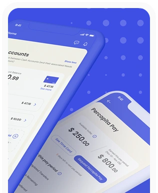
Percapita
We designed a full-fledged application for simplifying everyday finances.
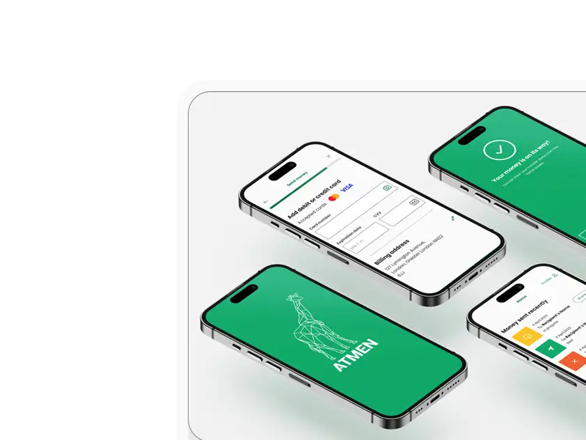
Atmen Fintech
Mobile App
Designing a Minimum Viable Product for a Diaspora Neobank Startup
Sterling Archer
By applying the DDD framework, we created multiple digital tools for a US based Data Company.

Ergomania and NGOs in the Netherlands
UX design for Fintechs, banks and financial startups is the everyday work of Digital Product Design company, Ergomania based out of Budapest, Hungary.

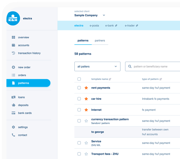
K&H Bank's Corporate Netbank
The K&H Electra Netbank App consolidates all financial needs into a single, user-friendly application. With its intuitive design, businesses can effortlessly manage their company's cash flow, transactions, and investments from one centralized hub.
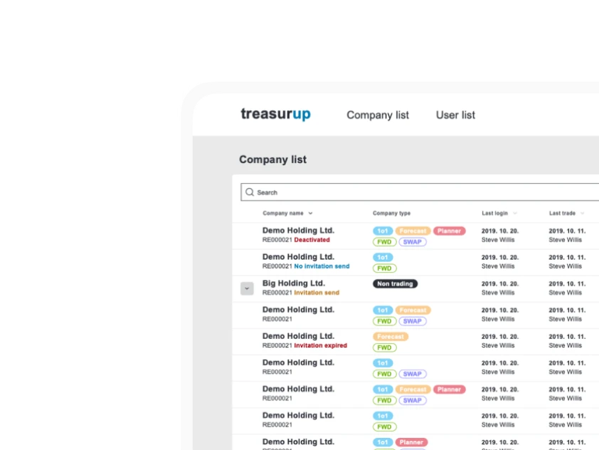
TreasurUp
We established written and visual consistencies and guidelines for TreasurUp’s financial platform.
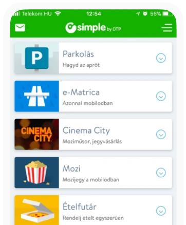
Simple by OTP
Simple by OTP Bank is Hungary's No.1 mobile payment app for cashless payments with 1M+ downloads, and 1 million+ transactions.
White Label Banking App
We provide full-blown next-generation mobile banking solutions for sales-oriented banks.
Want to read more
about UX, fintech and banking?
Subscribe to our biweekly newsletter and get the latest of our news and thoughts!