Big Banks aren't waiting idly, Digital banking in The Netherlands - part 2
Our previous blog post was about the modern services and UX solutions of Bunq, one of the most innovative Dutch financial companies. This article looks at the opportunities for incumbent providers in the market, large banks that have grown to their current size over decades/centuries for a reason.
It is generally accepted that the larger an organisation, the more difficult it is to respond to changes in market challenges. This is supported by the rise of Fintech firms; small, streamlined, agile businesses are quick to find niche markets that they can serve and achieve higher profit levels compared to traditional players. They have no other shot, as they have virtually no alternative but to pitch, due to the lack of resources that the big ones have. If they succeed, they can enter the market. If not – well, there is a reason why we don’t hear about those companies.
However, it is precisely this surplus of resources (capital, expertise, market knowledge) that keeps the biggest financial institutions in the ring in an increasingly competitive environment. With orders of magnitude more reserves, they can undertake larger-scale development and have much more scope to test their ideas – if they can change their entrenched corporate culture and the „sluggishness” of their size.
This article looks at how the big Dutch banks are responding to the Fintech challenge and the tools they are using to compete for consumers. Finally, it also looks at how ABN AMRO, ING and Rabobank can turn the situation to their advantage by gaining a deep understanding of the UX of their services and adapting this knowledge.
ABN AMRO – Artificial Intelligence at work
The third largest bank in the Netherlands, created by the merger of ABN and AMRO, currently has nearly 7 million customers. Its first predecessor was founded in 1765 and the financial institution builds on its history and reliability. Given its size, it is not able to transform itself rapidly and radically to match the innovative services of its smaller rivals in a short time.
Thanks to its partnership with Apple, ABN AMRO’s mobile application enables the use of Apple Pay. It provides a contactless, secure and easy way to make purchases via mobile devices, without the need for the customer to carry their debit /credit card with them. Simply touch your iPhone or Apple Watch smartwatch to the mobile card reader, and the NFC standard and personal authentication (Face ID or Touch ID) guarantee secure and fast payment procedures at equipped cash desks and ATMs.

Interesting fact: ABN AMRO announced in November 2019 the discontinuation of its Wallet mobile app for Android. The financial institution found that only 5 percent of its customers using Google’s mobile platform had taken advantage of the opportunity.
Despite its frequent mention, the emergence of AI in everyday life is elusive. ABN AMRO’s Grip application brings the possibilities offered by AI closer to customers. The financial advisor’s mobile app is in fact an intelligent digital financial assistant that provides insight into the details of a consumer’s income and spending. An easy-to-use interface allows users to check what they spend on what and how much each month. In addition to itemised tracking of expenditure, it can also be displayed in different groups and aggregated. Monthly budgets for different types of expenditure (e.g. food, insurance, transport, etc.) can be managed by entering monthly limits for each group.
Not only does Grip help you monitor the amount of money going in and out, it also gives you advice through built-in artificial intelligence. For example, it can predict the amount of money a user should save for a planned holiday, but also warn if the user
does not seem to have sufficient funds for regular monthly household expenses (utilities, subscriptions).
ABN AMRO Grip is not only for use with accounts and cards at the bank. The user’s accounts with other financial institutions can also be included in the database, so that transactions can also be managed from the mobile app.

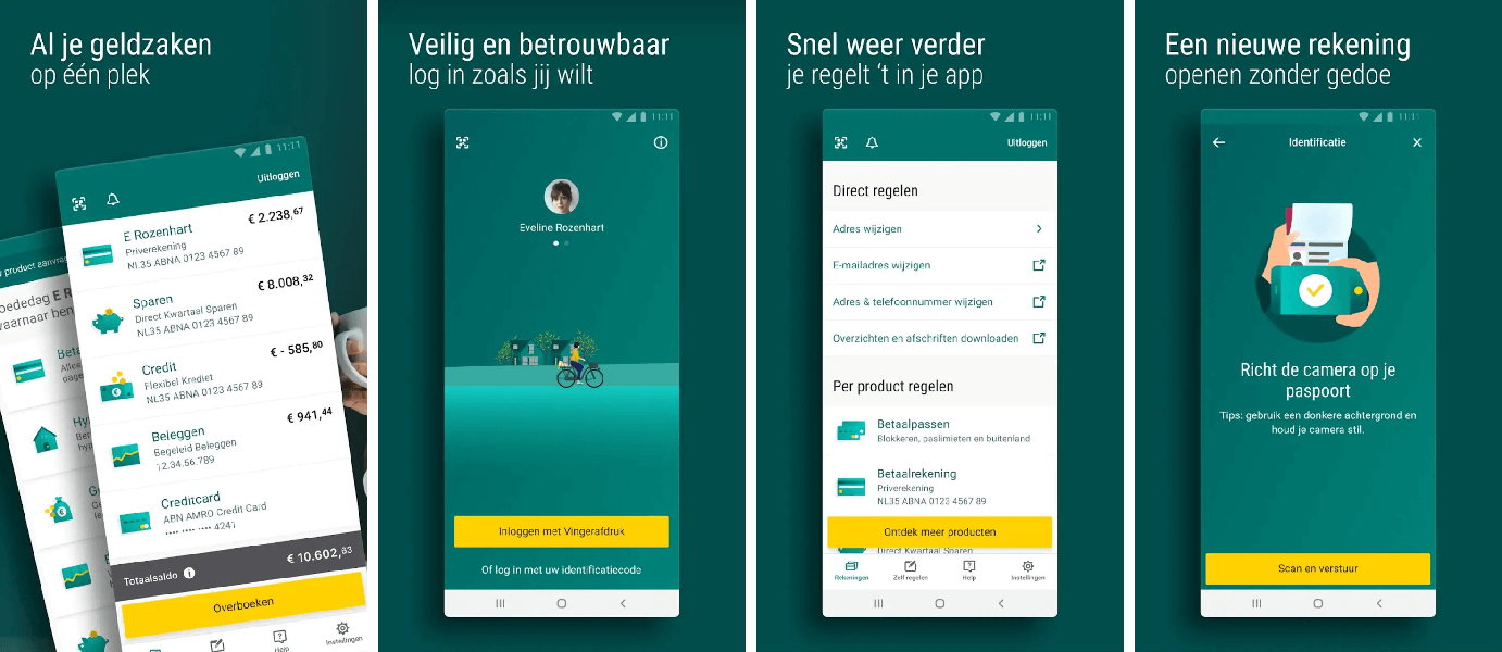
Easy to use, simple interface: the ABN AMRO Grip app
The fact that the interface is extremely easy to install and use is actively communicated by the bank, which is also advertising the phone version (mobile app) in its version for laptops:

The banking app can be downloaded from the Google Play and Apple App Store. Even before you hit the download button the bank is trying to show how easy it is to open a bank account with them through online processes, unlike traditional banks.
The onboarding interface is a facsimile of simplicity. During the process, you can choose whether you want to activate the app only or create a new account. To activate the app, the interface asks for a 5-digit identification code and explains the planned process in advance. From here it guides you through this process, all in a simple and clear interface. You can stop at any point and go back to the beginning of the process.
It is also possible to open a completely new account, which the app estimates to take 10 minutes. You will need a mobile-photographed version of your passport, (Dutch) driving licence or (Dutch) ID card. After that, you will only be asked to look into the camera. The process ends by selecting a package and providing some more basic information. Within four hours, the bank promises feedback on whether the registration was successful.
What can we then do with our account, how is this app different from what we are used to with traditional banking?
Let’s see what it promises: fully transparent finances, automatically organised into monthly and annual breakdowns. What does this mean?
The app automatically sorts incoming and outgoing items into different categories. It also sorts them in a transparent and easy-to-follow way. It helps you to summarise and present all your monthly spending, grouped into different categories such as food, entertainment, accommodation/housing. By clicking on these, you can drill down into the contents of each category and view the expenditure in each. You can also view your expenditure going back six months to a year, sorted by category.

You can set a limit for each category and the system will warn you if you have exceeded your planned expenditure.

The interface also allows us to classify items that it does not recognise into the appropriate categories.

What’s more, the app also displays an overview of our regular expenses, subscriptions and recurring costs. On request, we can receive regular notifications of these, so we can keep up to date with our water, electricity, gas and other expenses.
What does it show?
It is a very good and instructive example of the importance of revealing customer needs, of unravelling unspoken, even unconscious mental models. This can only be done through persistent and thorough research, including appropriate persona planning, of course research-based and supported by in-depth interviews. This has been complemented by the introduction of the use of AI already mentioned, resulting in an excellent and cutting edge solution.

The bank’s entire strategy is based on getting to know its customers as well as possible. They recognise that Dutch consumers are always connected, always online and value simplicity and speed. The tool they have designed to serve these customer needs as successfully as possible is called “Backbase Forms”.
They also want to serve this need on the mobile platform. In response to customer demands for digitisation, they have abandoned the complicated paper-based bank registration and moved everything to the online platform.
ING – efficient Facebook chat with the banking robot
Based in Amsterdam, ING (Internationale Nederlanden Groep) provides retail and wholesale, investment, direct, investment and private banking services, as well as managing insurance. It is one of the world’s largest financial institutions with assets of USD 1100 billion and has been a consistent player in the top ten European banks in terms of revenues for many years. Most of its nearly 38,5 million customers from more than 40 countries choose ING for the security of its vast financial backing.
But it cannot sit idly by in its dominant position, as smaller, more agile fintech companies are quickly and easily adopting new capabilities to seduce even some of the less financially savvy. This is why financial institutions like Lionel, launched in Australia, have turned to such developments. ING’s chatbot uses artificial intelligence to make banking easier. Or, as the financial institution puts it, the days are fast disappearing when customers could only interact with service providers on the company’s own platforms.
Lionel has a number of interesting features. Perhaps one of its most important features is that it does not use ING’s own IT backbone, but is available to users via Facebook Messenger. It does not have access to personal data for the time being, but it does, for example, inform users of the contact details of the nearest ATM. In order to increase its knowledge, ING engineers are currently training the AI ‘brain’ to answer increasingly complex questions. Instead of operating on pure rule-based principles, it can provide more human-like advice by significantly increasing the data set at its disposal.
Lionel, who made his successful debut at ING Australia, will be succeeded by Marie from Belgium. Thanks to previous experience and training, this AI is now capable of solving more complex problems. For example, it can help an ING customer on holiday with a problem with his bank card via Facebook Messenger on his phone, says Tim Daniels, ING’s Head of Programs.
Just like the human brain, bots can be made smarter by teaching them. One of the biggest challenges for chatbots is to interpret the questions they are asked and provide a relevant, usable answer. Let’s take a simple example. If a user asks a question about their credit card, and then in the next question no longer names it literally, the AI should know that it’s still the plastic card from the previous question.
While this is a very simple task for a human to process, it is knowledge that needs to be incorporated and trained in a chatbot. The Australian Lionel, the Belgian Marie, the Dutch Inge and the wholesale banking chatbot Bill all have in common that they use Natural Language Processing (NLP) to understand their customers. The majority of us don’t use words like “transaction” or “bank balance” in our everyday speech, but rather ask the question “Do I have enough money for a weekend away?”. The AI needs to understand this to be able to answer.

Despite all the improvements, it’s easy for situations to arise that chatbots can’t handle. ING’s experts monitor all conversations on digital dashboards, so they are quickly alerted if a customer is stuck dealing with the AI. In this case, they take over from the AI and continue the conversation as usual, with human-human interaction. At the moment, ING is not planning to go beyond this level of automation: it is relying on robots to take the burden of answering simple, repetitive questions instead of having its customer service staff doing so. This hybrid chatbot design makes work more efficient and does not frustrate customers when an overly complex problem is a problem for AI.
They also strive to make communication as human-like as possible. As the robots learn more and more about human nature, they will be able to sense changes in the mood of the customer they are communicating with. And they can respond to these. In its tests, ING was surprised to find that, with the right emoji, people became more forgiving of the robot’s “paralysis”. In other words, they are more tolerant of misunderstanding communication when the AI recognises this problem and tries to defuse the tension with a smiley or a joke.
According to Peter Netusil, an expert in machine learning at ING Belgium, we may eventually reach a point where the majority of people no longer necessarily realise they are talking to a human or a robot. And that will make managing finances even more efficient – from both sides. A cheaper-to-operate but expected level of customer service leads to high customer satisfaction, which leads to loyalty and ultimately higher revenues.
ING bankieren mobile app
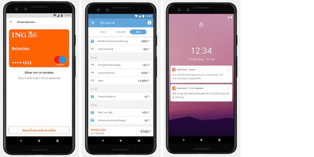
The ING bank app can be downloaded from the Google Play store and Apple App Store. The onboarding is simple, with lots of pictures and white lettering on an orange background. It is also easy to sign up here with a Dutch ID. The app has many innovative features such as requesting money, buying insurance, cancelling debit/credit cards, etc.
Get to know Inge, ING bank’s chatbot!
“Inge“, ING’s ATM locator chatbot designed for Facebook, helps users find the nearest cash withdrawal facility. It is still in the pilot phase of development, but it is already very helpful.
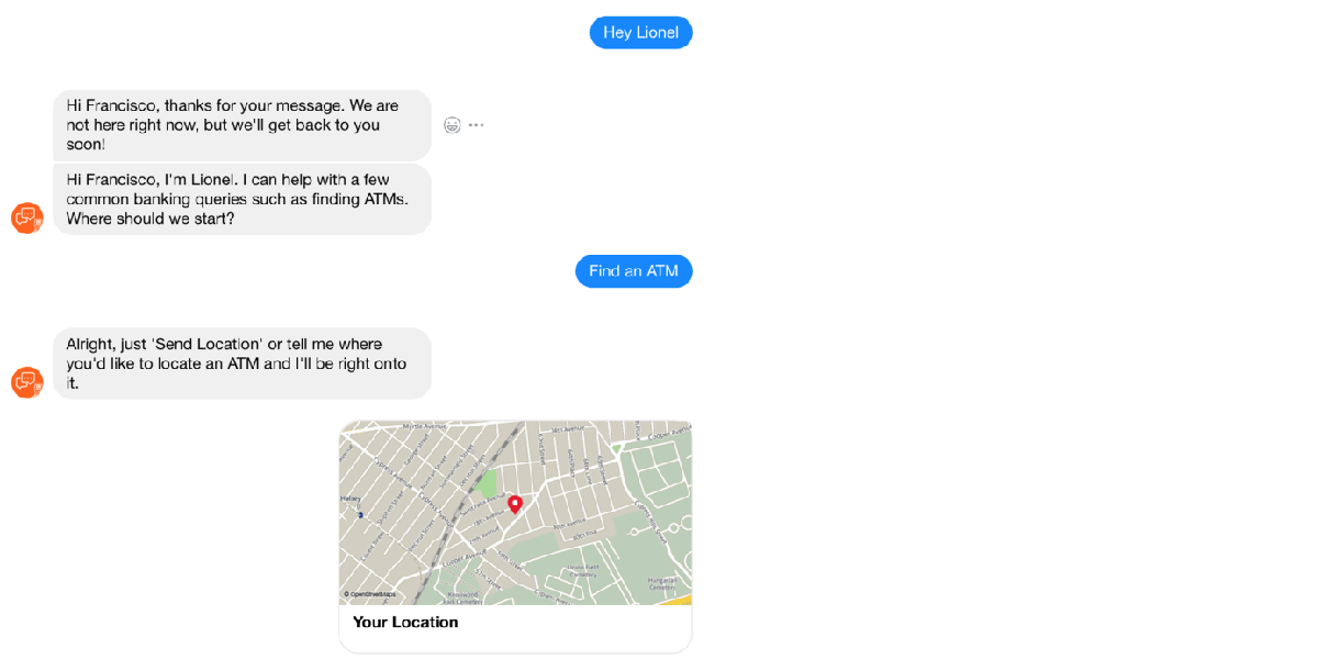
“NNG Inge” is the name of ING’s “Siri-like” voice-activated chatbot, which has been incorporated into its mobile banking mobile app. This solution was designed, created and built in-house by ING. It handles the following functions/contents:
- Bank statements
- Utilitiy payments
- Stock exchange quotes
- Weather forecasting
To the best of our knowledge, ING bank was the first bank to implement voice technology in its banking processes. The customer can use their voice to log in and to access certain functions. So, even if someone knows the phrase needed to log in, the system will not allow them to log in with it.
The days when we could log into banking or other systems with passwords or fingerprints using small push buttons and have to do things that way are long gone. You can give ING bank’s voice-activated chatbot specific instructions, ask it to sum up all the costs of your last holiday or show you your expenses according to a certain criteria.
Rabobank – the bank of the food industry
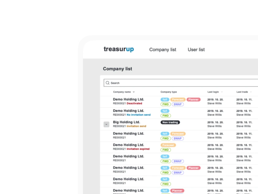
With a net profit of nearly €1,1 billion in 2020 (€12 billion in 2018), the bank was founded in Utrecht at the end of the 19th century. Today, the efficient work of just over 40,000 employees makes it a leader in financial support for the food and agricultural sector. Rabobank is also among the world’s leading financial institutions in sustainability banking. Overall, it is one of the 30 largest financial companies in the world. Rabobank is also at the forefront of internal innovation, having created TreasurUp, for which the design system was created by the Ergomania team.
Rabobank, which offers retail and personal services in addition to wholesale banking, for example, offers its more than 800 000 customers savings options through its RaboDirect service, which minimises financial jargon, complex contracts and conditions to minimise the interest of small investors. By putting the customer first, RaboDirect now oversees more than €30 billion in savings.
RaboDirect operates in a number of countries, from Germany to New Zealand. With no physical office in most countries, its services are available exclusively via the internet and telephone. By keeping operating costs low, the Dutch financial institution is not only increasing its own profits, but also reducing its customers’ costs. This makes savings and banking transactions less costly for those who can accept online banking compared to their competitors.
The current web interface was redesigned during 2018. The entire design process from start to finish was driven by thorough and detailed research and testing, with a focus on the new loan application. On the previous site, the loan application process was so complicated that many customers were forced to go in person, which at the time was quite burdensome, unnecessary costs for the bank and a poor user experience for customers. Rabobank’s aim was to enable customers to manage the entire loan application process themselves, from start to finish, on the new interface.
How did the whole design and research process work at Rabobank?
1. User research
In order to properly inform the extensive redesign project, it was necessary to find out what was causing the users to have a bad experience, what were the “pet peeves” of the users of the interface, what was not working properly. In order to find this out, the researchers conducted in-depth interviews with the bank’s customers. The results revealed here were presented in “Insight Cards” images. These cards contained the feelings and expectations about the action.
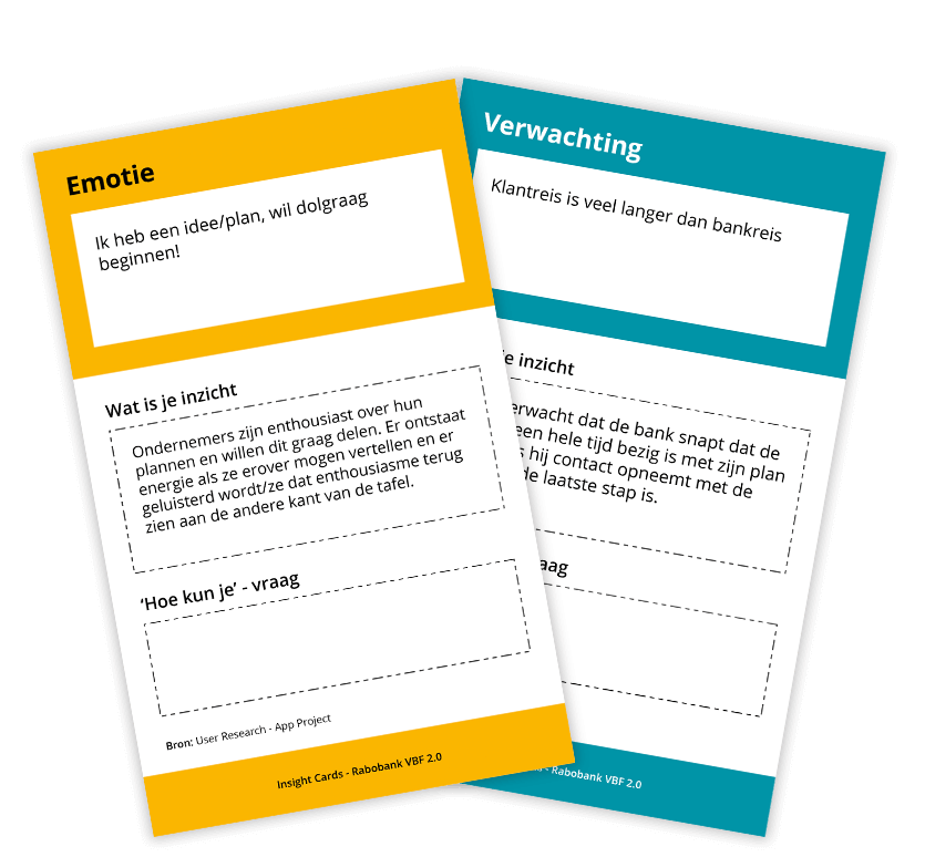
2. Customer Journey Workshop
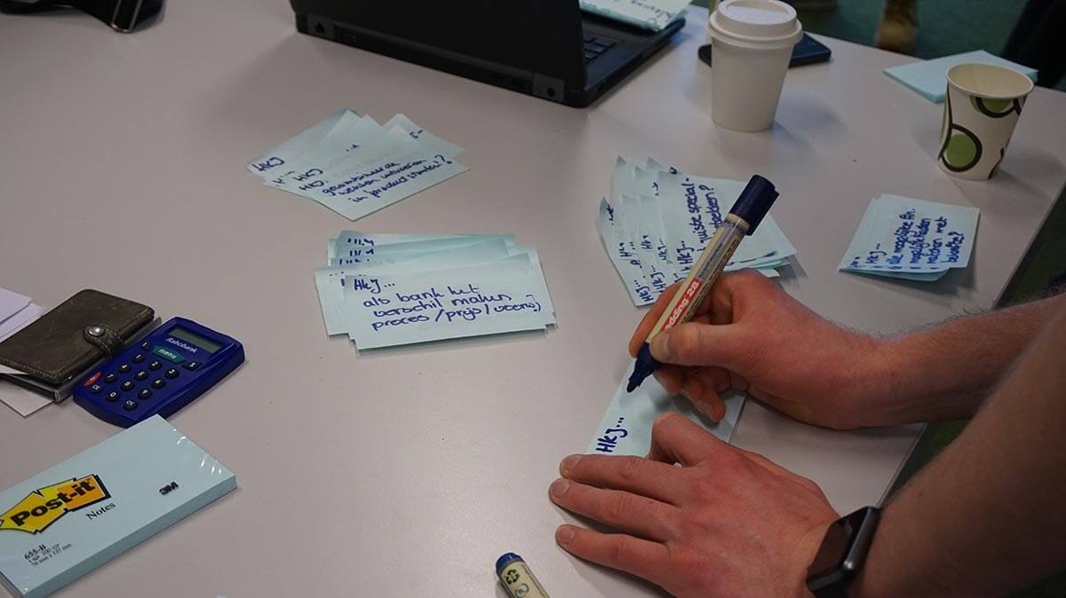
Having gathered all the user information, a few Customer Journey Workshops were held to get a detailed overview of the user journeys and possible touch points. During these workshops, user feedback revealed that many customers felt stressed during the banking process. In addition, some of Rabobank’s online processes were no longer useful.
During the Customer Journey Workshop, users were asked complete a banking process in a single attempt. A complicating factor was that they had to complete the process by uploading a document that they may not have had at that moment. The process journeys completed by users showed that there is plenty of room for improvement and that the process could be improved in a number of ways.
3. Design Sprint
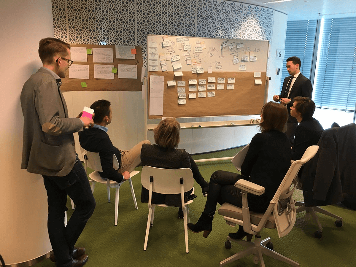
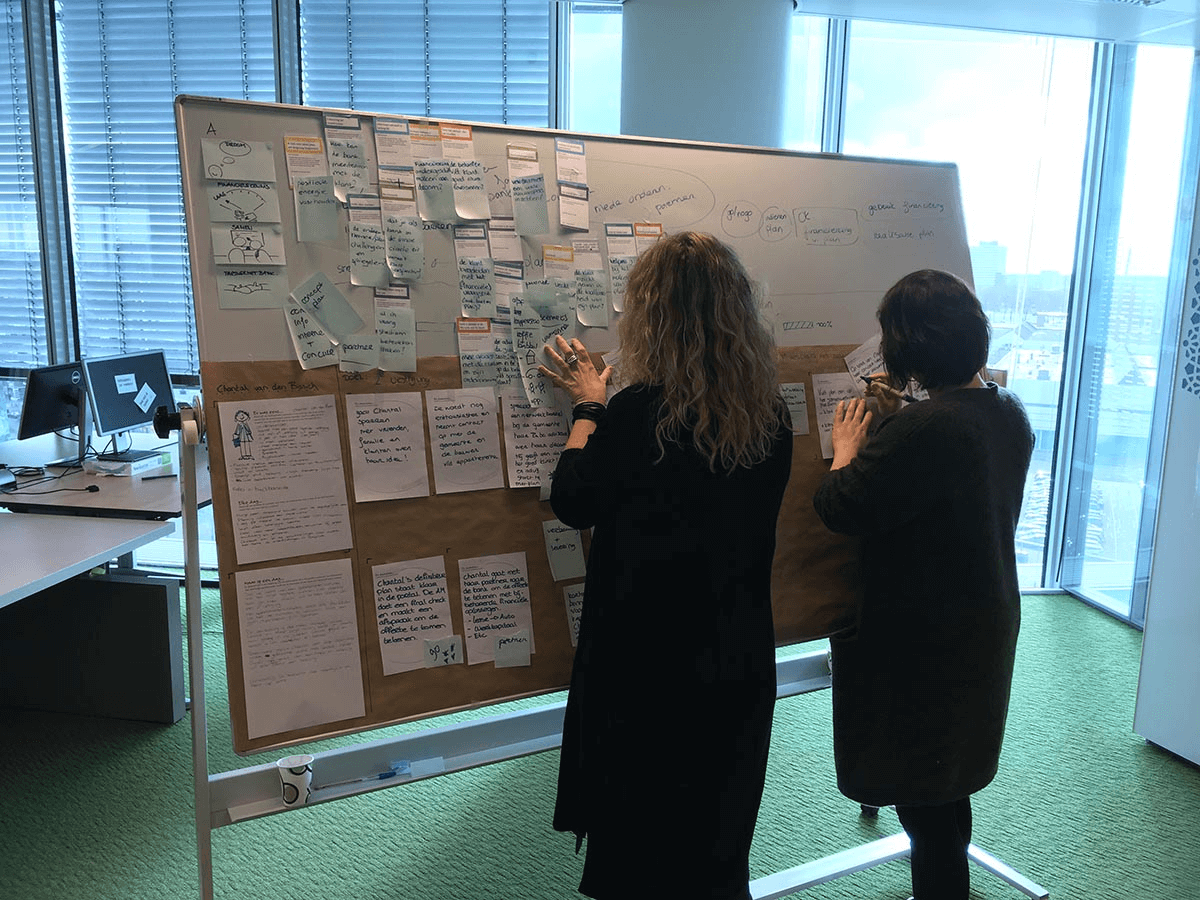
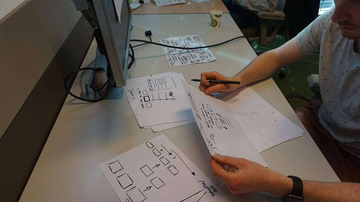
To generate new concepts for the new web application, the researchers held a Design Sprint. The focus was to make it easy for potential customers to find out about the possible loans available and not to make the loan application process difficult.
To this end, two prototypes were created during the Design Sprint and tested with users. One prototype focused on the orientation phase (loan enquiry, search) and the second on the actual loan application. Rabobank was smart to research and understand user needs beforehand. This step is often omitted in Design Sprints, as it takes a long time, but without it, the Sprint prototype is built on sand!

4. Design through iteration
In the final phase of the redesign, the UX team also worked together the product manager, UI designers, business analysts and service designers to ensure that the concept was as simple as possible. They also developed a testable version using a clickable prototype. All this was done in Sketch and Axure.

5. Prototype testing
After several design iterations, the Axure prototype was ready for user testing.
Three contractors were invited to the Rabobank UX lab in Utrecht. During the walkthrough of the testing scenarios, the participants presented their feedback on the interface in depth to the designers-researchers. They liked the designers’ approach of being able to stop the process at any time. At the same time, they pointed out a number of errors to the designers, such as repetitions and jumps. As with all well-organised and executed tests, this was an excellent basis for further improvement.
The final result
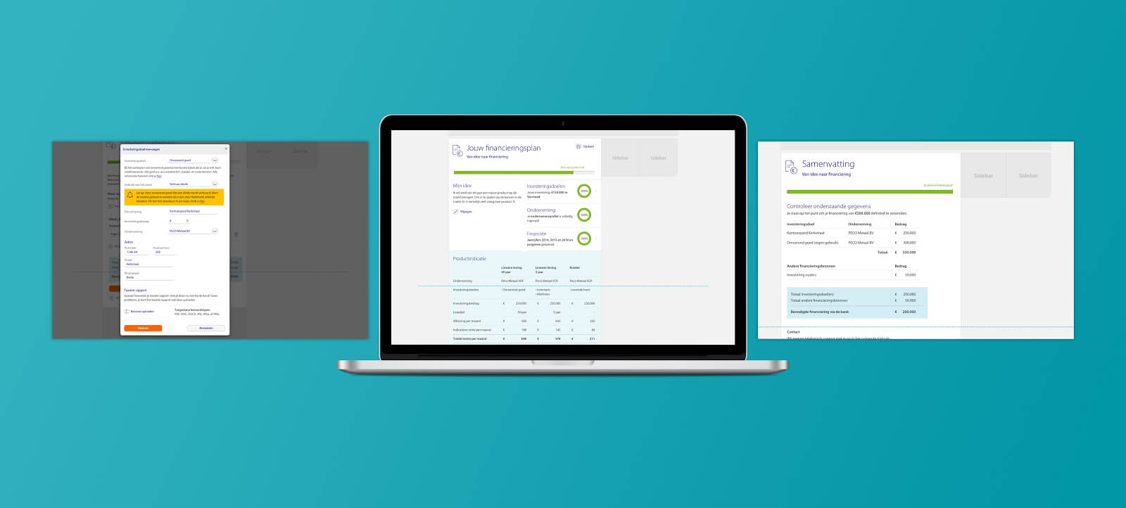
The results of the project were various processes and screens for the development team to start building the product. Moreover, a clickable Axure prototype was provided to the teams so that they could also experience the product for themselves.
Once the designs were delivered, the development team began development and launched the new app in summer 2018.
Conclusion – everyone wins
The above examples show that while Fintech companies are serious competitors to the big players, incumbent providers need not be afraid. The huge resources at their disposal allow them to enter the financial sector with innovative developments, albeit at a slightly slower pace.
They focus primarily on efficiency gains, for example by using artificial intelligence tools. More automated customer communication has a positive impact on the quality of contact, as well as reducing the human burden. It is of course a prerequisite for the continuous development of AI systems, chatbots in human interaction, ensured by deep learning algorithms and ever growing data sets on the technical side.
However, it is also clear that the cost savings that can be achieved by moving towards purely online administration (such as Rabobank’s RaboDirect service) do not translate into a one-stop-shop benefit for the bank. The competitive market forces a sharing with customers, i.e. that reduced costs not only increase the bank’s profits but also reduce the fees for those who use the bank’s services. This also benefits the financial institution in the long run, as lower costs can generate higher revenues by attracting customers.
The general experience is that the emergence of Fintech companies and their rapid growth in awareness and acceptance has given a boost to the development of incumbent service providers. New and innovative developments are therefore not only typical of smaller, more responsive financial institutions, but are now also being adopted by long-established players in the market, who are embracing modern features such as intuitive and simple user interfaces, artificial intelligence, customer management from a mobile environment and a focus on online communication.

