The road to maximum usability leads through minimal cognitive load
How easily users can find the content they are looking for on a website and how easily they can solve the planned tasks is affected by the actual cognitive load required to use the site or application. These can be physical in nature, like having to scroll too much or click far too often on the site. But just as important is the cognitive load that uses our intellectual resources and that determines our mental processing performance.
More about the physical load of clicks can be read in our previous article, “The Price of Interaction.” This article is about the cognitive aspects of usability.
The overall idea behind any web design should be creating simple, clearly usable websites, both in the commercial and public sector. Steve Krug, one of the experts of the subject has written a book on the subject (Don’t make me think) emphasizing that any website should be self-explanatory, obvious and user-friendly.
In order to grasp the concept of cognitive load, it is worth reviewing Krug’s key observations:
- There is no time for perfection, optimal is enough: When searching, we don’t have time to find the best result (we would have to read all the pages all the way through!), so we are ready to accept the first viable option. Why wouldn’t we? It is easy to correct errors on the web: use the “back” button.
- It is no coincidence that the “back” button is the most commonly used feature of browsers.
- When reading and gathering information, we look at both online and offline interfaces with anticipation: we have existing assumptions and expectations about the given visual interface. As we read, we jump forward again and again, in which case we practically validate our existing expectations.
- When users don’t get ahead on a particular website, they mostly don’t bother to read any FAQ’s or information materials. Hence, many times they don’t even know exactly what and how to use on the actual site, they simply muddle through the problem. Thus, many pages are misused, but still lead to the users’ successfully getting what they want. Krug labeled this Bushwhacker Technique.
These simplistic, relieving behavioral patterns are always chosen by users (never consciously, but rather unconsciously) to reduce resource usage (cognitive load) during the usage of the site, that is not to get tired by conducting a simple search function. Most computer users have long since learned that running too many programs on their machine at once slows it down and eventually crashes it. Therefore, when we experience a slowdown on our machine, we close programs that run unnecessarily and consume too much memory, especially when we are not using them.
Buffer overflow in the brain
Users need to understand effortlessly what is good on a given site and how it can be used. These are due, among other things, to the fact that, like computers, the human brain has only a limited amount of processing power. This means that if the amount of information received exceeds the amount we can handle, it will have a negative effect on the performance. This can take several forms: important details go unnoticed, or it takes longer to understand the current task. Ultimately, we get upset (frustration hits due to the overflowing amount of information we simply cannot digest) and just leave the whole site or task behind.
This could be the result of excessive cognitive load hitting us while using the website or application. The concept stems from psychology and it describes the total amount of mental resources required to use a system (site). Basically it shows how much mental effort it takes to learn new information. We can also think of it as “brainpower”.
Each time we browse a new site with a lesser-known layout or interface, we need to recognize and master – among other things – how to navigate, the names and layout of the menu items, the wording of the website, or the use of its forms. And even if the website or application seems quite familiar to the sites and interfaces we are used to, we need to rethink and validate the needs and information that are relevant to our current goal.
Let’s say, we are planning a holiday. Apart from familiarizing ourselves with interface, the use and information architecture of the given travel or booking site, we also have to use it to reach our goal (booking a trip). This should also include up-to-date, restrictive aspects such as time frame, travel habits and needs, budget limit, payment method, etc.
The responsibility is the designer’s not the user’s
If a computer can’t handle processing needs, we can replace it or simply upgrade it so we have another, more powerful machine. In contrast, to this day, there is no way to significantly increase the actual processing power of our brains. Thus, the task of increasing and optimizing performance is never really about our brains but about the site/interface/app.
Designers must first understand the meaning of cognitive load, should come to terms with its limitations, and in the second round they must follow the rules related to it and create interfaces that meet these limits, (unspoken) user needs and rules.
There are two types of cognitive loads: internal and external
Cognitive load cannot be completely eliminated – in fact, even if it were to be possible, it would not be desirable. Ultimately, people search and view various websites because they are looking for information on them. They go to specific websites to find out something about a product, service or organization. It’s about getting to know something they didn’t know before. The process of learning new information, absorbing it, and tracking your own goals is what we call internal cognitive load.
In contrast, outside (or external) cognitive load is any mental resource processing process that does not actually help the user understand the content (e.g., different fonts that do not give any unique meaning only appear for their own sake, unnecessarily complex color scheme, annoying gifs, etc.) Designers should strive to eliminate or at least minimize external cognitive exposure.
The most common causes of cognitive overload?
Many design variables, errors and ill-advised details can interfere with the user experience. Also, let’s not forget that your external environment can constantly give you a reason to lose focus. For example, you may be worried about other problems that are currently present in your life, e.g. next day presentation to the boss, PTA meeting at school, noisy construction next door, too loud A/C in the building next door. By definition, we cannot have an effect on these, but they may be present. We also have to reckon with the fact that our users are not the same: some are quick-thinking and loose, who pick up on problems easily, others may be slower and/or older, ill-sighted, hearing impaired or deaf. If we do not pay attention to the accessibility aspects, we would make things even more difficult for them. Moreover, it also matters how net-savvy the user is.
Let’s see what can make things harder for users and how to avoid them!
As more and more people pay attention not to tire out users, and since simpler usability tests are widely available now, most serious errors are getting filtered out well ahead of launch. It is getting more and more difficult to cite and present bad or rather avoidable examples. There are plenty of good examples to show, although little details could be perfected in these cases too.
Unnecessary details, unnecessary interactions
Every step, click, new page access uses cognitive resources. Every unnecessary step, uncertain click counts as a cognitive load. To do this, use easy flow with simple tasks on clear surfaces. The most usable websites and applications try to reduce the unnecessary interaction costs required to achieve various user goals by minimizing the following
- Reading (too much/too long texts)
- Scrolling
- Unnecessary energy consumption to find relevant information
- Understanding the information needed (complicated texts that are difficult to interpret)
- Unnecessary clicks/touches
- Typing, textual input
- Page loading and long waiting time
- Unnecessary memory load: a plethora of information that the user must memorize when using the page.
(Source and further reading: Raluca Budiu: Interaction Cost).
Too many pictures, animations and icons
It is a general truth that crowded, chaotic surfaces and spaces distract the user from their current task. You may also simply lose the focus of your attention and get distracted from your current task. The same thing happens when too many people talk to us at once.
On an online interface, exactly the same thing happens when too many images, animations, icons, advertisements and fonts vie for our attention at the same time. Work memory has to choose which external stimuli to let in. You need to decide what to look for, which of the most important information is available. In many cases, signs of visual communication automatically take precedence, which is why it is especially tiring when their presence is overloaded and confused.
Our old (and fortunately increasingly forgotten) “favourite” is the use of flashing gifs in many unnecessary, incompatible, disharmonious colors. The simultaneous application of two animations present at the same time and the mismatched color overstimulates certain users. Therefore, it is worth using colors that go together, and avoiding animations at all cost, except if it specifically helps with understanding.
(More on overstimulation: Danny is s SaaS article.)

At the same time, we can let the user pick the colors. The aesthetic final result is guaranteed if we specify the (carefully assembled) selectable colors, as shown in the example below:

Minimize the cognitive load!
User attention is a very valuable resource and should therefore be used accordingly. The most important guidelines on usability (division of content, optimizing response time) help to minimize the cognitive load.
Here are some tips to help with this:
Avoid visual clutter!
One of the most important aspect of a good UX is the well-thought-out, well-designed and regular page structure and typography. In this sense, it is worth avoiding
- Visual clutter
- The use of unnecessary, irrelevant images and links
- A confusing world of colors
- Unexpressive links
- Variable margins and line spacing
In addition, unreadable, intricate or square, poorly readable fonts, thoughtless, and inconsistent proportions all increase cognitive load, thus degrading usability as well.
Basic rules of typography are to be followed in all instances, including the appropriate application of hyphens and quotation marks. It also includes those little things that make reading easier, such as the use of ligatures, which “is not an issue today, because the fonts have them, the CSS knows, and is now handled by most browsers,” said Péter Serfőző, Zwoelf digital CEO.

Registration, shopping, checkout: forms everywhere
Forms: the area where it is imperative to avoid chaotic layouts, disorder and cognitive overload. If the user quits the ongoing process happening here, because the form they are filling out is too complicated or too unclear and the interface does not provide them with helpful clues, then the user cannot submit correct data. In this case, we receive neither feedback nor an order. Hence, the forms are not the most exciting, but in most cases the most important areas of websites. If you do not want to overload the user, ask him as little as possible and use auto-fill solutions where possible. Let’s see what else we can do to make this experience going smoother.
How can we help the user, how can we make filling the form easier?
‘Where I am, what is coming next?”
It also helps and reduces the cognitive load if the form is color-coded to help the user see how, and in what order it is worth completing.


Users can move more easily through forms if the information is arranged in one column. Never use more than two columns because it increases the cognitive load. It can also be a very helpful gesture to group the information (city and zip code, etc.) It is worth breaking down the data into semantic-blocks based on content groups, topics (date, personal data, address), thus helping the user to enter them.

The number of errors can be reduced by specifying the minimum-maximum character number or other value we expect from the user for each field. Potential error messages should always be concise and clear (this must be employed site-wise, not only for forms). The example on the right shows that the interface indicates immediately if you enter unwanted information (in our example a credit card number).

During the checkout process at the end of our shopping spree – and this is considered as classic information – do not burden the user with unnecessary information. Non-payment related information if displayed at all, should be in connection with the delivery service. More examples of correct use of forms can be found in DKO.
Another helpful and a very useful feature if you ask the user to photograph one of their documents during registration:

As a child, when we had a question about the world, our parents told many of us, “look it up“! 15 years ago, when the author of this very article was studying in Denmark, if the teacher did not know the answer from the top of his head, he said “Google it!” Nowadays, we can also ask the computer: Siri, Google Assistant or Alexa are very helpful voice-controlled solutions.

Siri, Google Assistant or Alexa could assist us in everyday matters, while Kate, the new digital personal assistant developed by the Czech KBC banking group, can help us out in financial matters. Kate is a voice-controlled smartphone app that not only allows its customers to organize their banking affairs, but also keeps track of their personal information. It makes investment suggestions and allows users to buy a book or train ticket.
Customers can submit their requests/instructions orally, in writing, or by tapping a button on the screen.

It is clear that digital assistants mentioned above also burden the cognitive energies of users. Their designers try to program them to meet the users’ explicit and subconscious expectations, their existing mental models. The basis of their behavior and reactions is probably the same as in other life situations.
Build on the user’s existing mental models
Reception mechanisms and habits related to online content are very different from the reception of traditional, offline (printed) resources. We don’t read through online interfaces, we simply scan them while paying attention to terms that are
- Related to our problems
- Meet our interest
- Stimulus words we constantly pay attention to: our own name, “free”, “sale”, and so on. (Krug, 2006.)
Our online orientation is also based on our expectations from our previous experience, and this idea leads to the issue of mental models.
What are these models?
Our mental models are preliminary ideas and habits related to the operation of things and systems (such as websites). These models are based on our previous experience and we feel good upon seeing them or similar solutions on the interface we are browsing. If a web interface uses terms and layouts that users have encountered before, they reduce the amount of learning to be done on that interface, i.e. the cognitive load.
If we expect users to perform a task that wasn’t necessarily part of their lives before, therefore they do not have pre-existing knowledge on it (no mental model), it would be a great help to publish a tutorial video for them. Rabobank from the Netherlands, for example, does this when it describes in a short video each step of the bank registration process. Looking at this, even the most complex process seems simple:

If we use this solution, we should expect some new challenges: unless we disable the comments under the YouTube video, it would become an online customer service surface for those who still get stuck in the process. It’s well worth preparing for this rather answering questions months later.
Of course, there are other methods to reduce the initial mental load. It is worth mentioning the methodology of strategy games known from gamification, which is built upon introducing the user to the mysteries of the interface by performing small, increasingly difficult tasks.
The same is true for visual elements: for icons, it’s always worth sticking with existing, familiar ones. When designing new icons, users will not only find it difficult to cope with the interface of that page, but may also be seriously confused if an icon looks different from the one they were expecting to see.
If an icon is used on one interface in the same way, it is worth using it on the entire interface in the same way.


In this post, we have worked on what cognitive load means and how to make things easier for users in a web environment. We argued that maximum usability is associated with minimal cognitive load, meaning we need to create interfaces that are simple and self-evident to users. An easy flow with a clear, simple, helpful interface equals minimal cognitive load. We saw detailed explanation on all kinds of nuanced details it covers. As an example, we brought forms, a particularly important part of the checkout process, because if the interface is not clear and helpful enough, there will be a lot of user dropouts, and we would have fewer orders.
We briefly dealt with voice-controlled – financial – applications, noting that the same users in these interfaces are informed with the same cognitive operations. So it is worth following the other aspects in the article when designing, building and preparing them. We also mentioned mental models: voice-controlled banking presumably follows the reception mechanism and model of real banking administration, and its investigation is a very interesting area of research.
So it is worth dealing thoroughly with the cognitive load on the user: research is not brain surgery either, and we can achieve success with a simpler, small number of user testing. Steve Krug and Jakob Nielsen.
About the authors
Related case studies
Prefixbox
Prefixbox is a Hungarian e-commerce scaleup. We helped them design an AI agent that gives more accurate product recommendations to shoppers with generative AI.

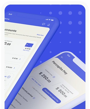
Percapita
We designed a full-fledged application for simplifying everyday finances.
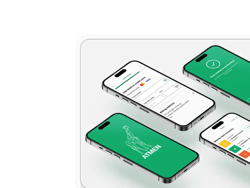
Atmen Fintech
Mobile App
Designing a Minimum Viable Product for a Diaspora Neobank Startup
Sterling Archer
By applying the DDD framework, we created multiple digital tools for a US based Data Company.

Ergomania and NGOs in the Netherlands
UX design for Fintechs, banks and financial startups is the everyday work of Digital Product Design company, Ergomania based out of Budapest, Hungary.

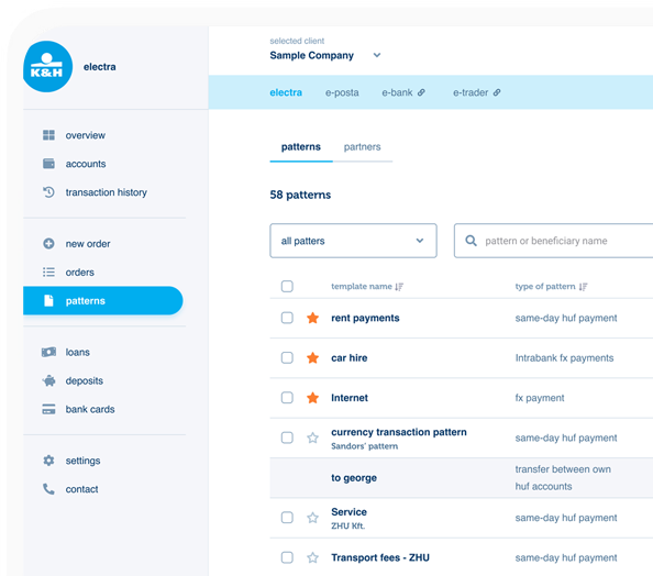
K&H Bank's Corporate Netbank
The K&H Electra Netbank App consolidates all financial needs into a single, user-friendly application. With its intuitive design, businesses can effortlessly manage their company's cash flow, transactions, and investments from one centralized hub.
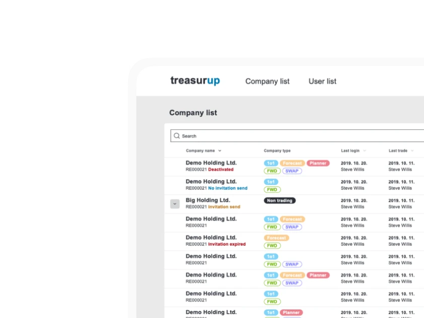
TreasurUp
We established written and visual consistencies and guidelines for TreasurUp’s financial platform.
Simple by OTP
Simple by OTP Bank is Hungary's No.1 mobile payment app for cashless payments with 1M+ downloads, and 1 million+ transactions.
White Label Banking App
We provide full-blown next-generation mobile banking solutions for sales-oriented banks.

Want to read more
about UX, fintech and banking?
Subscribe to our biweekly newsletter and get the latest of our news and thoughts!