Helpful, Not Creepy: What Makes Financial AI Supportive or Intrusive
AI is fast becoming not one feature inside the banking app but the interface itself. The more it infers about us from our transactions, the more pressing the question grows: will it be a partner or a watcher? The answer doesn't come down to tone. Four design decisions – inference, consent, control, and explainability – determine whether an insight helps or intrudes, long before a copywriter ever touches it.
Sunday night, around 11. We glance at our phone. Our banking app greets us with a push notification: "That's the third time you've ordered food delivery this week." The message isn't lying, yet something about it still feels wrong. The problem isn't what it says, but what it knows about us, and the way it lets us know.
In financial apps, AI is increasingly no longer one feature among many but the primary interface itself. Revolut AIR treats banking as a conversation; ChatGPT is wired to our account and tells us in a single sentence how much we spent in a given month. The app doesn't work from some abstract profile. It builds the picture from our own transactions, our incoming transfers, the timing and location of our payments – from the very material we hand it day after day.
The upside is tangible: it cancels a redundant subscription for us, forecasts where the month will end, shows us where our money leaks away. But the deeper the system digs, and the more it infers about us, the bigger the problem it can cause. Poorly designed personalization isn't merely awkward – it can be outright harmful, because it can turn our vulnerability into a target. Why the attention economy and the advertising model push financial AI in exactly this direction, we explored in an earlier article. But can this be designed differently?
Take two notifications. Same channel. Same Sunday night. The opposite feeling.
The first: "You've exceeded your monthly food budget by 15%." This is data. It doesn't judge, it doesn't commiserate – it states something that tells us where we stand. It treats us as adults. A good system might even tell us: "You spend 64% more on restaurants than people with a similar profile." No judgment; it leaves us to decide for ourselves whether it matters to us.
The second: "We've noticed you've been spending more on healthcare lately. Would you like us to set aside a budget for it?" On the surface, helpful. In reality, it has just revealed that it read a life situation from our card data. It noted a few pharmacy purchases, a private consultation, a cancelled gym membership, and inferred a chronic health problem from it, something we never shared with it. This is the creepy extreme. What unsettles us isn't that it's wrong, but that it hit the mark.
The difference between the two messages isn't word choice. The same copywriter could have written both, in the same friendly voice. The difference is architectural – it's decided by what the system infers, whether we asked for it at all, and whether we can switch it off. Tone is the last mile; before it, a chain of design decisions determines whether a message is useful or intrusive.
What Makes It Creepy?
Creepiness isn't an elusive feeling. It's the interplay of three structural questions, and all three can be named.
The first is inference: the system knows something we never gave it. Helen Nissenbaum calls this contextual integrity – data becomes creepy when it steps outside the frame in which we provided it. We spent at the pharmacy to get well, not so our bank could build a health profile out of it.
The second is consent: did we ask for this at all? The literature knows the tension as the personalization-privacy paradox – the same relevance we experience as helpful one moment feels like exposure the next, depending on whether we asked for it. There's also a phenomenon called personalization backfire: when situational privacy concerns kick in, targeting that is too precise can be worse than no targeting at all.
The third is control: can we see what it's doing, and can we stop it? Where there's no brake, even the most accurate prediction turns into a threat, because the only thing we know for certain is that we're not the ones steering.
These three questions can also be measured. The Creepiness of Situation Scale (CRoSS) breaks the reaction into two dimensions: cognitive ambiguity, when there's no cue as to where the system got its information, and emotional intrusion, the visceral discomfort we feel when the app violates a social norm. The Perceived Creepiness of Assistant Scale (PCAS)*, tailored to voice assistants, adds the dimensions of control and behavior. And here's the key to tone: from a financial provider we expect neutral, matter-of-fact composure. When AI passes moral judgment on our spending, it isn't merely rude – it is breaching a fundamental expectation, and that's why we recoil from it.
*The PCAS (Perceived Creepy Assistant Scale) is a specialized 7-item psychometric instrument designed to measure how "creepy" a voice assistant feels to users. It helps developers evaluate whether their smart speakers, digital agents, or chatbots induce discomfort and helps ensure new voice interfaces are more natural and user-friendly.
Finance Raises the Stakes
A webshop's bad product recommendation is at most an annoyance; a bank's mistaken inference, an unwarranted block, or a judgmental remark, on the other hand, can breed deep loss of trust. Money is inseparable from our sense of security and autonomy, which is why financial interfaces carry a heavier cognitive load from the outset.
From this follows a surprising design lesson. The classic UX principle says friction must be eliminated at all costs. In finance, though, that's misleading. When a large sum is moving, or when we grant access to an Open Banking provider, well-placed friction isn't a flaw but a building block of trust.When a high-stakes action goes through with no friction at all, it feels as if the system skipped a step – a confirmation, a check, the moment we'd have seen what was happening. The very absence of friction reads as something hidden. The goal, then, isn't frictionlessness but friction in the right place.
The Design Answer: One Move for Each Question
Each of the three structural questions has a UX answer, and each already has a working example – not a theory, but a pattern visible in live products.
A glass box instead of a black box. The strongest antidote to creepy inference is a system that answers the "Why am I seeing this?" question. As we laid out in our article on explainable AI, the explanation is itself the carrier of trust. The finest pattern is the counterfactual explanation. Instead of dryly announcing the rejection of our loan application, the system tells us what would have been needed for approval: "We'd have approved it if your income were $5,000 higher per month." This is also the strongest example of the useful extreme. The explanation doesn't judge, it points a way forward. And it can be tailored to the persona – the customer deserves a simple, empathetic sentence, not a SHAP (SHapley Additive exPlanations) diagram – the kind that breaks a model's decision into the weight of each factor, precise but unreadable to a layperson; a cluttered, unreadable chart erodes trust just as much as the silent black box.
Confidence and calibration. Bad personalization is often not malicious, just confident when it shouldn't be. ChatGPT-based financial assistants, by their own measurement, get it wrong roughly one in five times. If the system conceals this, it presents an 80% guess as a 100% fact. A calibrated interface says it out loud: "We're 85% sure of this." Showing uncertainty doesn't weaken the product – it protects us from blindly following a hunch.
 ChatGPT Personal Finance
Opt-in and granular control. Consent is real only when it's revocable item by item. The good solution is a dashboard where predictive recommendations can be switched off separately while fraud alerts stay on. It isn't all-or-nothing. We draw the line between what we experience as help and what we experience as intrusion. With the "financial memories" feature, the assistant remembers our habits over the long term. This is exactly where it's decided whether it's useful or creepy: memory is good when we turn it on, and can delete it at any time.
A ban on sensitive attributes. There are things the system mustn't infer even if it technically could. Health, life situation, socioeconomic status – this is where personalization slides into algorithmic redlining, into the system treating us worse on the basis of an inferred disadvantage. The Sunday-night health notification fails right here. The design decision is simple but hard. Certain inferences shouldn't be worded more gently; they should not be permitted at all – at the level of the model, not its wording.
Text Is the Final Polish
And only then, at the very end, comes the text. Here, four instructive examples present themselves. Cleo's "roast mode" deliberately mocks our spending in a snarky voice – and still isn't creepy, because it's opt in: we asked for the ribbing, so control stayed with us throughout. Bank of America's Erica – which by now counts more than 3 billion interactions and roughly 50 million users, and is long past being an experimental curiosity – points not toward our fault but outward. It doesn't say we've overspent, but that there's something we can change. Monzo's traffic-light signal gives a matter-of-fact pacing for the month, without moralizing – it doesn't say we've blown our budget, but where we stand in the month. And Revolut doses out personalization in the onboarding: it doesn't reveal everything in the first minute but gradually, as trust builds.
Finally, behind every automated decision there must be a human exit. In our article on AIR, we called this "the paradox of automation": the smoother the machine, the more critical the moment it gets stuck, and we're left on our own. Article 22 of the GDPR establishes that in a purely automated decision with legal effect we have the right to human intervention – and from the summer of 2026 a further layer reinforces this: EU Directive 2023/2673, for distance financial services, states that in interactions conducted through chatbots and automated tools we have the right to reach a human agent. Good design doesn't bury this deep inside a chatbot labyrinth but leaves it within reach.
The 5 Cs: Architecture First, Text Last
If all of this has to be captured in a single framework, it's the five Cs – but the order is what matters. Consent → Context → Confidence → Control → Calibration. First consent (did we ask for it at all), then context (explanation, the glass box), then confidence (how sure the system is), then control (can we switch it off), and only at the very end, calibration: tone, word choice, the text.

Consent now has a fresh, tangible legal anchor too. Under EU Directive 2023/2673, from 19 June 2026 every provider selling online to EU consumers must offer a prominent, easy-to-find electronic withdrawal function – a withdrawal button, specifically. Its principle aligns perfectly with consent: withdrawal can't be harder than signing up. If it can be concluded with one click, it can be undone with one click. The directive is explicitly aimed at dark patterns – that is, deceptive, unfair UX design. This lifts consent from the level of good intentions to a mandatory element of the interface.
This order is what sets the framework apart from an ordinary "just be nice" piece of advice. Creepiness isn't a wording flaw that a friendlier sentence smooths over at the end. Wording is the last step, not the first – if the architecture is wrong, even the kindest sentence remains just a nicely phrased piece of surveillance from a system that knows more about us than we'd like.
The Stakes: When AI No Longer Suggests but Acts
So far we've talked about suggestions and notifications. In May 2026, however, Robinhood opened its platform to external AI agents. Through Agentic Trading, Claude, or ChatGPT, it executes operations on our account in a separate "sandbox" account, with a preset spending limit, certain transfers requiring approval, and access that can be severed with a single click. When the system no longer merely sees and suggests but also acts, the three structural questions – inference, consent, control – are settled for real. A mistaken insight can still be brushed aside; a mistaken action cannot.
Yet the lesson is simple. It begins with that Sunday-night phone. Design is what separates the financial partner from the surveillance system. The same data, the same model, the same moment – and yet it either helps or haunts, depending on whether the questions of inference, consent, control, and explainability were answered by the designer before the copywriter ever touched it. Because trust isn't a matter of tone – trust becomes the product itself.
About the authors
Balázs has been working in content for more than 20 years, having the role as an editor at one of the first and largest news sites, later helping to establish the content marketing business for media publishers and agencies. Today, Balázs serves as content producer at Ergomania Ltd.
Related case studies
Prefixbox
Prefixbox is a Hungarian e-commerce scaleup. We helped them design an AI agent that gives more accurate product recommendations to shoppers with generative AI.

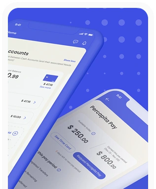
Percapita
We designed a full-fledged application for simplifying everyday finances.
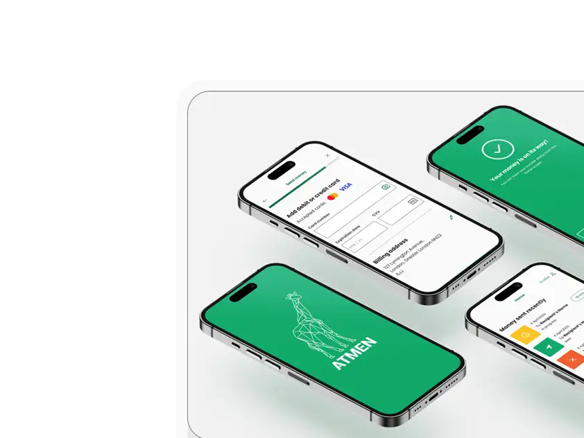
Atmen Fintech
Mobile App
Designing a Minimum Viable Product for a Diaspora Neobank Startup
Sterling Archer
By applying the DDD framework, we created multiple digital tools for a US based Data Company.

Ergomania and NGOs in the Netherlands
UX design for Fintechs, banks and financial startups is the everyday work of Digital Product Design company, Ergomania based out of Budapest, Hungary.

K&H Bank's Corporate Netbank
The K&H Electra Netbank App consolidates all financial needs into a single, user-friendly application. With its intuitive design, businesses can effortlessly manage their company's cash flow, transactions, and investments from one centralized hub.
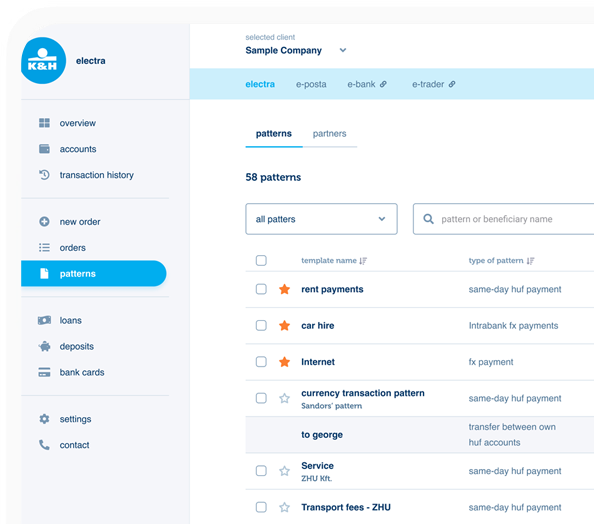
TreasurUp
We established written and visual consistencies and guidelines for TreasurUp’s financial platform.
Simple by OTP
Simple by OTP Bank is Hungary's No.1 mobile payment app for cashless payments with 1M+ downloads, and 1 million+ transactions.

White Label Banking App
We provide full-blown next-generation mobile banking solutions for sales-oriented banks.

Want to read more
about UX, fintech and banking?
Subscribe to our biweekly newsletter and get the latest of our news and thoughts!