Raiffeisen mobile banking app, a nice try
Today, a large company without a mobile page or application is embarrassing. Raiffeisen might as well felt the shame so the Raiffeisen mobile banking app was born. Recently, we shared a great article on mobile app design on our facebook page. Raiffeisen mobile banking app feels as if a couple of enthusiastic developers reading this article quickly put together an app to try if it really works. But Raiffeisen mobile app is so simple it is rather shocking.
Starting with the login, it is funny because the app is presented in Hungarian (in App Store) but its only language seems to be English. A direct login for your customer number and password is missing form the welcome screen. Direct login would spare one extra screen. Let’s have a look at the menu options. Why it is new in the second place? Who is interested in the credits on mobile site anyway? Developers could have put more effort in it…

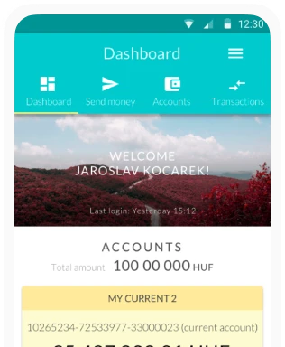
Banks always dream about clients having a myriad of accounts and the present UI tries to help clients to choose from their countless accounts. Banks should realize that clients usually have only one account and they do not have more than two or three. And even if they own multiple accounts there is usually a primary account they use daily, the others are for specific purposes used occasionally (for example: currency account, savings account). A convenient solution would show the most frequently used or default account immediately and spare the user from the burden of selection.


Before trying the money transfer let’s check the account history. Funny indeed that only two days(!) of account history is available. This must be because of some wicked safety considerations but there is no explanation so far for why a 3-day account history is dangerous. It is impossible to perform a frequent use case when the user would like to check an older transfer. Emphases are also misplaced on the UI. The date and amount should be emphasized instead of the type of the transfer while the name of the month should be given.

When you start a transfer you are able to send money to your previously saved partners for safety reasons. The reason behind this behaviour is that if your mobile is stolen no evil guy who is familiar with your login details will be able to send money to his own bank account. The app makes the life of the user more difficult but only provides virtual safety in return. Because in this case, our evil guy will still be able to login on the desktop version, get the transfer verification code to the stolen mobile, and with the code send himself the money which is not deserved. Here you meet the prevalent and popular pseudo-solution of mobile banking.

While typing the amount to transfer a calculator allowing larger numbers would be nice instead of the native keyboard. The SMS request is also rather clumsy. As far as I know the best solution for SMS code requests is presented by BNP Paribas, where the sent SMS is a clickable URL itself. If you click on this URL, you will have the same result as if typing in your password but easier since adding a password sent in SMS to another screen is tiresome. You are not allowed to copy, so you either remember the password by heart or you use pen and paper to write it done before you can enter it to the app.


Raiffeisen’s mobile banking app is long awaited, nice try which unfortunately lacks deeper understanding and passion. The icing on the cake is that if you fill the transfer details as an SME owner, nothing happens, literally. No message, no amount drawn from your account. Following a quick research, you will realize that SME owners have to verify the transfer with their signature but a inattentive developer (or designer if any) just forgot about it.

