Will it be enough to upgrade Revolut in the age of hyper-personalisation?
Revolut has come a long way in its relatively short, six year-long career. Launched in 2015, the startup had reached unicorn status by 2018 (the term given to startups with a valuation of at least $1 billion) and now has more than 15 million customers – and is still going strong.
But the app, which is constantly adding new features, has recently become a little complicated to use – a problem Revolut has addressed with the latest update to the app, promising users a simpler and more customisable experience. According to Ivan Vazhnov, Revolut’s Head of Android Engineering, the new layout gives users more options and allows them to interact with services in new ways. This sounds good, of course, but will it be enough to enable Revolut to maintain its market-leading status among the growing number of neo- and challenger banks? In our article, we take you through the key new features of the Revolut 8.0 update and see if the new platform can still go toe to toe with the innovative strategies of emerging competitors.
The key new features
When you open the updated Revolut app, you will automatically be greeted by an onboarding video detailing the new features. This tutorial will be available for a while under the Inbox tab, in case you have accidentally turned it off, or you can always check it on Revolut’s Facebook page. So let’s see what features have been added to the app.
The Hub
The new Hub (or Control Center) is perhaps the most striking new feature of version 8.0. The Hub displays all of Revolut’s products on one easy-to-navigate page, allowing you to scroll through a single screen to easily find your favourite features. The most important products are grouped into familiar categories, and the transparent layout makes it quick and easy to navigate the app.

Smart search
One of the biggest failings of previous Revolut versions was that it got quite difficult to navigate the app, which was constantly being expanded with more and more features. In response to this feedback, in version 8.0 a smart search bar has been added to the top of the tab menu pages, allowing users to easily navigate from anywhere to anywhere.
The search bar only appears when the user drags the screen down from the top of the page, taking up no unnecessary space. The autosuggest feature makes the search process even more intuitive: as soon as you click in the box, the app will suggest a whole range of options. The most common search categories are listed on a clickable tag in the top bar, and below that, recommended products, recent transactions and our Revolut accounts are displayed on clearly separated cards.

When you start typing in the search bar, results will still appear on separate cards. In addition to the basic categories (such as transactions, recipients or shares), the search engine lists the possible results in a whole new set of categories: depending on the characters you type, the search will display a card for the categories ‘Transactions’, ‘Latest news’, ‘Discover’ or ‘Select problem’, with results corresponding to the characters you type.

If you click on an element in the top tag bar, the category will not appear as a tag in the search bar, but as text, as if you had typed it. The search results will be displayed accordingly, so these tags do not act as a filter, they can only speed up the typing of characters in the search box.

This complex search feature is a great help in navigating through the different features of the app, and the grouped search interface brings to the fore features that many users may not have known existed.
Customizable home screen
The customizability trend that has swept through the major providers in recent years (such as Facebook’s newsfeed customizability or Apple’s iOS 14 update widget features) has reached Revolut – the new version allows you to pin (and unpin) features that are important to you on your home screen, so you can customize what you want to see when you open the app. This new option could make life easier for many customers, as Revolut’s range of services has grown, so has the range of users who can use the app for completely different purposes. The customizable home screen feature allows you to see only the information that is really relevant to you, making it easier and faster to use the app.
All you need to do is click on the dots in the top right-hand corner of the sub-page of the product or feature you want to use, then select the option “Move to Home screen/Hide from Home” from the context menu that pops up. At first glance, it may seem that this feature is somewhat hidden, but in the onboarding video mentioned above, the customization feature is explained in detail. Of course, if you missed it or didn’t watch the video, chances are you’ll just accidentally find the three dots and thus the context menu.

Hyper personalisation – the future of Fintech?
The idea behind the customizability of the home screen is personalization. This trend is not new per se, mainstream banks have been involved in some degree of personalisation of financial services for quite some time. However, in recent years, the customisation of applications and services has reached ever higher levels – so-called hyper-personalisation.
Hyper-personalisation combines real-time data with cutting-edge technologies such as artificial intelligence (AI) in order to provide users with more relevant information about a product or service.
A recent Deloitte research outlined that hyper-personalisation is “essential for banks” as it allows them to respond directly and quickly to customer needs, as well as being an excellent tool to increase financial inclusion (and therefore revenue) and differentiate themselves from competing bank brands. The 2020 pandemic has certainly been a major driver of the rapid adoption of this trend – as people’s demand for personalised digital interactions has soared over the past 12 months, so too has banking services changed significantly.
Steve Whiting, head of payments technology at Soldo, put it this way: “The evolution of the internet, mobile phones and social media has meant that consumers (including business leaders) expect seamless, user-friendly services. They want to manage their financial activities as easily as they manage their photos on Facebook or Instagram. I think this could be the definition of Fintech: the same techniques and technologies that brought the internet, social media and mobile to the world of finance.”
These digitally customised customer experiences could be the future of banking, especially for challenger banks, as it will allow them to become (or remain) competitive with incumbent banks. The digital platform gives financial institutions the opportunity to personalise a wide range of content, automate the process, create a more personal and deeper customer relationship and keep users informed. By offering such and similar personalised interactions, these companies can deliver a very valuable positive customer experience.
Fintechs are already at the forefront of exploiting this trend, especially those targeting Generation Y and Generation Z. These age groups have grown up with the internet, making them more financially literate than previous generations due to easier access to relevant information. They choose very different principles and methods for how and where they spend their money. They are the ones who actually expect more personalised features from their digital bank.
Mitto
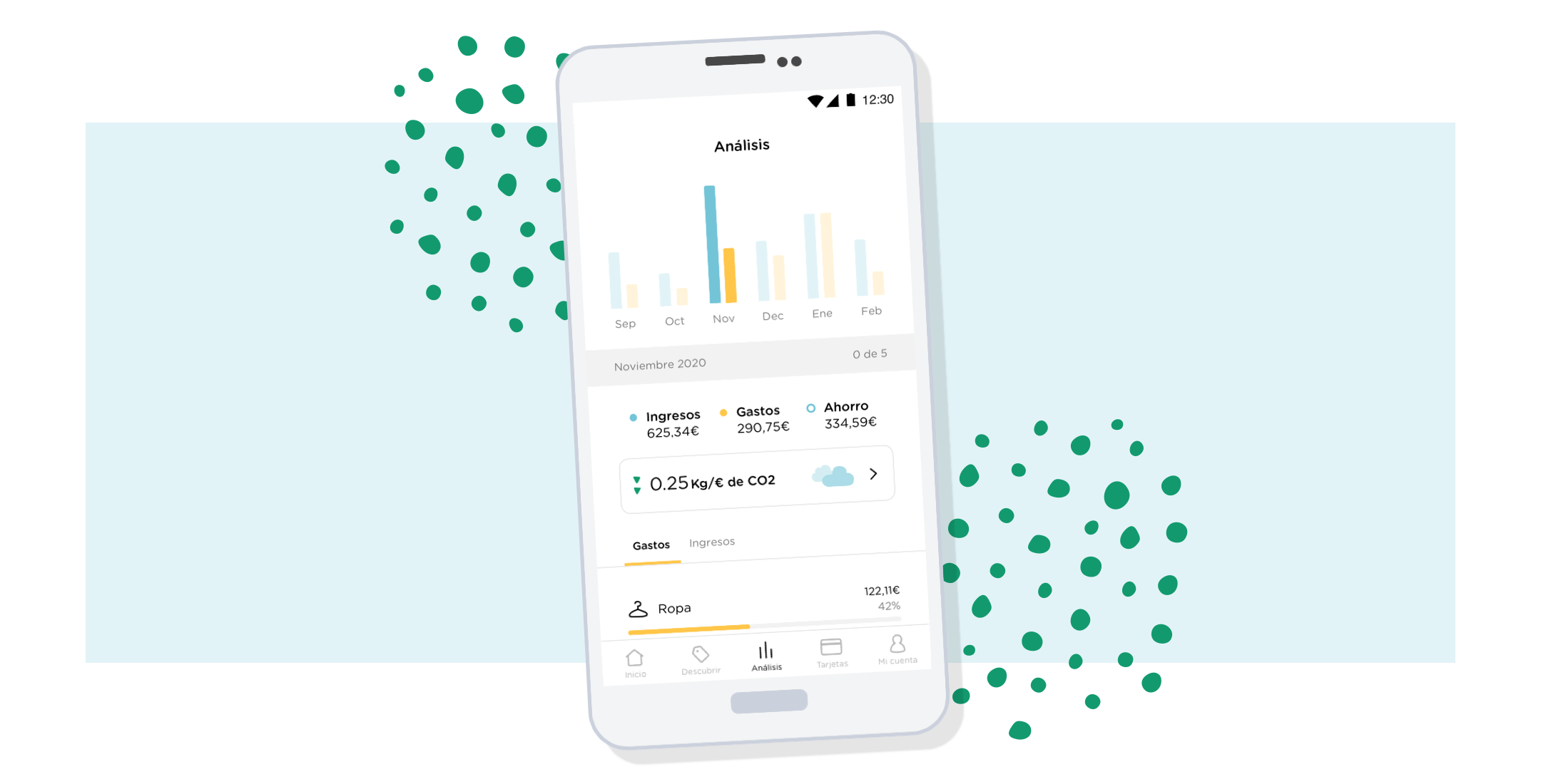
An exciting example is Mitto, a Spanish neobank that combines hyper-personalisation and conscious spending, focusing on teenagers and young adults. Mitto has added an eco-footprint measurement service to its classic banking functions, which tracks the CO2 impact of users’ purchases and compares it to their peers. The idea behind it is that by seeing and understanding the impact of each purchase and deposit, users will make more sustainable financial decisions in their everyday lives. Mitto also offers discounts on sustainable brands and services, giving users the opportunity to connect with brands that represent values that are important to them.
Atom
Also targeting a younger age group, Atom has launched a “Design your own logo” campaign as part of its go-to-market strategy. After registering, users were not confronted with Atom’s own logo, but were greeted by a unique, personalised logo that even included their name (e.g. Charlie’s Bank). The campaign generated 1.4 million logos and helped build a dedicated customer base, all before the product itself was even launched. Thanks to this unique customer experience, combined with word-of-mouth recommendations and significant social media campaigns, Atom has grown to become one of the UK’s largest challenger banks.
Bank of Ireland
Bank of Ireland uses data as part of its customer service programme to help deepen customer relationships. The company follows the lead of technology giants to track and amplify messages in order to personalise them, enabling it to offer tailored services and experiences within specific sectors. Bank of Ireland combines online and offline data to provide a unique and comprehensive view of customer information. As a result, the number of registrations and applications initiated through digital platforms has increased by 278%.
HSBC
HSBC uses artificial intelligence to predict how customers want to redeem credit card points – enabling them to offer personalised rewards to customers participating in their rewards programme. The idea behind it is that while customers can enjoy increasingly valuable rewards, competition will continue to grow. Tearsheet reported that 70% of customers who received personalised rewards were very satisfied with the gifts, and email open rates jumped by 40%.
Can Revolut stand its ground?
Compared to the above examples, one’s first thought might be that Revolut is nowhere behind in terms of personalisation. This doesn’t hide the truth – the customisability of the home screen was an important step in the right direction, and perhaps reveals as much about the company’s strategy as Revolut’s commitment to getting to know its wide range of users as best it can and tailoring its approach to their needs to provide them with the best possible user experience.
As a business slowly gets to know its customers and provides them with better experiences and services, it gets back a very important value: trust. Centuries ago, a wealthy family could stay in touch with a trusted advisor for generations. Hyper-personalisation aims to foster a 21st century version of this trusted relationship for a wide range, large and diverse client base in a way that feels human and intuitive. It aims to transform a purely business relationship into a human relationship worth keeping for the long term – in other words, it builds loyalty in users to the service and brand that is one of the most valuable commodities in today’s fast-changing and volatile world.

