Designing for Everyone: It's About Empathy, Not Just Compliance
Recently, I had the chance to speak at a Product Design Talks session about something I find important: digital accessibility and inclusive UX-UI design. It’s disappointing, isn't it, when the digital tools we rely on daily just don't work well? That disappointment is keenly felt by the people who face barriers using the things we create as designers.
Accessibility isn't just a checklist item. It's a fundamental mindset, a way of thinking that must be integrated into every stage of the design and development process.
Let's Think Broader: From Accessible to Universal Design
Accessibility is often narrowed down to designing specifically for people with disabilities. But there's more to it: I urge everyone to design broader. We should aim for inclusive design, which addresses all the diverse needs of people. Taking it even further, universal design is about creating things usable by everyone, whatever their situation.
 Microsoft's categorization from their Inclusive Design toolkit
Why? Because when you design considering those who might not be able to use one of their senses, or face motor skill challenges, you inevitably design for everyone. Accounting for these needs makes your product better and usable for more people.
You've likely seen Microsoft's framework categorizing limitations:
- Permanent: Someone without an arm, someone blind or deaf.
- Temporary: A broken arm.
- Situational: A new parent needing to use a phone one-handed.
What I love is seeing companies adapt this. At the Product Design Talks session, I shared examples from Booking.com, who mapped this to travel scenarios: the distracted driver who can't look at the screen, or the stressed traveler receiving bad news about a canceled flight. How would that stressed person react to an interface? It's certainly not the place to push an insurance proposal!
This approach isn't just for private companies. The UK government has also developed similar personas for their service design, thinking about how different situations impact user needs. For example, think of a busy entrepreneur trying to fill out a form while fielding calls, or a traveler navigating a noisy, unfamiliar airport. The closer we get to these real-world contexts, the more empathy we gain.
Practical Steps: What To Do (and Not To Do)
Knowing why accessibility matters is the foundation, but knowing how to implement it is critical. Here are some actionable guidelines. (A special shout out to Vitaly Friedman, whose Inclusive Design Patterns For 2025 presentation is highly recommended for anyone interested in the topic, and which I also drew on for this compilation.)
Visual Clarity and Perception
A user's first impression is visual, but sight is not universal. Ensuring clarity for people with visual impairments, including color vision deficiency, is a fundamental starting point.
- Don't Rely on Color Alone: Color can be a powerful tool, but it cannot be the only way information is conveyed. This is a core Web Content Accessibility Guidelines (WCAG) Level A criterion. For example, status indicators should use both color (a green dot) and text ("Active now"), and error fields need more than just a red outline.
- Ensure Sufficient Contrast: The contrast between text and its background is crucial for readability. WCAG sets clear minimums (Level AA): a 4.5:1 ratio for normal text and 3:1 for large text (18pt or 14pt bold). Use online tools to check your palettes. Remember that blue is often the safest hue for colorblind users to perceive, and you should avoid mixing red and green, or pink and turquoise.
- Avoid Superscript: That little raised text (like for TM or degrees) is harder to read. Use alternatives like "(TM)" or spell out "degrees." Rephrase fractions if needed.
 Right: Atul Varma's accessible color palette builder on GitHub
Navigation and Structure
A clear, predictable structure is the backbone of a usable interface. It reduces cognitive load for all users and is essential for those who navigate using assistive technologies.
- Build a Logical Hierarchy: Use semantic HTML correctly, especially heading elements (H1, H2, H3). This creates a logical outline of the page, allowing screen reader users to understand the structure and jump directly to the section they need instead of listening to everything.
- Maintain Consistency: Once you establish a navigation pattern, keep it consistent across all pages. A search bar or main menu that moves unexpectedly increases the cognitive effort required to use your site. This aligns with the WCAG criterion for Consistent Navigation (Level AA).
- Design Responsively: Use relative units like percentages, not fixed pixels, in your design. This ensures that your layout gracefully adapts when users zoom in or view it on different screen sizes, preventing content from becoming jumbled or inaccessible.
- Guide Attention with Layout Patterns: We often scan in an 'F' pattern, but sometimes users scan lower down (a layer pattern). Consider these patterns when placing key content.
Interaction and Forms
Every point where a user interacts with your product ‒ from clicking a link to filling out a form ‒ is an opportunity to either build confidence or create frustration.
- Use Descriptive Links: Generic links like "Click Here" or "Read More" are ambiguous for screen reader users. Read more about what? Click here for what? The link text itself should describe the action or destination, such as "Read the specification" or "Download the user guide."
- Label Forms Clearly and Give Feedback: Always use visible, persistent labels for form fields. Placeholder text inside an input field is not an acceptable substitute, as it often disappears once the user starts typing. Also, provide clear error feedback.
- Ensure Full Keyboard Accessibility: This is one of the most important tests you can run. Can you access and operate every single interactive element – from links to buttons to form controls – using only the keyboard? Ensure the focus indicator (the outline that shows which element is selected) is always visible. For complex interactions like drag-and-drop, you must provide a keyboard-only alternative.
- Simplify Requirements: Avoid overly complex password requirements that are difficult for people and password managers alike. Where possible, suggest two-factor authentication (2FA) or passkeys as more modern, accessible alternatives.
- Use Modals (Pop-up Dialogs) Sparingly: "Please no modals" might be too strong, but use them cautiously as they can disrupt user flow. Ensure they are fully accessible if you do use them.
Media, Animation, and Language
Dynamic content and rich media can enhance an experience, but they can also create barriers if not handled with care.
- Provide Text Alternatives: All relevant-for-context visual elements like photos, illustrations, sometimes even icons need a text alternative. For images, provide descriptive alt text. For purely decorative images that add no information, use an empty alt attribute. For audio and video content, provide transcripts and captions.
- Give Users Control over Motion: Have you landed on sites with blinking elements, auto-playing videos, or sudden noises? It can be disturbing for anyone, let alone users with cognitive or sensory sensitivities. Avoid auto-playing video or blinking elements. You must provide clear controls to allow users to pause, stop, or skip any moving content.
- Use Clear and Simple Language: Avoid jargon and write in a way that is easy to understand. This benefits everyone, from users with cognitive disabilities to non-native speakers.
Understanding the Standards: WCAG and The European Accessibility Act
Understanding the benchmarks is essential, as they’re soon to be a must for most companies. The main one is the Web Content Accessibility Guidelines (WCAG) from the World Wide Web Consortium (W3C). Key things to remember:
- Levels: A (must do), AA (should do ‒ the common target), AAA (striving for the stars –- often very difficult).
- POUR Principles: Content must be Perceivable (available to senses), Operable (interfaces cannot require interaction a user cannot perform), Understandable (content is readable and predictable), and Robust (works with assistive technologies).
- Versions: WCAG evolves (started in 1999, version 2.2 was released in 2023, and 3.0 is coming). WCAG 2.2 adds focus on things like visible focus indicators and minimum target sizes (e.g., ≥24px).
 This is not the London tube, but a handy map of the WCAG 2.2 accessibility guidelines. The stations represent specific success criteria and the colored lines group them into practical themes like keyboard, contrast, and forms, making the complex set of rules easier to understand and navigate.
Crucially, for any company offering products and services to customers in the EU it’s also important to know the European Accessibility Act (EAA).
- Effective Date: June 28, 2025.
- Scope: It goes beyond websites and apps. It covers self-service terminals (ATMs, ticketing machines), e-books, e-readers, digital banking services, and e-commerce products.
- Applies To: All private companies globally selling to European customers (B2C). EAA exempts microenterprises, defined as businesses with fewer than 10 employees and an annual turnover of less than €2 million. B2B providers can relax for now.
- Penalties: Non-compliance carries risks of significant fines (with maximums set by each country) or even imprisonment. (More on the regulation here.)
Making Accessibility Happen: It's a Process
So, how do you start or improve?
- Check Your Current State: Audit your website or service. Can text be zoomed to 200%? What happens with a screen reader? How are images handled?
- Test with Users with Disabilities: Testing is invaluable. Users often prefer using the normal website, not some separate accessible version or widget. Gather their feedback.
- Train Your Entire Team: Don't just train designers and developers. Train the CEO and management! Without their buy-in and prioritization, accessibility efforts often stall. They might be scared, but it needs to be part of the culture.
- Integrate Accessibility into Every Feature: Make accessibility checks part of your regular development process and Definition of Done. This way, it's not a surprise or a huge task at the end. (At Ergomania, we have checklists and resources we use daily to help with this.)
Final Thoughts: More Than Compliance, Accessibility Is About People
My main message is this: Accessibility is about making meaningful experiences. I dislike hearing it being framed only as compliance or a burden. Ultimately, designing accessibly means reaching more people. It requires empathy. And by having empathy, we genuinely make the world better through our digital products.
Yes, compliance is a driver, especially with deadlines looming. People often tell me, "This is compliance, it has zero business relevance." I strongly disagree! It has significant business relevance. Accessible design expands your potential market to a wider population, strengthens your brand image, and is a legal requirement under regulations like the EAA.
But the greatest shift is moving accessibility from being a checklist item to being a core part of the company culture. The most effective way to do this is to involve decision-makers in user tests with people with disabilities. When a manager or CEO sees a real person struggling to use their product, the conversation transforms instantly. It moves from "What's the minimum we have to do to be compliant?" to "How can we fix this for them?" Seeing those videos and having personal experiences has certainly helped me to become a better expert and a better person.
Let's keep working toward a more accessible digital world!
About the authors
As a product designer driven by curiosity and maximalism, I specialize in Fintech products, with a particular focus on chatbot interfaces and AI. My goal is to align all three key objectives: user needs, business goals, and technical feasibility. This balance is challenging to strike, but that’s precisely what motivates me professionally. I am especially passionate about facilitating workshops of any size or format.
Related case studies
Prefixbox
Prefixbox is a Hungarian e-commerce scaleup. We helped them design an AI agent that gives more accurate product recommendations to shoppers with generative AI.

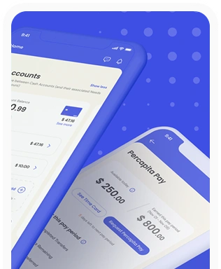
Percapita
We designed a full-fledged application for simplifying everyday finances.
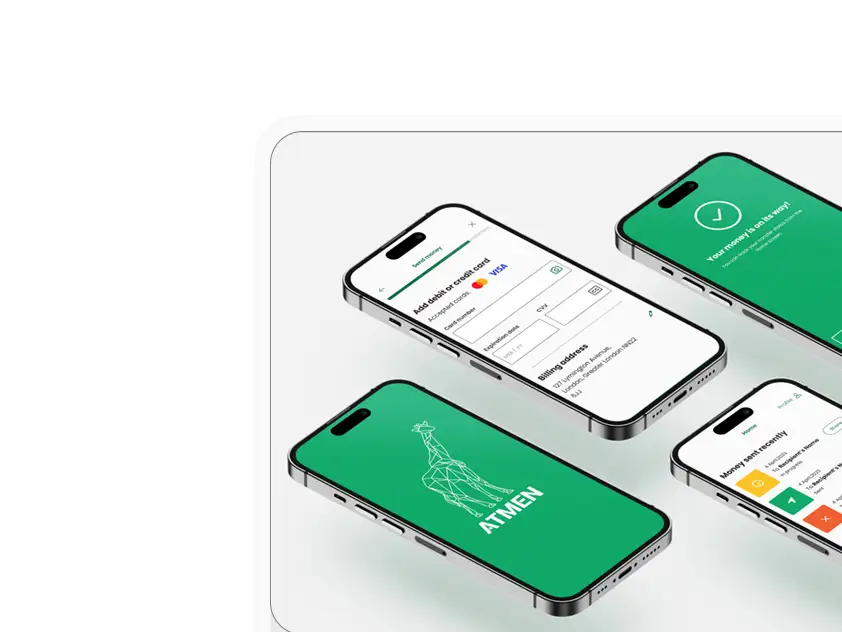
Atmen Fintech
Mobile App
Designing a Minimum Viable Product for a Diaspora Neobank Startup
Sterling Archer
By applying the DDD framework, we created multiple digital tools for a US based Data Company.

Ergomania and NGOs in the Netherlands
UX design for Fintechs, banks and financial startups is the everyday work of Digital Product Design company, Ergomania based out of Budapest, Hungary.

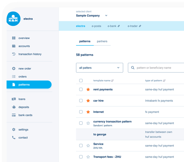
K&H Bank's Corporate Netbank
The K&H Electra Netbank App consolidates all financial needs into a single, user-friendly application. With its intuitive design, businesses can effortlessly manage their company's cash flow, transactions, and investments from one centralized hub.
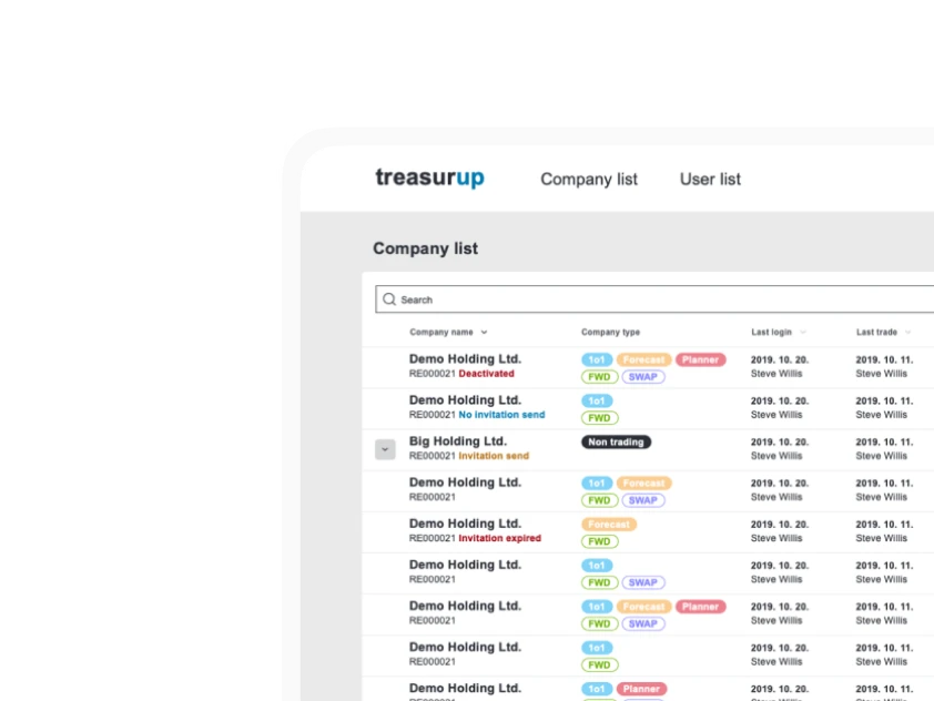
TreasurUp
We established written and visual consistencies and guidelines for TreasurUp’s financial platform.
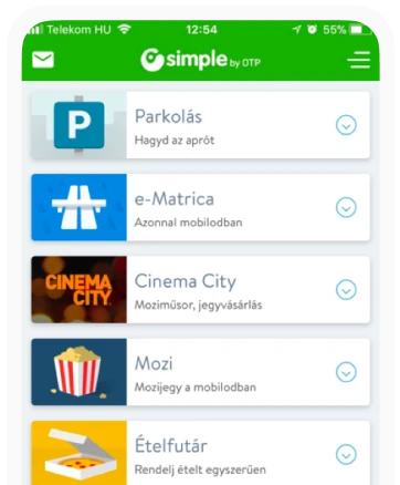
Simple by OTP
Simple by OTP Bank is Hungary's No.1 mobile payment app for cashless payments with 1M+ downloads, and 1 million+ transactions.
White Label Banking App
We provide full-blown next-generation mobile banking solutions for sales-oriented banks.
Want to read more
about UX, fintech and banking?
Subscribe to our biweekly newsletter and get the latest of our news and thoughts!